ONE WORK OF ART: Beatrice Mandelman’s ‘Cool Wind’

Beatrice Mandelman- Cool Wind circa 1950- Matthews Gallery

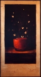
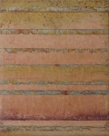
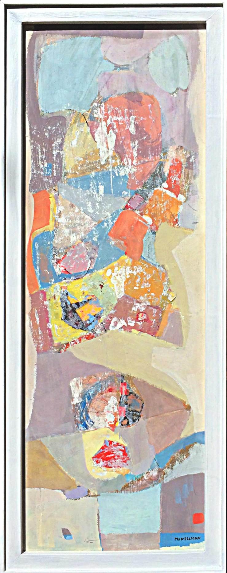
Beatrice Mandelman, Cool Wind c. 1950, Casein with Collage on Masonite Panel

When John Sloan invited Beatrice Mandelman and Louis Ribak to visit Santa Fe in 1944, the two artists were on the rise among New York City’s avant-garde. They had ties to Hans Hoffman and Fernand Leger, and were often mentioned in the same breath as Jackson Pollock. Sloan, who had been summering in New Mexico for years, had a reputation for spiriting away his favorite artists to the Desert Southwest. During their trip the recently married duo took a train to Taos and decided to stay.

The move marked a radical change in Mandelman and Ribak’s artwork. “We had to start all over again,” Mandelman said. “We spent the first couple years painting landscapes.” They were known for their figurative paintings in New York, but in this radically different environment their focus shifted to pure abstraction. They were trailblazers for a new wave of artists called the Taos Moderns, a movement that enlivened the Taos art colony but enraged an older vanguard of academic painters with ties to the Taos Society of Artists of the 1910’s and 20’s. To this tight clique of romanticists, the newcomers stuck out like colorful cacti—particularly Mandelman.

Portrait of Beatrice Mandelman in her Taos studio circa 1950- Matthews Gallery Beatrice Mandelman, 1950

“She worked with full abstraction at a time when most artists were not daring enough to do so,” writes David L. Witt in his book Taos Moderns, noting that Mandelman considered herself “the first of the second generation of artists in Taos.” The voice of a young, female abstract painter had never been part of the remote art community.

Far from the big city, Mandelman developed a new appreciation for the natural world and humanity’s relationship with it. By the late 1940’s she was developing an abstract symbol system to express her emotional responses to the landscape. Her elegant compositions didn’t mimic the lines or palette of the high desert, but they perfectly evoked the strong, solitary spirit of its inhabitants.

The mixed media painting in our collection was likely done in the 1950’s. Early in her experiments with abstraction Mandelman chose a muted palette, but here brighter colors poke through. This more expressive style was inspired by Henri Matisse and Mandelman’s former teacher Leger, and allowed her to explore the highs and lows of human experience with great vigor. Cool Wind‘s undercurrent of chilly blues and bright accents of orange and red call forth the sensation of a shiver passing up the spine.

As the evenings get cooler in Santa Fe, we’ve developed an ever-evolving passion for this piece and the innovative artist who created it. Learn more about Beatrice Mandelman on our website, and connect with us on Facebook, Twitter and Instagram for daily gallery news.

NOT A POP ARTIST: Five Sides of Jim Dine

Jim Dine Rainbow- Matthews Gallery Blog


78-year-old artist Jim Dine has earned his place in any good post-war art history textbook. Picking exactly when to spotlight the artist must be a difficult task for scholars. The painter, sculptor, illustrator, printmaker, stage designer and performance artist has a way of diverging from the status quo and ending up at the forefront of new art movements. Just when things get established, he’s off on his own again.

A mixed media drawing  by Dine recently found its way to Matthews Gallery, so we took the opportunity to explore 5 manifestations of the chameleonic artist:

Fluxus Performer

Dine grew up in Cincinatti and got his BFA from Ohio University. When he arrived in New York in 1958, the art world was fixated on a type of work you couldn’t sell in a gallery. Some critics called them “wacky nightmares“, others described them as “a three-ringed circus with undertones of group therapy“, but Dine and his friends Claes Oldenberg, Allan Kaprow and John Cage dubbed their performance art pieces “Happenings”.

Happenings were designed to be as ephemeral and unpredictable as day-to-day life—but a little weirder. Battles between ballerinas and roller-skaters, reenactments of the Lincoln assassination, bikini stripteases and blue ice cream feasts were all passionately performed, often in rapid sequence. Whether you call it though-provoking or senseless, the Fluxus movement was one-of-a-kind. For Dine, all the world was a stage until…

Pop Progenitor

Jim Dine- Robe Diptych- Matthews Gallery Blog


Jim Dine, Red and Black Diptych Robe, 1980

In 1962, Dine’s paintings appeared alongside work by Andy Warhol, Roy Lichtenstein, Ed Ruscha and others in the Pasadena Art Museum’s show New Painting of Common Objects. Curated by Walter Hopps of Ferus Gallery (site of Warhol’s first solo show), the exhibition was a seminal moment for a new movement: Pop Art.

Dine’s inclusion in the exhibition made perfect sense at the time. He was experimenting with serial imagery of familiar objects and symbols like bathrobes, hearts and tools. However, the artist’s expressive style and often tender subject matter clashed with the postmodern angst of other Pop progenitors. Soon enough, he was plotting his escape…

Modernist

Jim Dine- Paris- Matthews Gallery Blog

Jim Dine, Paris Smiles in Darkness, 1976

Dine moved to London in 1967, a strange decision considering his controversial history with the United Kingdom. A year before his solo exhibition at London’s Fraser Gallery was raided by police and the owner was fined for showing “indecent” images.

The artist defiantly continued to his relationship with Fraser and used his time in Europe to study the work of Van Gogh, Picasso, Matisse and other modernists. In 1971 he returned to the United States, ready to chart a new course…

Neo-Expressionist

Jim Dine- A Lady Sitting Drawing- Matthews Gallery Blog

 Jim Dine, A Lady Sitting, Mixed Media, 1975

Minimalism was en vogue when Dine arrived in New York, but the artist wasn’t interested. Instead he focused on figure drawing, refining his skills in various mediums and earning a reputation as a master draftsman. The mixed media drawing in our collection is from this period. A stunningly realistic face painted in oil is framed by confident charcoal marks and a glowing crayon color field.

In the years to come Dine’s figurative work would mark him as a founder of Neo-Expressionism, but critics could never assign the artist a particular label for long…

Modern Individualist

2008_JimDine_23220011

Installation shot, Jim Dine: Poet Singing (The Flowering Sheets)

 Perhaps Dine’s artistic identity is best summed up by MoMA:

This commitment to a personally invested, image-dictated content and a continuing interest in the technical and expressive potential of every medium has characterized Dine’s work as a whole. Thus, Dine has often been out-of-step with the major movements of the post-World War II period and must be considered a modern individualist.

It’s a bit of a non-title, but Dine defies labels at every turn. The almost-octogenarian is still working his way into new chapters of art history.

Check out our website for more on Jim Dine, and connect with us on Facebook, Twitter and Flickr for to-the-minute gallery news.

CURATE THIS, CURATE THAT: Place your votes!

Collectors-Choice-Social1

The selection process for our social media-curated show COLLECTOR’S CHOICE is underway, and fans on Facebook, Instagram, TwitterTumblr and other networks have placed their votes. It’s time for some tie breakers on WordPress! Check out the match-ups below and vote for your favorites in the comments section. From January 31 to February 5, we’ll unveil your selections in the gallery and online.

JAMIE CHASE

Jamie Chase- Collector's Choice- Matthews Gallery blog

ROUND 1! Jamie Chase is known for his figurative work like image #1, and also his abstracted landscapes like #2. Which one should appear in the show? Take the curatorial reins!

WILLIAM LUMPKINS

William Lumpkins- Collector's Choice Show- Matthews Gallery Blog

Do you prefer William Lumpkins‘ careful watercolor brushstrokes (#1) or experimental wild felt-tip pen marks (#2)? Read more about the influential Santa Fe modernist here before you decide…

KATE RIVERS

Kate Rivers- Collector's Choice Show- Matthews Gallery

Curate this! Should we feature a Kate Rivers book collage in the show, or one of her nests? Read about her mixed media work in this blog post, and vote for #1 or #2 in the comments.

HANNAH HOLLIDAY STEWART

Hannah Holliday Stewart- Collector's Choice- Matthews Gallery Blog

These tall, spindly bronzes might be very different, but they’re both by powerhouse feminist sculptor Hannah Holliday Stewart. Figurative or abstract? Curate that!

PAUL GAUGUIN

Paul-Gauguin-Collectors-Choice

Two Tahitian myths inspired these woodblock prints by Paul Gauguin. Which do you prefer? Read about them in this blog post, and vote now!

Thanks for participating in COLLECTOR’S CHOICE! To place your vote on other social networks, connect with us through the links on our About Page.

NEW HORIZONS: Landscape Art Speaks

NEW HORIZONS- Focus on Landscapes- Matthews Gallery

For our NEW HORIZONS: Focus on Landscapes show, running now through October 27, Tesuque sculptor Frank Morbillo‘s latest body of work engages with our diverse collection of contemporary landscape art. Throughout the exhibition, you’ll find observations by Morbillo and seven other artists, many of whom are inspired by the same severe desert expanses and infinite skies. Below is a selection of works and quotes from the show:

Sprung- Frank Morbillo- Matthews Gallery

Kate Rivers- Reflections- Matthews Gallery

PATTERN

Frank Morbillo finds patterns wherever he looks in the natural world.
Kate Rivers uses manufactured patterns to form fractured reflections of nature.

“What’s a pattern? Something that might be predictable. When I observe things, that’s what I see. As an artist, you take all of these different things and see how they work together.”

-Frank Morbillo

 “I’m using this history of text and image as something that is beautiful, and weaving the words together.”

-Kate Rivers

Frank Morbillo- Cool Encounter- Matthews Gallery

David Grossmann- Snow Rhythms- Matthews Gallery

RHYTHM

David Grossmann abstracts his landscapes to lay bare underlying rhythms.
Frank Morbillo traces the formation and disruption of natural rhythms.

“My paintings… are simplified rhythms of color, light, and shape. On the surface they are quiet whispers, but I hope that they convey a depth of emotion to anyone who takes the time to stop and listen.”

-David Grossmann

“Entropy is the introduction of chaos and disorder. That’s a root of what I’ve done over the years. You take something that could be highly organized, and understand that everything, all things, are subject to entropy. As much as we feel like we’ve created something that defies that, there’s no chance. Everything is subject to it.”

-Frank Morbillo

Frank Morbillo- Unraveling- Matthews Gallery

Terry Craig- Burning Questions- Matthews Gallery

TEXTURE

Terry Craig blends materials to mimic natural textures.
Frank Morbillo places materials with contrasting textures side-by-side.

“It took a long time… to develop the formulas and get the materials to do what I wanted them to do. You can scrape into it and get all sorts of these wonderful organic qualities.”
-Terry Craig

“Glass is a beautiful material that sets up this nice contrast with the metal. If you add texture to it, it takes on a different color. The light behaves differently going through it.”
-Frank Morbillo

Frank Morbillo- Traverse II- Matthews Gallery

Jamie Chase- Two-Horizons- Matthews Gallery

COLOR

Jamie Chase uses multiple layers of paint to reveal and obscure different hues.
Frank Morbillo relies on the properties of glass to enhance his palette.

“There are so many narratives underneath the final painting. It starts out as something really dark or really dramatic in contrasting colors, and by the end it’s almost neutral colors, but there’s something moving under the surface.”
-Jamie Chase

“The glass introduced color into the work that really isn’t achievable in metal. The cobalt blues and reds and ambers have a quality that you can’t get with any of the metals.”
-Frank Morbillo

See NEW HORIZONS: Focus on Landscapes now through October 27 at Matthews Gallery. Connect with us on Facebook, Twitter and Pinterest to see more material from the show.

ACID JAZZ AND WABI-SABI: Michelle Y Williams

Artist Michelle Y Williams- Matthews Gallery- Santa Fe, New Mexico
Michelle Y Williams

Being “cloistered in” may be key to Michelle Y Williams’ process, but that doesn’t mean she’s a recluse. Solitude is what the Houston, Texas artist needs to focus her mind and  tune in to her subconscious. Her mixed media works are equally inspired by measured decisions and the pure emptiness of the blank surfaces before her. They’re conglomerations of the figurative and the abstract, and boast a subdued palette that echoes the artist’s fascination with rust, crumbling concrete and peeling paint.

When Williams isn’t in her studio, she’s not afraid to step into the spotlight. In September she’ll be featured in Luxe Magazine, and last week she granted an interview to the Matthews Gallery. Michelle told us about everything from her many materials to the Japanese aesthetic of wabi-sabi, a worldview that has taught her to accept her flaws and create with abandon. Here’s what she had to say:

Michelle Y Williams- Petit 28- Matthews Gallery
Petit 28, Michelle Y Williams

You write in your artist statement, “Inspiration for my work is both selective and completely random.” Is the same true for your choice of materials for a particular piece? How do you select a medium? 

The primary medium in my work is acrylic (very quickly after I began as a painter using oils, I realized I have an aversion to cleaning brushes). Pigmented inks have also proven to be an often used medium for me (applied with a dropper, then floated across the canvas using my palette knife).

The choice for other materials, indeed, comes more randomly. Whether I incorporate sand or oil bar or even attaching a piece of torched metal with wax string to the canvas happens naturally & intuitively as the work progresses.

You also talk about a “relationship that develops” between you and your work. Does this change your notion of when a work is completed? Is it sad to say goodbye?  

I suppose it’s more of a short-term relationship…shall we call it a fling.  I invest energy into a piece which is then reciprocated upon completion, but the real gratification comes when someone has made a connection with my work, which couldn’t happen unless I surrendered it readily.

Michelle Y Williams- Cut 12-532- Matthews Gallery
Cut 12-532, Michelle Y Williams

You prefer to work in solitude. What are some other important parts of your process? Do you listen to music? Do you work on multiple pieces at a time, or just one?

My preference for sequestration is actually paramount – in order to maintain the integrity and authenticity of my work, I eliminate most outside influences that could dull my own creative process. Diverse genres of music can be heard in my studio – from acid jazz to classic rock to classical – while I move between several pieces in various stages of completion.

You mention the importance of seeking a balance in your work. How does that connect with the tenets of wabi-sabi, the Japanese aesthetic that embraces the transient self?

Rather than trying to exert control over a painting, my pursuit of aesthetic balance, (while maintaining my penchant for asymmetry), transpires more instinctively. The absence of obsessing over that quest for balance and the capacity to “let go”, relates to the principles of wabi-sabi.

Michelle Y Williams- Petit 18- Matthews Gallery
Petit 18, Michelle Y Williams

I found this part of your bio particularly beautiful: “In a stain, we find understanding; in a dent, our ability to heal; in a blemish, an unchained beauty.” Embracing your flaws can be a difficult process. How does your work help you do this? 

Quite simply, the alternative to embracing flaws requires far too much negative energy. For me, perfection is boring and I truly find immense beauty in flaws – chips & cracks in tea bowls used in Japanese tea ceremonies or uncut & unpolished rough just-mined diamonds – these things excite and inspire me.

I hear you’re quite the humanitarian. What projects are you involved with? 

I am an “equal opportunity donator”, giving my work with abandon to many different charitable organizations throughout the year.

Click here to see more of Michelle’s art, and connect with us on Facebook, Twitter and Pinterest for updates on her latest work.


STATE OF THE ART: A Survey of New Mexico Artists

The very first artists who came to work in New Mexico found themselves on a harsh frontier. Harold Elderkin and his wife moved to Santa Fe in 1886 to run a gallery and teach painting lessons, but left for El Paso two years later. An artist named George Stanley tried the same thing in 1897 and failed even faster.

The 1920s saw an influx of artists who had already established their careers on the East Coast. The Southwestern landscapes they sent home would build this region’s reputation for stunning natural beauty and great art. Nowadays, Santa Fe is one of the nation’s largest art markets and New Mexico is a magnet for artists from across the globe.

Though New Mexico has changed a lot since those first creative pioneers settled here, the independent spirit of the frontier lives on through art. Our April 5-18 exhibition “State of the Art”showcases the work of seven recognized contemporary masters who work in New Mexico. Their art may be as diverse as our desert sunsets, but it’s all influenced by the Land of Enchantment.

Jamie Chase moved to Santa Fe in 1980 from his home state of California. He initially found success here painting traditional landscapes, but started exploring other styles and subject matter as he developed his own visual vocabulary. His current work includes non-objective paintings, abstract landscapes and abstracted figurative paintings. “State of the Art” will feature his elegantly abstracted female figures, who roam among dazzling color fields in search of transcendence.

The landscape-based abstract paintings of Terry Craig are literally rooted in the earth. He uses powdered pigment, marble dust and other materials to explore the tension between careful geometric order and wild gestural strokes. The Albuquerque artist draws inspiration from colors and patterns he sees in nature, but when he puts brush to surface he surrenders to his subconscious.

Annie O’Brien Gonzales was born and raised in Oklahoma and got her BFA in painting and art history at Oregon State University. She pursued fiber arts for many years but recently switched back to painting. You can still see traces of her fiber work in the bold patterns and colors she incorporates into her still life paintings.

Form and line, and observation, are the tools of the passage of my self-discovery,” says 89-year-old Santa Fe artist Robert W. Hinds. The sculptor worked as an illustrator and graphic designer before deciding to explore the third dimension. His bronze sculptures are of animals and people, and often show surreal interactions between them. Hinds’ abstracted style is contemporary, but the stories he tells through his sculptures recall Classical myths.

Frank Morbillo was raised on Long Island, but moved to Montana and then Santa Fe as a young adult. His sculptures speak the same language of entropy and change as New Mexico’s majestic rock formations, with an added element of political dialogue that you’ll find in his inquisitive titles. “I often find myself walking the line between artist and activist,” he says.

You’ll find old letters, candy wrappers, bits of string and other flotsam and jetsam in Kate Rivers‘ mixed media works. The artist, who grew up in Ohio and now lives in Santa Fe, uses these often overlooked objects to investigate memory and metaphor. Her most recent works are enormous collages made of dozens of stitched-together book bindings. Fragments of titles jumble together, encouraging new associations between the stories and characters behind them.

Diane White may be well versed in traditional still life techniques, but a closer look at her serene paintings of ceramic pots and other vessels will lead to fantastical discoveries. The Santa Fe artist, who worked for many years as a potter before studying painting at the Loveland Art Academy, weaves elements of magical realism into her works right under the viewer’s nose. Magical realism is a literary genre made famous by writers like Gabriel Garcia Marquez that illustrates extraordinary events in the context of a quotidian setting. Pay attention to every detail in White’s work and you’re sure to discover something supernatural, from a leaf transforming into a butterfly to a bouquet of lilies melding with the night sky above it.

State of the Art” opens Friday, April 5 from 5-7 pm and runs through April 18, 2013. Check out our Facebook and Twitter pages for more information.