MORANG AND FRIENDS: The Bohemians

Alfred Morang Art Exhibition- Matthews Gallery Blog

How did you get this many Morangs together?”

That’s the most frequent question we’ve received from Alfred Morang fans who’ve come to our show in the past few weeks. It’s common to see one or two works by the Santa Fe master in a gallery’s collection, but it’s quite a special experience to view 37 pieces in one place.

Truth is, we called our exhibition MORANG AND FRIENDS because we thought Morang’s contemporaries would dominate the show. It was only through a huge response from the Santa Fe community—private collectors, dealers, galleries—that it all came together. We’re so grateful to everyone involved for working with us, with special thanks to El Farol, Silver Sun Gallery, the Matt Kuhn Collection and our co-curator Paul Parker.

And what a show it was! As we take the paintings down today, we’re feeling quasi-nostalgic for the Santa Fe golden age that Morang’s diverse body of work evokes. For the last 21 days, we’ve been transported to a City Different full of wild saloons and drunken shootouts, free-flowing absinthe and spooky ghosts.

For our final blog post on the show, we thought it would be fitting to spotlight the colorful clique of bohemian artists who surrounded Morang during his time here in the 1930’s- 50’s. Morang was a brilliant art teacher who passed his knowledge to the next generation of Santa Fe artists. They ensured that his influence still ripples through the New Mexico art world today…
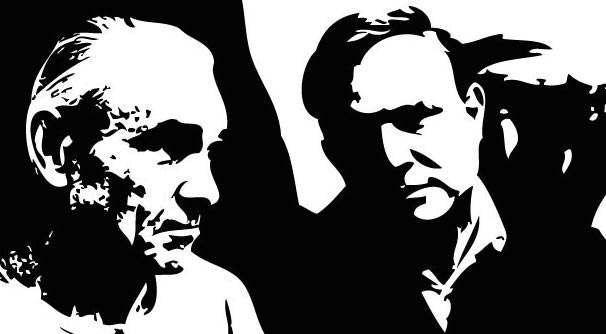
Portrait of Alfred Morang by Tommy Macaione- Matthews Gallery Blog

 TOMMY MACAIONE

This portrait of Alfred Morang appeared in the exhibition courtesy of the Matt Kuhn Collection. It was made by another colorful Santa Fe character, Thomas S. Macaione (1907-1992), also known as ‘El Diferente’. Macaione’s mature painting style was heavily influenced by Morang’s teachings, and they also had similar lifestyles. They lived as true bohemians, devoted to art above all else.

“[Macaione’s] passion for plein-air painting was not entirely appreciated at first in the town’s lingering Wild West atmosphere,” wrote the Santa Fe New Mexican in 2013. “Once, when painting a garden on Acequia Madre, he was scared off by the property owner, who fired a pistol in the air in his flowers’ defense.” A photograph of this bust appears on the final page of Walt Wiggins’ essential biography of Alfred Morang, A Neglected Master, along with a quote from Margaret Turner Williams:

 [Morang] died as he lived: alone. Yet he was never lonely, for he was a creator, and creators learn early in life to bridge the gap between the pain of loneliness and the peace of solitude.

With no material wealth, he was one of the richest human beings who ever lived. Everyone who knew him, and some who didn’t, feel a sense of loss at his passing.

Alfred Morang- Into Tomorrow- Matthews Gallery Blog

TRANSCENDENTAL PAINTING GROUP

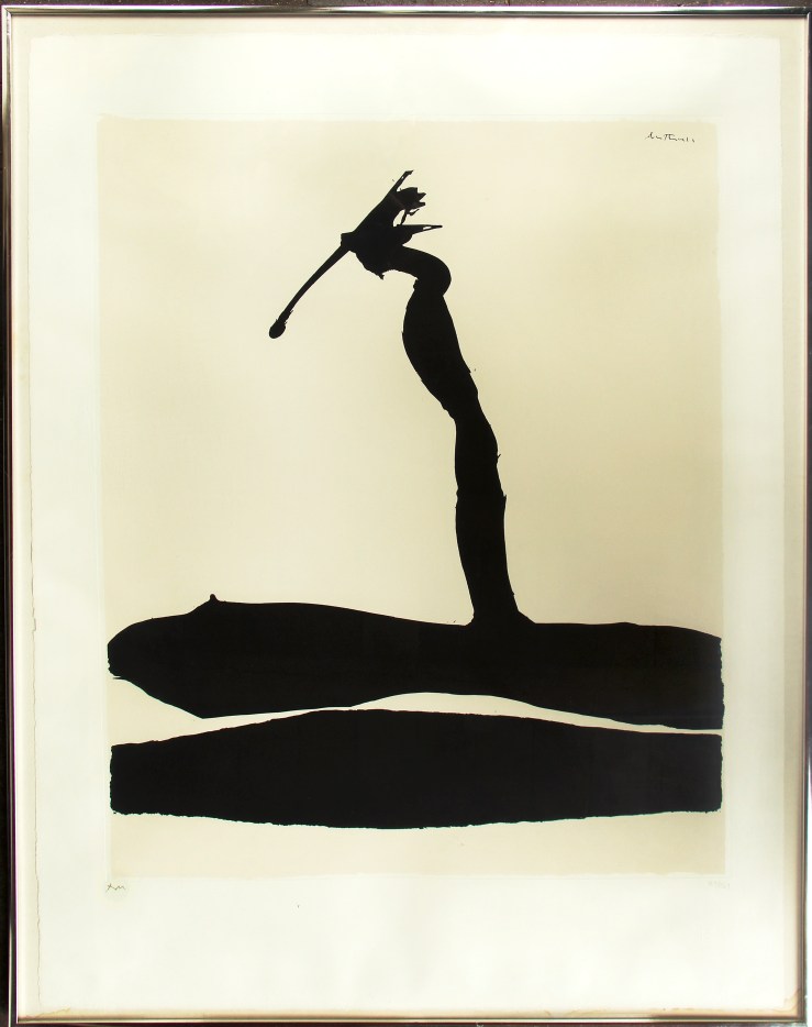
A small group of New Mexico artists including Raymond Jonson, Emil Bisttram, and William Lumpkins formed the Transcendental Painting Group (TPG) in 1938. The collective was inspired by early abstract artists like Wassily Kandinsky and Piet Mondrian, as well as Theosophy, Zen Buddhism and Dynamic Symmetry. Their goal was to validate and promote abstract art by transcending their senses to explore spiritual realms. The group organized lectures, published articles and mounted exhibitions in New Mexico, San Francisco and New York. Alfred Morang was not a founding member of the group, but he acted as their press secretary for a number of years. An excerpt from Morang’s November 4, 1938 article “Transcendental Foundation Plans Extensive Activities” in the Santa Fe New Mexican:

It is deeply significant that in this time of readjustment in almost every stratum of life, a few people are intent upon an important branch of cultural development. In Santa Fe the founding of the ‘American Foundation for Transcendental Painting, Inc.’ marks the start of a new phase of American art. […] Briefly, transcendental painting is no school or ism. It is a phase of art that, out of many more or less isolated experiments, has evolved toward non-objective painting, the type of painting that is not dependent upon an object, in nature, but is deeply concerned with forms conceived by the imagination.

The TPG only lasted a few years, disbanding in 1942 because of World War II. However, the collective’s influence endures in the Southwest and beyond. Some consider the group an heir to Russian Constructivism and the Bauhaus. Morang completed a number of abstract works inspired by the group’s philosophy, including the oil painting above titled “Into Tomorrow“. Click here to see more.

Janet Lippincott- Alfred The Painter- Matthews Gallery Blog

JANET LIPPINCOTT

 “Alfred Morang was one of the few people who encouraged me in my abstract expressionism,” said Janet Lippincott (1918-2007), one of Morang’s  best-known pupils. Lippincott came to New Mexico in 1946 and studied at the Emil Bisttram School for Transcendentalism in Taos. Bisttram was a founding member of the Transcendental Painting Group (1938-1942), a collective of abstract painters with a spiritual, non-political approach to art, for which Morang served as press secretary. Santa Fean Magazine interviewed Lippincott for an article on Morang in their April 1978 issue:

He was an excellent painter and inspiring teacher “and he had a good mind,” Janet Lippincott says. She studied landscape painting with him for three months one summer, and she remembers that “he had something about him that could draw out the best you had in you.”

This portrait of Alfred Morang isn’t the only artwork by Lippincott that appeared in the show. Click here to see more.

Dorothy Morang- Untitled Abstract 1935- Matthews Gallery Blog

DOROTHY MORANG

Dorothy Morang (1906-1994) was born in Richmond, Maine. She met Alfred in 1925, and they were married in 1930. They lived in Portland, Maine for a number of years, and moved to Santa Fe in 1937 to alleviate the symptoms of Alfred’s tuberculosis.

Dorothy and Alfred divorced in 1950, but she looked out for him for the rest of his life and arranged the transfer of his estate to a Morang relative after his death in 1958. Dorothy was an impressive painter in her own right—here she draws inspiration from the Transcendental Painting Group, for which her husband acted as press secretary. She worked for many years at the New Mexico Museum of Fine Arts, primarily as a curator. An excerpt from an oral history interview with Dorothy Morang by Sylvia Loomis in the Archives of American Art:

SYLVIA LOOMIS: Were you painting after you got to
Santa Fe?

DOROTHY MORANG: Yes, I started even more seriously. I’d been working quite steadily in Portland, Maine – Alfred and I lived there for about seven years before we came here – and I went on and worked very seriously with some criticism from Alfred and from Raymond Jonson, who was living in Santa Fe then. […] Alfred had also taken up writing, and he was very active, as you know, on radio, too, interviewing artists on the radio. He had an interview program for several years. He was extremely active.

William Vincent Kirkpatrick- Upper Canyon Road- Matthews Gallery Blog

WILLIAM VINCENT KIRKPATRICK

“[Alfred Morang] taught half of us how to paint and the other half how to see,” remarked an unknown Santa Fe artists after Morang’s tragic death in 1958. The Morang School of Fine Art was instrumental in the development of a new generation of Santa Fe artists. At the time of Morang’s death, William Vincent Kirkpatrick (1939-2004), one of his star pupils, was studying at the Taos School  of Art. He returned to Santa Fe, rebuilt his master’s studio and worked on a series of canvases inspired by Morang’s vivid hues and painterly textures. Vincent Kirkpatrick also did a painting on the wall at El Farol near Morang’s series of murals, ensuring that their work would hang side-by-side for years to come!
Learn more about Alfred Morang and his contemporaries on the Matthews Gallery website, and make sure to connect with us on Facebook, Twitter and Instagram for daily gallery news. Also keep your eye out for our 2015 exhibition schedule, which will explore other corners of the Santa Fe art colony. Coming very soon!

OUTSIDER/INSIDER: Abstract Expressionism at Matthews Gallery

Stanley Boxer and Robert Motherwell at Matthews Gallery Boxer (left) and Motherwell

It was Mark Rothko’s 111th birthday this Friday, and the occasion has us pondering one of the 20th century’s most polarizing art movements: abstract expressionism.

Three artworks by renowned abstract expressionists have recently landed on our walls. The first two are heavily impastoed oil paintings by Stanley Boxer, who resolutely clung to the far fringes of the movement. Determined to defy labels, he was furious when art critic Clement Greenberg called him a color field painter, and yet the arc of his creative explorations closely paralleled that of his abstract expressionist contemporaries:

In the manufacture of my art, I use anything and everything which gets the job done without any sentiment or sanctity as to medium. Then, too, I have deliberately made a practice of being “visionless”… this is, I go where my preceding art takes me, and never try to redirect the future as to what my art should look like. This is a general credo and foundation for everything I have ever done and stands firm in its solidity as this is written.

Boxer, who died in 2000, would have loved Grace Glueck’s New York Times review of a 2004 exhibition of his late works. She notes that he was “never part of a movement or trend,” but rather driven by paint’s “physical possibilities without script or program.”

Abstract Paintings by Stanley Boxer- Matthews Gallery Blog Atriumofashreddednight  (top) and Crisppitchofsigh, Oil on Linen

Glueck ends the piece with a brief analysis of Boxer’s titles, lyrical lists of words that are jammed together in unbroken strings. The works in our collection, for example, have names that read like fragments of beat poems: Atriumofashreddednight and Crisppitchofsigh. Glueck writes, “As Boxer joked in his titles, these canvases, more than most, do not really lend themselves to verbal exposition. They live for the eye, to which they bring deep satisfaction.”

Boxer’s titles provide a link to Robert Motherwell, the other abstract expressionist represented in our collection. Unlike many “abex” artists who labeled their canvases using dates or arbitrary numbers, Boxer and Motherwell were unapologetic in their wordplay.

That’s where the similarity ends. While Boxer considered himself an isolated frontiersman of abstract painting, Motherwell was an eager icon of abstract expressionism. He coined the term ‘New York School’ to describe his revolutionary circle, which included Mark Rothko, Jackson Pollock and Willem de Kooning, and acted as a spokesperson for the movement in the world of academia.

If Boxer’s titles were little more than impressionistic quips, Motherwell, who was a scholar before he became a “serious artist” and wrote numerous essays on aesthetics, chose names that have inspired endless analysis. His most famous series of paintings, Elegies to the Spanish Republic, chronicles the Spanish Civil War in bold strokes of black and white and subtle passages of ochre, blue, green and red.

Mainly, I use each color as simply symbolic: ochre for the earth, green for the grass, blue for the sky and sea,” Motherwell wrote. “I guess that black and white, which I use most often, tend to be protagonists.” In varying contexts, each color holds a universe of meanings. To fully understand the use of ochre in Motherwell’s Spanish Elegies, “You would have to know that a Spanish bull ring is made of sand of an ochre color,” the artist wrote.  Other works that feature ochre, like Western Air or Personage, with Yellow Ochre and White, would naturally spark different associations. 

Robert Motherwell- Africa 4- Silkscreen- Matthews Gallery Blog Robert Motherwell, Africa 4, Silkscreen

What to make of our Motherwell silkscreen, titled Africa 4? Motherwell completed the Africa suite in 1970, the same year he created his Basque and London suites. They were his first projects entirely devoted to silkscreens, and a divergence from the heavily layered nuances of his oil paintings. Here his black abstract forms stand crisply against their off-white backgrounds, although on closer inspection, their tumultuous edges still seem to weave in an out of focus.

“All my works [consist] of a dialectic between the conscious (straight lines, designed shapes, weighed color, abstract language) and the unconscious (soft lines, obscured shapes, automatism) resolved into a synthesis,” the artist wrote in 1944.

Motherwell first explored the concepts of automatism and the subconscious with a group of Parisian Surrealists, including Duchamp, Ernst and Masson, who had fled Europe during World War II.  Their ideas would help shape the spiritual side of abstract expressionism, a spontaneous, intuitive element that Motherwell carefully balanced with his more intellectual inclinations.

Motherwell’s connection to the Surrealists lends us a potential clue to the significance of the ‘Africa’ title. In his 1946 essay ‘Beyond the Aesthetics‘, Motherwell discusses the life of French Symbolist poet Arthur Rimbaud, who helped inspire Surrealism. In the final decades of his life Rimbaud quit writing and set off on an African expedition, a leap of faith that Motherwell compares to the Surrealists’ break from Dada and formation of a new movement:

Like Rimbaud before them, the Surrealists abandoned the aesthetic altogether; it takes a certain courage to leave poetry for Africa (as Rimbaud did, fh). They revealed their insight as essentially moral in never forgetting for a moment that most living is a process of conforming to an established order which is inhuman in its drives and consequences. Their hatred sustained them through all the humiliating situations in which the modern artist find himself, and led them to conceptions beyond the reach of more passive souls. For them true ‘poetry’ was freedom from mechanical social responses. No wonder they loved the work of children and the insane – if not the creatures themselves.

Perhaps Motherwell’s Africa suite represents a similar journey, a leap into the unknown that is a clear break from previous adventures. Just as Rimbaud abandoned an intellectual pursuit for one centered on travel and action, and as the Surrealists broke from the societal battles of the Dadaists to explore dreamscapes, so Motherwell’s stark Africa forms landed him in a new realm of image-making. Perhaps he sought to prove that even the most distinctly divided blacks and whites could possess endless shades of grey.

Learn more about Stanley Boxer and Robert Motherwell on our website, and make sure to connect with us on Facebook, Twitter and Flickr for more gallery news.

MEMORY IN BLUE: Jan van Leeuwen

Jan van Leeuwen- Barbed Wire Number 1- Matthews Gallery Blog

Jan van Leeuwen, Barbed Wire No. 1 (Cyanotype), Matthews Gallery

What color is memory? Is the human soul tinted by life’s great joys and sorrows?

Jan van Leeuwen‘s darkest recollections are a deep blue tide. His self-portraits take shape much like memories do. It’s a long process with details fading in and out of focus, projecting visions of the self that never feel quite complete. It took a lifetime for the photographer to discover his medium, but when he did the images came spilling out.

Jan van Leeuwen- Cyanotype Portraits- Matthews Gallery Blog

Leeuwen was born in Amsterdam in 1932. In 1940, when the artist was 8 years old, the Dutch surrendered to the Nazis and Leeuwen watched as his community fell apart. Jewish neighbors and schoolmates fled or were taken. Over the course of the four-year occupation, the young boy’s confusion turned to anger, frustration and guilt.

Leeuwen’s first career was as a kitchen wares distributor, and he learned how to work a camera by photographing the products. He took his first serious stab at the medium in 1986 when he was in his 50’s, mostly so he’d have something to do when he retired.

Jan Van Leeuwen- Cyanotype Portraits- Matthews Gallery Blog

Drawing inspiration from the innovative spirit of the Dutch Renaissance masters, Leeuwen developed his own method of producing photographs. He uses a 100-year-old wood camera to capture an image on resin-coated paper, creates a negative and then makes a contact print using a UV-B lightbox.

The process of capturing and transferring the images echoes the artist’s struggles with the trauma he experienced in his youth and the impact it has had on his identity. For the cyanotype in our collection, the artist used a long exposure to fracture himself into eight meshed figures. The only thing starker than their furrowed brows is the strand of barbed wire that stands in their way.

Jan Van Leeuwen- Cyanotype Portraits- Matthews Gallery Blog

Leeuwen created Barbed Wire No. 1 in 1993. A year later he quit his job to pursue photography full-time. Since then he’s had a stellar contemporary art career, with shows across the world and artwork in The Photo Review, Art in America and many other publications.

The artist’s success hasn’t dampened the intimacy of his self-portraits, or lightened the burden of his memories. However, Leeuwen reminds us that sadness is accompanied by beauty, and creation always surmounts the pain of destruction.

Learn more about Jan van Leeuwen’s art and life on the Matthews Gallery homepage, and connect with us on Facebook, Twitter and Pinterest for more gallery news.

PICASSO GETS BURNED: 5 strange facts about the Vollard Suite

Pablo Picasso- Personnages Masques et Femme Oiseau- Matthews Gallery blog

Pablo Picasso, Personnages Masques et Femme Oiseau, aquatint and etching

When it came to marketing himself, art dealer Ambroise Vollard (1866-1939) was a pro. He had a knack for scouting out young artists with rockstar potential and he wasn’t afraid to ask for favors later on. Vollard gave Pablo Picasso his very first gallery show in 1901. By 1930, Picasso was world-famous and Vollard enlisted him for a special commission. In exchange for paintings by Renoir and Cezanne, Picasso would create a series of 100 etchings ending with three portraits of Vollard.

What better way to immortalize yourself? Picasso completed the Vollard Suite over the next seven years, and it would become one of his most famous print suites. The first etchings in the series are in the neoclassical style and show a sculptor in the studio with his beautiful muse. As World War II set in, Picasso turned to darker subject matter culled from Greek mythology. A friendly minotaur appears, but soon grows agitated and violent. By the end of the series the minotaur has lost his vision and wanders aimlessly.

At Matthews Gallery we have the 24th print from the series, titled “Masked Characters and Bird Woman“. In our research on the print, we’ve discovered some pretty weird facts about the Vollard Suite. Five things you (almost surely) didn’t know:

1.  Armed Art Critics Attack! 

Guerrilleros de Cristo Rey tear down Picasso's Vollard Suite- Matthews Gallery Blog

Spanish paramilitary group Guerrilleros de Cristo Rey on the march

Aside from Steve Wynn 0r Olga Dogaru, Picasso’s most violent critics might just be fascist paramilitary group Guerrilleros de Cristo Rey. Picasso finished the Vollard Suite in 1937, but Vollard’s untimely death in 1939 and World War II prevented the prints from going on the market until the 1950s. In the 1970s, the series starred in a short-lived exhibition in Madrid. In protest of Picasso’s political views on the Spanish Civil War the Guerrilleros stormed the show, tore down the prints and burned them with acid. Ouch.

2. Death by Foot

Honore de Balzac's The Unknown Masterpiece inspired Picasso's Vollard Suite- Matthews Gallery Blog

Image from Honore de Balzac’s The Unknown Masterpiece

Sometimes, art kills. Scholars have tied the Vollard Suite to Honore de Balzac’s short story “The Unknown Masterpiece.” The tragic tale chronicles an artist’s frustration at his inability to capture a model’s supreme beauty on canvas. He manages to paint her foot, but soon gives up and commits suicide in despair. Picasso explores similar themes in his etchings. His lover Marie-Therese Walter appears throughout the series, at first as his adoring model and then as a girlish guide to the blind minotaur. The artist has lost his power to capture his model in his art, and now she nimbly leads him toward death.

3. Sweet Art

Pablo Picasso used a sugar life aquatint technique in his Vollard Suite- Matthews Gallery Blog

Sugar lift aquatint from the Vollard Suite

It seems Picasso had a sweet tooth. The ever innovative artist experimented with new printmaking techniques for the Vollard commission, including dry point and aquatinting. The latter method allows the artist to create varying tones on the print using particles of rosin and an acid. Sugar lift aquatinting is a sweet variation. A layer of sugar syrup is applied to parts of the print and then burned off with acid to create dark fields on a white ground (see the dark patches in the image above).

4. Clairvoyant Pablo

Was Pablo Picasso psychic? - Matthews Gallery Blog

Picasso possessed many artistic talents, but was he also a fortune-teller? One of the Vollard prints shows a model who is a doppelgänger for Picasso’s lover Francoise Gilot, though it prefigures their relationship by over ten years. Third eye or not, the artist noted Gilot’s resemblance to his archetypal female figures when he met her. It made quite the flattering pick-up line.

5. Vollarchitecture

Vollard Suite in Brazil named after Picasso Print Series - Matthews Gallery

The Vollard Suite in Curitiba, Brazil

In more recent news, the world’s first rotating building is named after the Vollard Suite. The futuristic residential complex in Brazil opened in 2001 with an exhibition of Picasso’s prints. Its design resembles a Greek pillar, a reference to Picasso’s neoclassical style in the suite (check out the bird lady’s perch in our print). The skyscraper’s $400,000 apartments turn 360 degrees every hour. It might sound dizzying, but something tells us the extravagant artist would approve.

Learn more about our Vollard print here, and connect with us on Facebook, Twitter and Pinterest for more news from Matthews Gallery!

THE MATTHEWS GALLERY: Arc of Art History

"Stride", Jamie Chase, Matthews Gallery
“Stride”

When Santa Fe visitors step into the Matthews Gallery, they often mention that something feels different. Our gallery location is in a historic adobe on Canyon road just like many of the other galleries so we have a hunch that the novelty they’re sensing is our devotion to carefully curating every wall of our gallery.

We show work from the 19th, 20th and 21st centuries. Our curatorial direction is to exhibit a variety of work from these eras that relate to the artistic development from impressionism to contemporary art. Here are some of the names that you won’t see anywhere else on Canyon Road—or even elsewhere in Santa Fe:

Head of Baby with Finger in Mouth, Mary Cassatt, Matthews Gallery
“Head of Baby with Finger in Mouth”, Mary Cassatt

Mary Cassatt (1844-1926) ~ The American painter and printmaker was refused entry to the Ecole des Beaux-Arts, so she studied the masters on her own at the Louvre. She would become a master herself, named one of “les trois grandes dames” of Impressionism by Gustave Geffroy.

"Les Saltimbanque", Pablo Picasso, Matthews Gallery
“Les Saltimbanque” by Pablo Picasso

Pablo Picasso (1881-1973) ~ Several works by the most influential artist of the 20th century have passed through the Matthews Gallery. Our most notable current work by Picasso is “Les Saltimbanque”. The drypoint etching the artist created as a teenager shows the harlequin, a personal symbol that would recur in his work throughout his career.

"Composition aux deux Personnages", Fernand Leger, Matthews Gallery
“Composition aux deux Personnages” by Fernand Leger

Fernand Leger (1881-1955) ~ The painter, sculptor and filmmaker’s lithograph “Composition aux deux Personnages” marked a shift in his oeuvre from Cubism to bold figurative works that would later identify him as a forerunner of Pop Art. As is the fate of all art movements, Picasso and Braque’s Cubism were irrevocably fractured.

"Blue Nude", Harold Frank, Matthews Gallery
“Blue Nude” by Harold Frank

Harold Frank (1917-1995) ~ Born in Southampton, England, Frank’s family moved to New York when he was a child. You can see influences from both shores in his colorful canvases that take cues from modernism and abstract expressionism.

"Alic", Enrique Echeverria, Matthews Gallery
“Alic” by Enrique Echeverria

Enrique Echeverria (1923-1972) ~ Echeverria and his contemporaries brought the ideas of modern European art movements to Mexico and subverted the traditional figurative painting style. They became known as the Generacion de la Ruptura, the Rupture Generation.

"Avian Keepers", Robert W. Hinds, Matthews Gallery
“Avian Keepers” by Robert W. Hinds

Robert W. Hinds (1924- present) ~ This World War II veteran was born a year after Echeverria. He had a successful graphics career for years before moving to Europe to study casting techniques in Italy and Bologna. Now he produces figurative bronze sculptures that are collected throughout the world.

"Untitled Grey Nude on Orange", Jamie Chase, Matthews Gallery
“Untitled Grey Nude on Orange” by Jamie Chase

Jamie Chase (1954- present) ~ The painter and graphic novelist was born in California, and traveled to Europe to educate himself on the work of the masters. He moved to Santa Fe in 1980, where he’s now known for his non-objective paintings, abstract landscapes and abstracted figurative paintings.

Browse all of the artists we represent here, and follow our Facebook and Twitter accounts for updates on their work.