THE QUINTESSENTIAL MODERNIST

Randall Davey- Leaving the Paddock- Matthews Gallery Blog

We’re ending our SPRING OF MODERNISM blog series with the tale of a pioneering artist who was the model of a New Mexico modernist. Randall Davey (1887-1964) was born in East Orange, New Jersey. His father was an architect, and he enrolled at Cornell for architecture in 1905. Three years later he dropped out and moved to New York to study art, to the consternation of his father.

At the New York School of Art, Davey forged a close friendship with teacher and Ashcan School artist Robert Henri. Henri was friends with the founders of the Taos Society of Artists, and worked hard to cultivate New Mexico’s budding reputation as an arts destination. In 1910, Davey exhibited with George Bellows and Stuart Davis and in 1913 his artwork was in the New York Armory Show, the most influential modern art exhibition in U.S. history.

Portraits of Santa Fe Artist Randall Davey- Matthews Gallery Blog
Davey and artist John Sloan visited Santa Fe in the summer of 1919, and Davey fell in love with the Land of Enchantment. His art career in New York had stalled, and the Southwest adventure offered a fresh start. Davey bought an old mill on Upper Canyon Road and moved there permanently the next year. It was a path that had been calling him since his early days as an artist. Inspired by the metropolitan subject matter of the Impressionists, Davey developed a diverse oeuvre of still lifes, horse-racing and polo scenes, artistic nudes and landscapes.
Davey was a true Renaissance gentleman: he made paintings, prints and sculptures, played cello, built a polo field on Upper Canyon Road and was always dressed to the nines (even when he was painting in the hot sun).
Prints and a Drawing by Santa Fe Artist Randall Davey- Matthews Gallery Blog
The lifelong automobile enthusiast died in a car accident on a trip to California at 77 years old. After his death, his wife donated the Davey house and land to the Audubon Society. The Randall Davey House is still open for tours on Fridays, and stands as a tribute to an artist who helped make the Santa Fe art colony what it is today.
A Davey House docent visited the gallery for our SPRING OF MODERNISM opening, and kindly offered us a private tour. Keep your eye on the blog for photos from the tour and more information on Davey. Make sure to visit our exhibition before it closes on March 31st, and connect with us on Facebook, Twitter and Instagram for more gallery news.

THE LUMPKINS LEGACY: Bill’s Last Request

William Lumpkins Jr- Matthews Gallery Art Opening

William Lumpkins Jr. next to his father’s serigraph “Abstract Landscape #3

At last Friday’s opening of NEW MEXICO MODERNS: The Lumpkins Files, William Lumpkins Jr. was a quiet presence. He stood to the side surveying his father’s work or chatted softly with visitors, many of whom were family friends. One woman had known his dad, who died in 2000, through an art discussion group that met at local coffeehouses. “Whenever Bill spoke, we all had to lean in. He was such a lovely, gentle man,” she said.

Will’s father may have passed down his mild temperament, but both men are also legendary for their fierce artistic passion. Will has carefully preserved the artwork in The Lumpkins Files show for years, and meanwhile has developed his own artistic style. The jacket he wore to the show was emblazoned with intricate celtic knots and a dragonfly.

When we asked about his dad, the more colorful side of Will’s personality emerged. Here’s William Lumpkins’ son on his father’s never-before-seen artwork, and why he decided to release it more than 15 years after Lumpkins’ death.

 What’s it like to see your dad’s work hanging in the gallery? 

Well, his work was all around us growing up, so it’s not that strange. The gallery did an excellent job though.

When did you first bring the work to Matthews Gallery?

About a year and a half ago. I had shopped around and didn’t relate to anybody until I met Larry.

Where did you keep it for all these years? 

I had it in a case between sheets of acid-free paper. When I was teaching at Virginia Commonwealth University, I was in charge of museology. It was a whole print and painting conservation training program. So my dad knew that I could take care of them. Watercolors in particular are a sensitive thing for archiving.

Why didn’t he want you to release them until now? 

It didn’t have to do with the work. He said to me, ‘Okay, you wait until after you’re 70 because by then your personal artistic statement will be you. You won’t have to mimic me.’ So at 70, my artwork was me and I brought these out again.

Were you ever tempted to release them before that? 

No, it just didn’t seem right until I started looking around recently. I trusted you guys.

One of the biggest surprises in this body of work was the watercolor from 1937. That’s one of the earliest Lumpkins pieces we’ve ever seen. Did you know it was in there?

I knew that the work spanned a lot of time. When Dad was closing down the studio, he picked these out because these were the ones that he really liked from different points in his career. He felt that they were significant, and that they weren’t typical. His typical work is pretty well-known, but these he wanted to hold out so that they’d be totally new.

What was your vision for this show? 

I gave the work to Larry and said, ‘Do you what you think is best.’ I just want them to be out in the open where they can be seen. If people want them enough, if people like them a lot, that’s good.

Hear more from Will Lumpkins in this week’s Pasatiempo, and visit the show at Matthews Gallery through Friday, April 25. For more images from the opening, check out our photos page and connect with us on Facebook and Instagram.

NOT A POP ARTIST: Five Sides of Jim Dine

Jim Dine Rainbow- Matthews Gallery Blog


78-year-old artist Jim Dine has earned his place in any good post-war art history textbook. Picking exactly when to spotlight the artist must be a difficult task for scholars. The painter, sculptor, illustrator, printmaker, stage designer and performance artist has a way of diverging from the status quo and ending up at the forefront of new art movements. Just when things get established, he’s off on his own again.

A mixed media drawing  by Dine recently found its way to Matthews Gallery, so we took the opportunity to explore 5 manifestations of the chameleonic artist:

Fluxus Performer

Dine grew up in Cincinatti and got his BFA from Ohio University. When he arrived in New York in 1958, the art world was fixated on a type of work you couldn’t sell in a gallery. Some critics called them “wacky nightmares“, others described them as “a three-ringed circus with undertones of group therapy“, but Dine and his friends Claes Oldenberg, Allan Kaprow and John Cage dubbed their performance art pieces “Happenings”.

Happenings were designed to be as ephemeral and unpredictable as day-to-day life—but a little weirder. Battles between ballerinas and roller-skaters, reenactments of the Lincoln assassination, bikini stripteases and blue ice cream feasts were all passionately performed, often in rapid sequence. Whether you call it though-provoking or senseless, the Fluxus movement was one-of-a-kind. For Dine, all the world was a stage until…

Pop Progenitor

Jim Dine- Robe Diptych- Matthews Gallery Blog


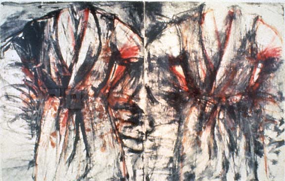
Jim Dine, Red and Black Diptych Robe, 1980

In 1962, Dine’s paintings appeared alongside work by Andy Warhol, Roy Lichtenstein, Ed Ruscha and others in the Pasadena Art Museum’s show New Painting of Common Objects. Curated by Walter Hopps of Ferus Gallery (site of Warhol’s first solo show), the exhibition was a seminal moment for a new movement: Pop Art.

Dine’s inclusion in the exhibition made perfect sense at the time. He was experimenting with serial imagery of familiar objects and symbols like bathrobes, hearts and tools. However, the artist’s expressive style and often tender subject matter clashed with the postmodern angst of other Pop progenitors. Soon enough, he was plotting his escape…

Modernist

Jim Dine- Paris- Matthews Gallery Blog

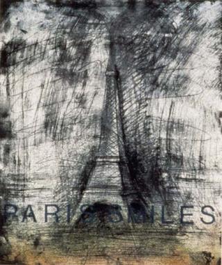
Jim Dine, Paris Smiles in Darkness, 1976

Dine moved to London in 1967, a strange decision considering his controversial history with the United Kingdom. A year before his solo exhibition at London’s Fraser Gallery was raided by police and the owner was fined for showing “indecent” images.

The artist defiantly continued to his relationship with Fraser and used his time in Europe to study the work of Van Gogh, Picasso, Matisse and other modernists. In 1971 he returned to the United States, ready to chart a new course…

Neo-Expressionist

Jim Dine- A Lady Sitting Drawing- Matthews Gallery Blog

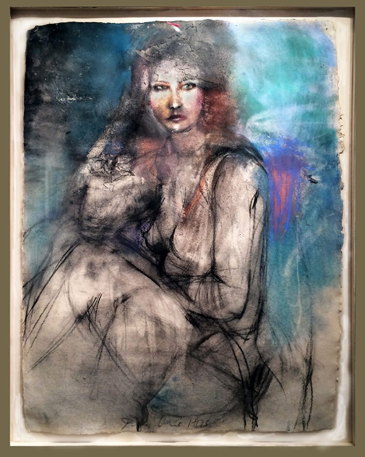
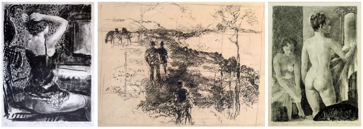
 Jim Dine, A Lady Sitting, Mixed Media, 1975

Minimalism was en vogue when Dine arrived in New York, but the artist wasn’t interested. Instead he focused on figure drawing, refining his skills in various mediums and earning a reputation as a master draftsman. The mixed media drawing in our collection is from this period. A stunningly realistic face painted in oil is framed by confident charcoal marks and a glowing crayon color field.

In the years to come Dine’s figurative work would mark him as a founder of Neo-Expressionism, but critics could never assign the artist a particular label for long…

Modern Individualist

2008_JimDine_23220011

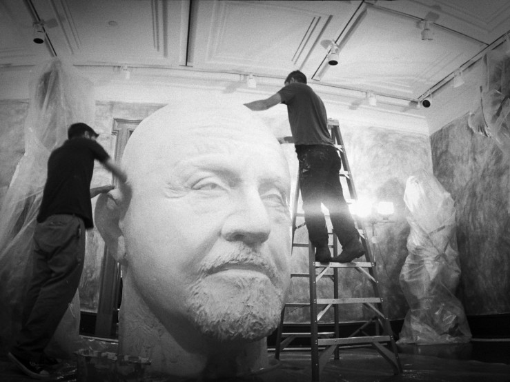
Installation shot, Jim Dine: Poet Singing (The Flowering Sheets)

 Perhaps Dine’s artistic identity is best summed up by MoMA:

This commitment to a personally invested, image-dictated content and a continuing interest in the technical and expressive potential of every medium has characterized Dine’s work as a whole. Thus, Dine has often been out-of-step with the major movements of the post-World War II period and must be considered a modern individualist.

It’s a bit of a non-title, but Dine defies labels at every turn. The almost-octogenarian is still working his way into new chapters of art history.

Check out our website for more on Jim Dine, and connect with us on Facebook, Twitter and Flickr for to-the-minute gallery news.

BURST OF BRILLIANCE: Adolph Gottlieb’s Southwestern Epiphany

“It was like being at sea,” said Adolph Gottlieb. The artist had just spent a year in the Desert Southwest- from 1937 to 1938- and returned to his hometown of New York City with a radically altered style. “There’s… a tremendous clarity of light and at night the clouds seem very close,” he continued. This was a very different type of “sea” than the one that carried Gottlieb on his inaugural artistic journey. When he was 17 he dropped out of high school and caught a merchant ship to Europe. He spent two years there, including six months in Paris where he audited art classes and visited the Louvre every day. Back in New York, he studied at The Art Students League and befriended Barnett Newman, Mark Rothko and Milton Avery. Together they founded the abstract expressionism movement, working to develop color field painting and other innovations. They remained close until Gottlieb decided to strike out on his own to Tucson, Arizona. It was an endeavor that would markedly separate him from his contemporaries, even after his return to the East. Gottlieb’s New York friends called the style he had developed in Arizona simplistic, but the artist refused to look back. He distanced himself from his colleagues and focused on developing a Surrealist style. Experiments with automatism and surrealist biomorphism helped him create an abstract symbol system for his gridded Pictographs series. Finally, in the 1950’s, he started work on two series that would become his most well-known work. Both series are represented in our collection, and their very existence seems linked to the bare, elegant vistas of the Desert Southwest.

IMAGINARY LANDSCAPES

Around 1950-51… I was finally getting away from the pictographs and looking for something… So it was necessary to find other forms, a different changed concept. So finally after a certain period of transition I hit on dividing the canvas into two parts, which then became like an imaginary landscape… What I was really trying to do when I got away from the pictographs was to make this notion of the kind of polarity clearer and more extreme. So the most extreme thing that I could think of doing at the time was dividing the canvas in half, make two big divisions and put something in the upper division and something in the lower section.

The color and texture of the land mass in “Green Foreground” recalls Gottlieb’s sea simile. In this period the artist was consolidating surrealist and abstract expressionist theories by approaching the two movements as different sides of the same coin (hence a “polarity”). Our lithograph implies a fantastical landscape, but works just as well as a flat, wholly abstract composition. If we imagine ourselves exploring this terrain, it would look much like Gottlieb’s surroundings in the Southwest, albeit with a greener tint.

BURSTS

After doing the imaginary landscapes until say 1956, in ’57 I came out with the first Burst painting… There was a different type of space than I had ever used and it was a further clarification of what I was trying to do. The thing that was interesting that it was a return to a focal point, but it was a focal point with the kind of space that existed in traditional painting. Because this was like a solitary image or two images that were just floating in the canvas space. They had to hold the space and they also had to create all the movement – that took place within the rectangle.

Gottlieb’s Bursts are Imaginary Landscapes that have further dissolved into abstraction, though their compositions still root them somewhat in reality. In “Crimson Ground” two discs rise (or set) like a sun and moon from a monochrome tangle with the most ephemeral of horizon lines.

When I started doing the Bursts I began to do part of the painting horizontally. It was necessary to do that because I was working with a type of paint which had a particular viscosity, which flowed, and if it were on a vertical surface it would just run. If it were on a horizontal surface, I could control it… I was using a combination of brushes and knives, palette knives… and spatulas… I’ve tried everything, rollers, rags, I’ve put paint on with everything.

“Crimson Ground” isn’t a painting, but it still has a painterly quality to it. The edges of the discs are uneven and textured, and the forms below are as splattered as a Pollock drip painting. This further highlights the polarity between the surreal landscape and an abstract expressionist painting. One is focused on depth, the other focuses solely on the surface. Learn more about Adolph Gottlieb on our website, and connect with us on Facebook, Twitter and Pinterest for to-the-minute gallery updates!

From MoMA to Matthews: Gauguin’s Metamorphoses

Paul Gauguin - Mahana No Atua - Matthews Gallery Blog

Paul Gauguin, The Day of God (Mahana No Atua), woodcut

There’s no record of what Paul Gauguin’s last lover Marie-Rose Vaeoho thought of him, but their courtship must have been rough. By the time Gauguin reached the Marquesan island of Hiva Oa in 1901, he had eczema, syphilis, malaria, tooth rot, a heart condition and a very bad liver. Local teen Marie-Rose gave birth to his daughter in September of 1902, and he died on May 8, 1903. Gauguin’s body was already rotting in the tropical heat during the burial.

This distasteful finale is an ill-fitting epilogue to Noa Noa, Gauguin’s fanciful (and mostly false) account of his early travels in Polynesia. The artist’s twilight years may have been ruled by destruction and decay, but he clung to themes of rebirth, transformation, divinity and utopia in his art and writing. The New York MoMA’s new exhibition Gauguin: Metamorphoses centers on woodblock prints and other works on paper that he produced between 1889 and the time of his death. At Matthews Gallery we have two Gauguin woodblock prints from the same period that he made to accompany his Noa Noa memoir.

From MoMA:

 These remarkable works on paper reflect Gauguin’s experiments with a range of mediums, [including] radically “primitive” woodcuts that extend from the sculptural gouging of his carved wood reliefs […]. Gauguin’s creative process often involved repeating and recombining key motifs from one image to another, allowing them to evolve and metamorphose over time and across mediums.

For Gauguin, the printmaking process was a natural extension of this mercurial philosophy. It allowed him to mirror and tweak imagery between prints and even in different runs of the same print.

 In New York, you can see several versions of Gauguin’s Noa Noa woodblock prints. In Santa Fe, come track the evolution of the series through two of our works. Here’s a peek—

Paul Gauguin- Mahana No Atua- Woodblock print and painting- Matthews Gallery Blog

The Day of God (Mahana No Atua), our woodblock print and the painting

Our woodblock print and its oil counterpart were created around the same time and are close mirror images of each other. Both show three women on a shore with a Polynesian sculpture (based on carved Buddhist reliefs from Java) rising above them. In the painting, our eyes are drawn to the bright colors and wild abstract forms of the water. In the print, the women and the statue stand out as bold graphic elements, highlighting the symmetry of the composition.

Gauguin’s decision to reverse the composition from one work to the other brings up some interesting interpretive questions. The three women in the foreground may represent birth, life and death. If their positions can be so easily flipped, perhaps life’s course isn’t so linear either. Viewed together, the works form a loop that reflect Buddhist beliefs concerning rebirth.

Paul Gauguin- LUnivers Est Cree- 5 Versions- Matthews Gallery Blog

Five versions of Paul Gauguin’s L’Univers Est Cree, including ours (center)

We’ve written about our version of L’Univers Est Cree on the blog before, but Gauguin, his son Pola and artist Louis Roy made several print runs from the block. Some are crisply defined and others are murky with only a few details clearly in view. Some incorporate bright reds and yellows, while others are starkly monochrome.

When Gauguin presented his Noa Noa prints in a private studio show in Paris in 1894, he hung several versions of each print. The decision seems like the artist’s acknowledgment of his futile struggle to embrace a paradaisical version of his island experiences. As scholar Alaistar Wright puts it, the repeated, ever-changing images “allowed him to reflect on the impossibility of having any authentic experience in his dreamed-of Polynesian idyll.”

Visit us at Matthews Gallery to see Paul Gauguin’s incredible woodblock prints. To learn more, read our blog post about “L’Univers Est Cree” and listen to Lawrence’s accompanying podcast.  For daily gallery news, connect with us on Facebook, Twitter and Tumblr.

PICASSO GETS BURNED: 5 strange facts about the Vollard Suite

Pablo Picasso- Personnages Masques et Femme Oiseau- Matthews Gallery blog

Pablo Picasso, Personnages Masques et Femme Oiseau, aquatint and etching

When it came to marketing himself, art dealer Ambroise Vollard (1866-1939) was a pro. He had a knack for scouting out young artists with rockstar potential and he wasn’t afraid to ask for favors later on. Vollard gave Pablo Picasso his very first gallery show in 1901. By 1930, Picasso was world-famous and Vollard enlisted him for a special commission. In exchange for paintings by Renoir and Cezanne, Picasso would create a series of 100 etchings ending with three portraits of Vollard.

What better way to immortalize yourself? Picasso completed the Vollard Suite over the next seven years, and it would become one of his most famous print suites. The first etchings in the series are in the neoclassical style and show a sculptor in the studio with his beautiful muse. As World War II set in, Picasso turned to darker subject matter culled from Greek mythology. A friendly minotaur appears, but soon grows agitated and violent. By the end of the series the minotaur has lost his vision and wanders aimlessly.

At Matthews Gallery we have the 24th print from the series, titled “Masked Characters and Bird Woman“. In our research on the print, we’ve discovered some pretty weird facts about the Vollard Suite. Five things you (almost surely) didn’t know:

1.  Armed Art Critics Attack! 

Guerrilleros de Cristo Rey tear down Picasso's Vollard Suite- Matthews Gallery Blog

Spanish paramilitary group Guerrilleros de Cristo Rey on the march

Aside from Steve Wynn 0r Olga Dogaru, Picasso’s most violent critics might just be fascist paramilitary group Guerrilleros de Cristo Rey. Picasso finished the Vollard Suite in 1937, but Vollard’s untimely death in 1939 and World War II prevented the prints from going on the market until the 1950s. In the 1970s, the series starred in a short-lived exhibition in Madrid. In protest of Picasso’s political views on the Spanish Civil War the Guerrilleros stormed the show, tore down the prints and burned them with acid. Ouch.

2. Death by Foot

Honore de Balzac's The Unknown Masterpiece inspired Picasso's Vollard Suite- Matthews Gallery Blog

Image from Honore de Balzac’s The Unknown Masterpiece

Sometimes, art kills. Scholars have tied the Vollard Suite to Honore de Balzac’s short story “The Unknown Masterpiece.” The tragic tale chronicles an artist’s frustration at his inability to capture a model’s supreme beauty on canvas. He manages to paint her foot, but soon gives up and commits suicide in despair. Picasso explores similar themes in his etchings. His lover Marie-Therese Walter appears throughout the series, at first as his adoring model and then as a girlish guide to the blind minotaur. The artist has lost his power to capture his model in his art, and now she nimbly leads him toward death.

3. Sweet Art

Pablo Picasso used a sugar life aquatint technique in his Vollard Suite- Matthews Gallery Blog

Sugar lift aquatint from the Vollard Suite

It seems Picasso had a sweet tooth. The ever innovative artist experimented with new printmaking techniques for the Vollard commission, including dry point and aquatinting. The latter method allows the artist to create varying tones on the print using particles of rosin and an acid. Sugar lift aquatinting is a sweet variation. A layer of sugar syrup is applied to parts of the print and then burned off with acid to create dark fields on a white ground (see the dark patches in the image above).

4. Clairvoyant Pablo

Was Pablo Picasso psychic? - Matthews Gallery Blog

Picasso possessed many artistic talents, but was he also a fortune-teller? One of the Vollard prints shows a model who is a doppelgänger for Picasso’s lover Francoise Gilot, though it prefigures their relationship by over ten years. Third eye or not, the artist noted Gilot’s resemblance to his archetypal female figures when he met her. It made quite the flattering pick-up line.

5. Vollarchitecture

Vollard Suite in Brazil named after Picasso Print Series - Matthews Gallery

The Vollard Suite in Curitiba, Brazil

In more recent news, the world’s first rotating building is named after the Vollard Suite. The futuristic residential complex in Brazil opened in 2001 with an exhibition of Picasso’s prints. Its design resembles a Greek pillar, a reference to Picasso’s neoclassical style in the suite (check out the bird lady’s perch in our print). The skyscraper’s $400,000 apartments turn 360 degrees every hour. It might sound dizzying, but something tells us the extravagant artist would approve.

Learn more about our Vollard print here, and connect with us on Facebook, Twitter and Pinterest for more news from Matthews Gallery!

ONE WORK OF ART: Marc Chagall’s “Paris L’Opera”

Marc Chagall- Paris L'Opera- Matthews Gallery Blog

Marc Chagall, Paris L’Opera poster, Color Lithograph

When Marc Chagall (1887-1985) was commissioned to redo the ceiling of the Paris Opera in 1963, not everyone in the City of Lights was happy about it. The Russian-Jewish artist didn’t have a drop of French blood, and he was also a modernist. Critics worried that his vibrant palette and “primitive” style would clash with the pseudo-classical interior of the building. It was sure to be “die Faust auf’s Auge“—a punch in the eye—for cultured opera fans.  
Chagall might not have been everyone’s favorite, but he certainly had good credentials. Before moving from Russia to Paris in 1910, he studied under a well-known theatre designer in St. Petersburg. Years later in 1958 the Paris Opera hired him to design the sets and costumes for Maurice Ravel’s ballet Daphnis et Chloe. That same year, he embarked on his monumental stained glass project for the Metz Cathedral
Paris Opera- Marc Chagall's Ceiling- Matthews Gallery Blog
Paris Opera
After he saw a performance of Daphnis et Chloe, French minister of culture Andre Malraux had no doubt Chagall was capable of covering the 560-square-meter stretch of ceiling surrounding the opera house’s crystal chandelier. Ignoring the bluster of the arterati, he set Chagall to work painting panels for an enormous removable frame that would cover the original Baroque-style mural by Jules-Eugene Lenepvue. 
Chagall divided the space into several color zones and wove together scenes and characters from the most beloved operas and ballets. The mural would honor the works of fourteen composers, from Mussorgsky to Mozart and Beethoven to Tchaikovsky.
Chagall’s ceiling (or, in French, le plafond de Chagall) was unveiled on September 23, 1964 during the finale of a Mozart symphony, the artist’s favorite composer. As the music swelled the great chandelier lit up to reveal the mural. Et voilà:
Marc Chagall's Ceiling at the Paris Opera- Matthews Gallery Blog
Chagall’s critics were (for the moment) struck dumb as opera goers first set eyes on what is now considered one of the great marvels of Paris.
The mural was quite a novel sight, but there’s one portion of the work that Parisians would’ve found familiar. The opera house also asked Chagall to design a limited edition poster for the ceiling’s debut. The artist based the poster on a portion of the mural featuring Tchaikovsky’s Romeo and Juliet. The famous lovers hover in the air above Paris, perhaps locked in a heavenly embrace after their tragic deaths.
Marc Chagall's Ceiling detail- Paris Opera- Matthews Gallery Blog
Detail of Chagall’s Ceiling showing Romeo and Juliet
Just 5,000 “Paris L’Opera” prints were made. The poster at Matthews Gallery is signed in pencil by Chagall himself.
To get this artwork for your sweetheart, make sure to contact us before February 7 so we can ship it in time for Valentine’s Day. Connect with us on Twitter, Facebook and Pinterest for more gallery news!
*Special thanks to our friend and fellow art lover Paul, who gave us this idea and provided some of the images*

ONE WORK OF ART: Salvador Dali’s “Frontispiece for Goya Suite”

Salvador-Dali-Goya-SuiteMaster

Salvador Dali, Frontispiece for Goya Suite (1973), multi-plate etching

You can see rare prints by Francisco Goya at the New Mexico Museum of Art’s Renaissance to Goya: Prints and Drawings from Spain, the only U.S. stop of a special traveling exhibition from the British Museum. Learn about Salvador Dali’s twist on one of Goya’s most famous works below, and come see it at Matthews Gallery on Canyon Road. 
In 1797, Francisco Goya embarked on a political art project that almost brought him up against the Spanish Inquisition. In a series of 80 aquatints entitled Los Caprichos (The Whims) he outlined the “innumerable foibles and follies to be found in any civilized societies.”
The hardly whimsical opus was a critique of 18th century Spain, which Goya depicted as full of deformed monsters and foolish beasts. The artist avoided punishment at the hands of the ruling class when the king spoke up for him, but the prints were still withdrawn from public sale in 1799.

426px-Museo_del_Prado_-_Goya_-_Caprichos_-_No._43_-_El_sueño_de_la_razon_produce_monstruos

174 years later, The Sleep of Reason Produces Monsters (left) from Los Caprichos was considered one of Goya’s most iconic works, and another Spaniard by the name of Salvador Dali decided to create a Surrealist tribute to the series. In the etching Frontispiece for Goya Suite Dali used the first image from Los Caprichos, a self-portrait of Goya in a top hat. 

2cb338d5fe19d368d2ee3639caf7a649Dali drops Goya into a universe even more bizarre than that of the original Caprichos, stitching his predecessor’s visage atop the body of a dragon-like beast. A second, more monstrous head with a drippy nose and lumpy halo emerges from behind Goya, and a shadowy figure in the distance leaves a trail like a comet. 
Is Dali’s remix another critique of Spanish society, refreshed for the weird world of 1973? The artist drops a slippery hint in this work’s alternate title, Lenguado Menguado. Lenguado could mean “flat-fish” or “sole”, and menguado is either “well-dressed” or “diminished”.
So, Dali could be calling Goya a stylish fish or a diminished one. The title might refer to the worn—or fashionable—shoes of the pedestrian in the background. In any case, the artist seems to be commenting on Spain’s obsession with appearances, a theme first explored in several of Goya’s Caprichos. Of course, Dali was himself an offender when it came to sartorial dalliances, but that adds some spice to the criticism.
View Dali’s bizarre reworking of a classic Goya print at Matthews Gallery, and connect with us on Facebook, Twitter and Pinterest for more news from Canyon Road.

FOCUS ON THE FIGURE: The good, the bad and the body

Two Odalisques by Pierre-Auguste Renoir and Jamie Chase- Matthews Gallery blog

Two Odalisques by Pierre-Auguste Renoir (left) and Jamie Chase (right)

No matter their preferred medium or subject matter, one of the first things young art students are challenged to do is pick up a pencil and draw from life.

“It’s only by drawing often, drawing everything, drawing incessantly, that one fine day you discover to your surprise, that you have rendered something in its true character,” said Camille Pissarro, mentor to the Impressionists.

Of course, Pissarro had a different idea of what it meant to evoke something’s “true character” than, say, Paul Gauguin. As we discussed in our last post, Vermeer and de Kooning painted female figures in oil to highly divergent ends.

Our FOCUS ON THE FIGURE survey show, running now through the end of December, has us pondering the artist’s eye for the human body. History’s verdict on the success or failure of a particular depiction is often entirely based on the culture that first viewed it. Even in the hands of the most technically talented artists, the human body has a unique capacity to spark fiery controversies. Here are some notorious offending body parts:

SKIN

Michelangelo- The Last Judgment detail- Matthews Gallery blog

The Last Judgment (detail), Michelangelo

Believe it or not, that’s a woman in the image above. Michelangelo (1475-1564) had a hard time depicting feminine grace, probably because he used massive body builders as models. That’s not the reason the artist’s Last Judgment mural in the Sistine Chapel drew the ire of the church, though. Michelangelo left many of his buff bodies unclothed and the clergy was afraid they would provoke sinful titillation. After the artist’s death, fig leaves were swiftly deployed.

TEETH

Elisabeth Vigee Le Brun- Self Portrait- Matthews Gallery

Self portrait, Elizabeth Vigee Le Brun

As chronicled in our blog series 10 Women Who Changed Art History Forever, even fully clothed models (with frilly collars) could show too much. When Marie Antoinette’s court painter Elisabeth Vigee Le Brun (1755-1842) dared to flash a smile for this self-portrait she was roundly condemned for diverging from the style of “the Ancients”. Read what one gossip columnist had to say about it here.

EARS

John Singer Sargent- Madame X- Matthews Gallery blogMadame X, John Singer Sargent

Top Paris socialite and legendary beauty Virginie Amelie Avegno Gautreau couldn’t resist John Singer Sargent’s (1856-1925) offer to paint her portrait in 1883. When conservative viewers at the Paris Salon were scandalized by Gautreau’s bare white shoulder and bright red ear in the painting, Sargent attempted some damage control by painting in a shoulder strap and renaming the painting Madame X. Alas, Gautreau’s reputation was forever damaged.

FACES

Pablo Picasso- Les Demoiselles dAvignon- Matthews Gallery blog

Les Demoiselles d’Avignon, Pablo Picasso

Pablo Picasso (1881-1973) always referred to his seminal painting of a group of Spanish prostitutes as The Brothel of Avignon. The canvas sat in his studio for years before he exhibited it under the title Les Demoiselles d’Avignon (The Young Ladies of Avignon) in 1916. Even after its rebranding, the painting caused a stir because the women’s faces—influenced by traditional Iberian art, African tribal masks and the art of Oceania—were considered savage and their postures barbaric and aggressive.

After the show, the work was rolled up and stored away for years. It wouldn’t be recognized for its visual innovations until later, when designer Jacques Doucet bought it for 25,000 francs in 1924. “It is a work which to my mind transcends painting; it is the theater of everything that has happened in the last 50 years,” Doucet said.

Our FOCUS ON THE FIGURE show features art by Jamie Chase, Kate Rivers, Eric G. Thompson, Pierre-Auguste Renoir, Harold Frank, Pablo Picasso and more. Connect with us on Facebook, Twitter and Pinterest for more news about the exhibition.

START YOUR BIDDING: Colorful lots from our fall online auction

Matthews Art Auctions- Camille Boutet- Artfact

Our European, American and Southwestern Art Auction just started on Artfact.com, and it features a particularly vibrant line-up of lots. The charming image above is a color lithograph from turn of the century France by Camille Boutet. It shows three children peering longingly into a confectioner’s shop, and would make a lovely holiday gift. The best part? Bidding starts at $50. Read about more of our offerings below, and make sure to bid before the auction ends on November 17.

Frank Morbillo- Arched Axe- Artfact Auctions

Lot 41: Frank Morbillo- Arched Axe
Starting bid: $350
Estimated value: $450-$900

Arched Axe” is from Frank Morbillo’s sculpture series inspired by the simple, elegant lines of prehistoric hand tools. Several other glass and bronze works from the set appear in the sale, including “Ceremonial Serpent Axe“, which features an intricate floral motif, and the swanlike “Honing Axe“.

Bertram Hartman- Still Life- Artfact Auctions

Lot 59: Bertram Hartman (1882-1996)- Still Life
Starting bid: $250
Estimated value: $350-$750

Bertram Hartman (1882-1960) was born in Kansas and received training at the Art Institute of Chicago. He continued his studies at the Royal Academy in Munich and Paris, drawing inspiration from Impressionism and other modernist movements. His European influences are clear in this impeccable impasto still life.

Jamie Chase- Bather by the Sea- Artfact Auctions

Lot 70: Jamie Chase- Bather by the Sea
Starting bid: $400
Estimated price: $600-$900

Jamie Chase’s well-known figurative work and his latest experiments with landscape painting combine in “Bather by the Sea“. An abstracted nude  stands on the shore, and the surrounding landscape seems to radiate her serene mood. Jamie’s “Seen” and “Iconic II” are also up for sale in the auction.

Ernest Blumenschein on Artfact

Lot 86: Ernest Blumenschein (1874-1960)- Loading
Starting bid: $700
Estimated price: $2,000-$3,500

Ernest L. Blumenschein (1874-1960) was a founding member of the Taos Society of Artists, and is known for his stunning portrayals of the Southwestern landscape and people. In “Loading” the artist pays homage to his home state of Ohio. A lone figure smokes a cigarette and watches the activity at the Conneaut Mill across the tracks.

William Lumpkins- The Red Sky- Artfact Auctions

Lot 91: William Lumpkins (1909-2000)- The Red Sky
Starting bid: $400
Estimated price: $600-$1,000

William Lumpkins- Pink Handle- Artfact Auctions

Lot 97: William Lumpkins (1909-2000)- Pink Handle
Starting bid: $400
Estimated price: $600-$1,000

The Red Sky” and “Pink Handle” are from a series of never-before-seen artworks by legendary Santa Fe modernist William Lumpkins (1909-2002). The work was recently released from the collection of a Lumpkins family member, and also features a series of serigraphs.

Ed Levin- Kachina- Artfact Auctions

Lot 102: Eli Levin- Kachina (after Louie Ewing)
Starting bid: $175
Estimated value: $400-$600

Contemporary Southwestern painter and printmaker Eli Levin pays tribute to legendary Santa Fe printmaker Louie Ewing (1908-1983) in this silkscreen of a Pueblo kachina doll. In the 1930s, Ewing received a grant from the WPA’s Federal Art Project to pursue printmaking, and is largely responsible for the enduring popularity of printmaking among contemporary Southwestern artists.

Bettina Steinke- Santa Clara Dancer- Artfact Auctions

Lot 106: Bettina Steinke (1913-1999)- Santa Clara Dancer
Starting bid: $50
Estimated value: $400-$500

Bettina Steinke (1913-1999) moved to Taos in the 1950s, where she opened a gallery with her husband and mentored young artists. She moved to Santa Fe in the 1970s. The artist was known for her vivid portraits of the Pueblo people, and was particularly interested in traditional Native dancers. Other historic New Mexico artists featured in the auction include Fremont Ellis, John McHugh and Hannah Holliday Stewart.

Check out the European, American and Southwestern Art Auction on Artfact to browse all 116 lots, and connect with us on Facebook, Twitter and Pinterest to see more highlights from the sale. The auction ends on November 17 at 7:00 pm.