SPRING OF MODERNISM: Paul Burlin

Paul Burlin- New Mexico Modernist- Matthews Gallery Blog  As our SPRING OF MODERNISM exhibition approaches its closing date on March 31st, we’re sharing the incredible stories of 20th century artists who shook the foundations of the New Mexico art community. This week we have Paul Burlin, who battled blindness to create his magnum opus. 

Paul Burlin (1886-1969) was born in New York City and had a difficult childhood that he preferred not to discuss. He completed his early education in England before returning to New York at the age of twelve.

He left home at 16, and studied part-time at the National Academy of Art and the New York Art Students League from 1900 to 1912. During that time, he worked as an illustrator under Theodore Dreiser and frequented Alfred Stieglitz‘s 291 gallery. At 291, Burlin developed a taste for Picasso‘s ‘primitive’ artwork that lead him to study African tribal art and, later, the art and culture of the Southwest Pueblos.

Paul Burlin- Untitled New 1951- Matthews Gallery Blog

Burlin visited New Mexico for the first time in 1910. Paintings from this visit were received warmly in New York and exhibited in 1911. As a result of his early success, he was the youngest artist (at 26 years old) to participate in the 1913 Armory Show.

The same year, Burlin moved back to Santa Fe to develop a new body of work, and continued to exhibit in New York City. With the images and ideas of the Armory Show still prominent in his mind, Burlin was impressed and moved by what he described as the ‘primeval, erosive, forbidding character of the landscape.’ His early works in New Mexico were genre paintings of the Pueblo Indians in a realist style, but he soon developed a colorful abstract vocabulary ruled by symbols both ancient and modern.

Burlin’s time in New Mexico had a profound impact, not only on his own work, but on the development of modernism throughout the Southwest.  From University of New Mexico art historian Sharyn Udall:

Burlin was the first Armory Show participant to reach New Mexico, and that fact, coupled with his confident handling of local subject matter, made a definite impression on newcomers [Marsden] Hartley and B.J.O. Nordfeldt… It is clear, moreover, that Burlin’s stature as the first modernist painter in New Mexico was unquestioned; his was the pivotal role in introducing fauve and expressionist modes to the art of New Mexico (Udall 1984; 28).

Paul Burlin- Untitled Pivot 1952- Matthews Gallery Blog

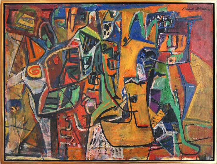
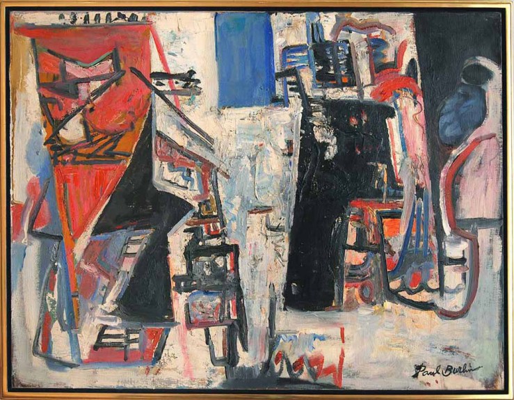
Though he moved away from New Mexico in 1920—living in New York and Paris for the rest of his days—Burlin’s artistic evolution in the Land of Enchantment influenced his work for the rest of his life, as evidenced in these canvases from the 1950s. Not long after he made this work, Burlin began to lose his sight. His final series of paintings, completed while he was legally blind, were exhibited at the New York Museum of Modern Art in 1971, two years after Burlin’s death.

From Burlin:

We live in an age of treacherous, harrowing notions of mutability, death and decay…All of the old realities have dissolved…all rigidities of form disappear and enter into a new metamorphosis.  This metamorphosis of form and reality is manifested in shape and color, which destroy visual reality and…shape themselves into a reality of their own.

Learn more about Paul Burlin on our homepage, and connect with us on Facebook, Twitter and Pinterest for daily gallery news.

COLLECTOR’S FORUM: Conservator Matt Horowitz

 Fine art conservator Matt Horowitz will appear at our COLLECTOR’S FORUM workshops
on October 17 and 24. The free events are for anyone who’s ever considered buying, selling or caring for fine art and has questions about the inner workings of the art world. To reserve a seat, make sure to contact us!

Matt-Horowitz-Goldleaf-Framemakers-Conservator

Conservator Matt Horowitz with a 17th century painting he restored for Matthews Gallery

“I came in and they gave me a de Kooning,” says Matt Horowitz. He’s telling the story of his arrival in Manhattan at 24 years old to work for a famed art restoration firm. If he failed this audition, there would be dire art historical consequences.

“A piece of the white paint had chipped away, which is the hardest thing to match, because white is never really white,” Horowitz says, nervously twisting the ring on his finger. “I was like, ‘You don’t even know who the hell I am, and you just gave me a de Kooning and you want me to fix it.'” At the end of the painstaking task, Horowitz had a new job. Eight years later he sits in Matthews Gallery’s front room among paintings he’s restored for us, with a budding reputation as a rare young master in his field.

Horowitz grew up in Santa Fe, where his father Marty founded Goldleaf Framemakers in 1988. One summer in high school he got bored with the family business and asked local art conservator Steven Prins to teach him the tricks of the trade.

After receiving his BFA in painting and drawing at the University of New Mexico, Horowitz returned to Santa Fe to work with Prins, but he’d always dreamed of living in New York. When he got a job offer from Lowy Frame & Restoration Company in Manhattan, he took the leap.

Matt Horowitz- Art Conservator- Goldleaf Framemakers of Santa FeHorowitz at work

“I didn’t go and get my masters degree in conservation because I went for a ‘apprenticeship to working commercially’ route,” Horowitz says. “I prefer it because when you go to school it’s a very different environment. It’s very intellectual.” At Lowy he got hands-on experience with diverse museum-quality work: paintings by Degas, Dali and other legends.

Horowitz had a great job and an apartment in Manhattan, but he was far away from his family. “Things had gotten really rough after the recession,” he recalls. “My dad calls and says, ‘Would you be interested in coming back and helping your old man out?'” It was a difficult decision, but Horowitz left New York behind.

His first winter back in Santa Fe was hard work. Horowitz lived in the family shop and turned out beautifully restored artwork on tight deadlines, building a successful new wing of the business. It’s been four years since his return and a decade since he started working as a professional art conservator, and business is booming.

Still Life Attributed to Jean-Baptiste Monnoyer- Matthews Gallery blogUntitled still life by Jean-Baptiste Monnoyer, impeccably restored by Horowitz

“Now that I’ve been doing it for 10 years, I really push that,” Horowitz says. “I’ve definitely come up against the ageism, and the people who say, ‘How could you know what you’re doing? You’re too young.'” That’s why he jumped at the chance to collaborate with us on our Art Matters event, COLLECTOR’S FORUM. During our free workshops on October 17 and 24, he’ll discuss the fine points of maintaining and restoring artwork in your collection and tell fascinating stories from his career, including the tale of restoring one of Matthews Gallery’s oldest works of art.

“It’s kind of like being a detective,” he says. “It’s exciting. Something comes in and it’s not always totally straightforward, there’s a combination of things. It can be stressful but it’s exciting. You have to follow the clues and figure it all out.”

Learn more about COLLECTOR’S FORUM on our exhibition page, and connect with us on Facebook, Twitter and Instagram for daily gallery updates.

OUTSIDER/INSIDER: Abstract Expressionism at Matthews Gallery

Stanley Boxer and Robert Motherwell at Matthews Gallery Boxer (left) and Motherwell

It was Mark Rothko’s 111th birthday this Friday, and the occasion has us pondering one of the 20th century’s most polarizing art movements: abstract expressionism.

Three artworks by renowned abstract expressionists have recently landed on our walls. The first two are heavily impastoed oil paintings by Stanley Boxer, who resolutely clung to the far fringes of the movement. Determined to defy labels, he was furious when art critic Clement Greenberg called him a color field painter, and yet the arc of his creative explorations closely paralleled that of his abstract expressionist contemporaries:

In the manufacture of my art, I use anything and everything which gets the job done without any sentiment or sanctity as to medium. Then, too, I have deliberately made a practice of being “visionless”… this is, I go where my preceding art takes me, and never try to redirect the future as to what my art should look like. This is a general credo and foundation for everything I have ever done and stands firm in its solidity as this is written.

Boxer, who died in 2000, would have loved Grace Glueck’s New York Times review of a 2004 exhibition of his late works. She notes that he was “never part of a movement or trend,” but rather driven by paint’s “physical possibilities without script or program.”

Abstract Paintings by Stanley Boxer- Matthews Gallery Blog Atriumofashreddednight  (top) and Crisppitchofsigh, Oil on Linen

Glueck ends the piece with a brief analysis of Boxer’s titles, lyrical lists of words that are jammed together in unbroken strings. The works in our collection, for example, have names that read like fragments of beat poems: Atriumofashreddednight and Crisppitchofsigh. Glueck writes, “As Boxer joked in his titles, these canvases, more than most, do not really lend themselves to verbal exposition. They live for the eye, to which they bring deep satisfaction.”

Boxer’s titles provide a link to Robert Motherwell, the other abstract expressionist represented in our collection. Unlike many “abex” artists who labeled their canvases using dates or arbitrary numbers, Boxer and Motherwell were unapologetic in their wordplay.

That’s where the similarity ends. While Boxer considered himself an isolated frontiersman of abstract painting, Motherwell was an eager icon of abstract expressionism. He coined the term ‘New York School’ to describe his revolutionary circle, which included Mark Rothko, Jackson Pollock and Willem de Kooning, and acted as a spokesperson for the movement in the world of academia.

If Boxer’s titles were little more than impressionistic quips, Motherwell, who was a scholar before he became a “serious artist” and wrote numerous essays on aesthetics, chose names that have inspired endless analysis. His most famous series of paintings, Elegies to the Spanish Republic, chronicles the Spanish Civil War in bold strokes of black and white and subtle passages of ochre, blue, green and red.

Mainly, I use each color as simply symbolic: ochre for the earth, green for the grass, blue for the sky and sea,” Motherwell wrote. “I guess that black and white, which I use most often, tend to be protagonists.” In varying contexts, each color holds a universe of meanings. To fully understand the use of ochre in Motherwell’s Spanish Elegies, “You would have to know that a Spanish bull ring is made of sand of an ochre color,” the artist wrote.  Other works that feature ochre, like Western Air or Personage, with Yellow Ochre and White, would naturally spark different associations. 

Robert Motherwell- Africa 4- Silkscreen- Matthews Gallery Blog Robert Motherwell, Africa 4, Silkscreen

What to make of our Motherwell silkscreen, titled Africa 4? Motherwell completed the Africa suite in 1970, the same year he created his Basque and London suites. They were his first projects entirely devoted to silkscreens, and a divergence from the heavily layered nuances of his oil paintings. Here his black abstract forms stand crisply against their off-white backgrounds, although on closer inspection, their tumultuous edges still seem to weave in an out of focus.

“All my works [consist] of a dialectic between the conscious (straight lines, designed shapes, weighed color, abstract language) and the unconscious (soft lines, obscured shapes, automatism) resolved into a synthesis,” the artist wrote in 1944.

Motherwell first explored the concepts of automatism and the subconscious with a group of Parisian Surrealists, including Duchamp, Ernst and Masson, who had fled Europe during World War II.  Their ideas would help shape the spiritual side of abstract expressionism, a spontaneous, intuitive element that Motherwell carefully balanced with his more intellectual inclinations.

Motherwell’s connection to the Surrealists lends us a potential clue to the significance of the ‘Africa’ title. In his 1946 essay ‘Beyond the Aesthetics‘, Motherwell discusses the life of French Symbolist poet Arthur Rimbaud, who helped inspire Surrealism. In the final decades of his life Rimbaud quit writing and set off on an African expedition, a leap of faith that Motherwell compares to the Surrealists’ break from Dada and formation of a new movement:

Like Rimbaud before them, the Surrealists abandoned the aesthetic altogether; it takes a certain courage to leave poetry for Africa (as Rimbaud did, fh). They revealed their insight as essentially moral in never forgetting for a moment that most living is a process of conforming to an established order which is inhuman in its drives and consequences. Their hatred sustained them through all the humiliating situations in which the modern artist find himself, and led them to conceptions beyond the reach of more passive souls. For them true ‘poetry’ was freedom from mechanical social responses. No wonder they loved the work of children and the insane – if not the creatures themselves.

Perhaps Motherwell’s Africa suite represents a similar journey, a leap into the unknown that is a clear break from previous adventures. Just as Rimbaud abandoned an intellectual pursuit for one centered on travel and action, and as the Surrealists broke from the societal battles of the Dadaists to explore dreamscapes, so Motherwell’s stark Africa forms landed him in a new realm of image-making. Perhaps he sought to prove that even the most distinctly divided blacks and whites could possess endless shades of grey.

Learn more about Stanley Boxer and Robert Motherwell on our website, and make sure to connect with us on Facebook, Twitter and Flickr for more gallery news.

BURST OF BRILLIANCE: Adolph Gottlieb’s Southwestern Epiphany

“It was like being at sea,” said Adolph Gottlieb. The artist had just spent a year in the Desert Southwest- from 1937 to 1938- and returned to his hometown of New York City with a radically altered style. “There’s… a tremendous clarity of light and at night the clouds seem very close,” he continued. This was a very different type of “sea” than the one that carried Gottlieb on his inaugural artistic journey. When he was 17 he dropped out of high school and caught a merchant ship to Europe. He spent two years there, including six months in Paris where he audited art classes and visited the Louvre every day. Back in New York, he studied at The Art Students League and befriended Barnett Newman, Mark Rothko and Milton Avery. Together they founded the abstract expressionism movement, working to develop color field painting and other innovations. They remained close until Gottlieb decided to strike out on his own to Tucson, Arizona. It was an endeavor that would markedly separate him from his contemporaries, even after his return to the East. Gottlieb’s New York friends called the style he had developed in Arizona simplistic, but the artist refused to look back. He distanced himself from his colleagues and focused on developing a Surrealist style. Experiments with automatism and surrealist biomorphism helped him create an abstract symbol system for his gridded Pictographs series. Finally, in the 1950’s, he started work on two series that would become his most well-known work. Both series are represented in our collection, and their very existence seems linked to the bare, elegant vistas of the Desert Southwest.

IMAGINARY LANDSCAPES

Around 1950-51… I was finally getting away from the pictographs and looking for something… So it was necessary to find other forms, a different changed concept. So finally after a certain period of transition I hit on dividing the canvas into two parts, which then became like an imaginary landscape… What I was really trying to do when I got away from the pictographs was to make this notion of the kind of polarity clearer and more extreme. So the most extreme thing that I could think of doing at the time was dividing the canvas in half, make two big divisions and put something in the upper division and something in the lower section.

The color and texture of the land mass in “Green Foreground” recalls Gottlieb’s sea simile. In this period the artist was consolidating surrealist and abstract expressionist theories by approaching the two movements as different sides of the same coin (hence a “polarity”). Our lithograph implies a fantastical landscape, but works just as well as a flat, wholly abstract composition. If we imagine ourselves exploring this terrain, it would look much like Gottlieb’s surroundings in the Southwest, albeit with a greener tint.

BURSTS

After doing the imaginary landscapes until say 1956, in ’57 I came out with the first Burst painting… There was a different type of space than I had ever used and it was a further clarification of what I was trying to do. The thing that was interesting that it was a return to a focal point, but it was a focal point with the kind of space that existed in traditional painting. Because this was like a solitary image or two images that were just floating in the canvas space. They had to hold the space and they also had to create all the movement – that took place within the rectangle.

Gottlieb’s Bursts are Imaginary Landscapes that have further dissolved into abstraction, though their compositions still root them somewhat in reality. In “Crimson Ground” two discs rise (or set) like a sun and moon from a monochrome tangle with the most ephemeral of horizon lines.

When I started doing the Bursts I began to do part of the painting horizontally. It was necessary to do that because I was working with a type of paint which had a particular viscosity, which flowed, and if it were on a vertical surface it would just run. If it were on a horizontal surface, I could control it… I was using a combination of brushes and knives, palette knives… and spatulas… I’ve tried everything, rollers, rags, I’ve put paint on with everything.

“Crimson Ground” isn’t a painting, but it still has a painterly quality to it. The edges of the discs are uneven and textured, and the forms below are as splattered as a Pollock drip painting. This further highlights the polarity between the surreal landscape and an abstract expressionist painting. One is focused on depth, the other focuses solely on the surface. Learn more about Adolph Gottlieb on our website, and connect with us on Facebook, Twitter and Pinterest for to-the-minute gallery updates!