PICTORIALISM: From Stieglitz to Curtis

Alfred-Stieglitz-Edward-Curtis-Art2

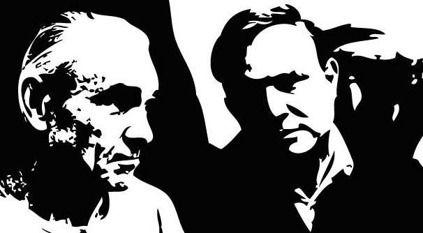
It was 1901 in New York City, and photographer Alfred Stieglitz (1864-1946) was busy preparing an exhibition that would shake the foundations of the art world. He had worked for years—often to the point of physical exhaustion—to elevate photography to the stature of fine art. A series of juried photography shows, judged mostly by painters, had popularized the aesthetic of pictorialism. Pictorialist photographers approached their art like a painter or illustrator, playing with focus and exposure in innovative ways and even marking the surfaces of their images. The idea was to “make” an image rather than “take” it, projecting emotions into the scene and onto the viewer.

Stieglitz and his friends saw the need for yet another leap forward in this new era of photography. They would mount a show composed entirely of photographs, and judged only by photographers. Or rather, it would be judged by one photographer: Stieglitz himself. He put together the show in two months and dubbed it the Photo-Secession, intending to secede from old conceptions of both photography and fine art. The exhibition was an enormous success, and gave Stieglitz the momentum to launch a photography journal and gallery to promote his ideas.

Pictorialism- Alfred Stieglitz to Edward Curtis- Matthews Gallery Blog


From left: View of Stieglitz’s Little Galleries of the Photo Secession, which opened in 1905;
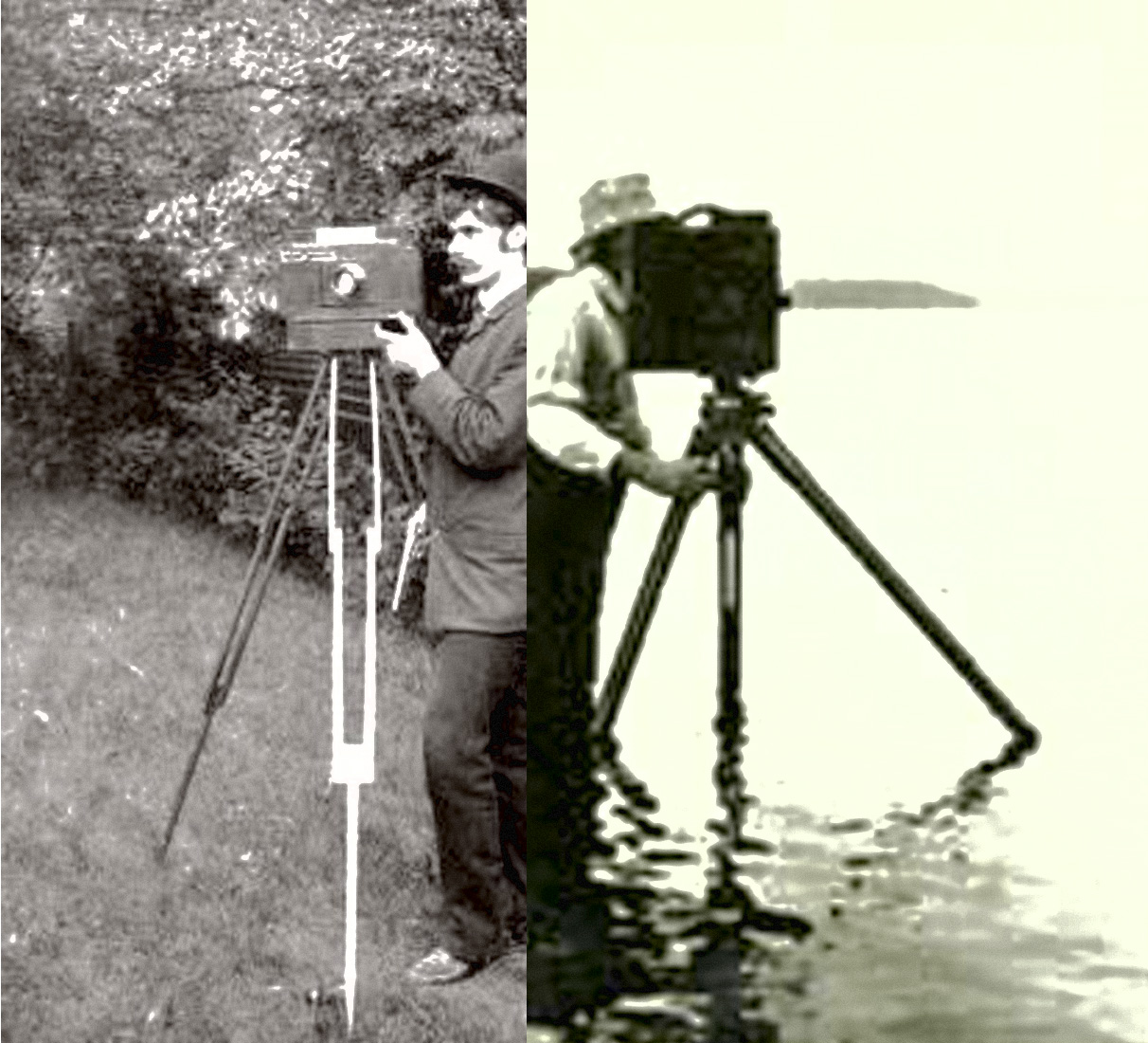
Edward S. Curtis in his adventure clothes.

Thousands of miles away in Seattle, Edward S. Curtis (1868-1952) was just beginning his photography career. Curtis grew up in Wisconsin and built his first camera when he was a teenager. At 17 he apprenticed in a photography studio in St. Paul, Minnesota, and when his family moved to Seattle in 1887, he bought a partnership in a portrait studio. Over the next few years, he began photographing Native American people of the Washington territory, some of them relatives of Chief Sealth and other important leaders. These early portraits and genre scenes inspired a 30-year adventure through the American West, during which Curtis and his team recorded the lives of over 80 tribes in photographs, writings, recordings and sketches.

Curtis’ expeditions, which he recorded in a series of volumes called The North American Indian, kept him far away from the epicenter of the American avant-garde where Stieglitz resided. “He was an outsider, too far removed from the photographic salons to court or count on ready shows and reviews that had instituted pictorialist photography,” writes Gerald Vizenor in an essay on Curtis. However, it’s this aesthetic that ties Stieglitz and Curtis together in art history.

“Curtis kept abreast of national, even international, trends in photography—and in the visual arts more generally,” writes Mick Gidley. “His early writings for Seattle magazines reveal that he absorbed much from Pictorialism in photography, including the example of Alfred Stieglitz, the founder of the Photo-Secession.” Curtis’ earliest photographs of Native peoples feature the soft focus and sepia tone of some classic pictorialist images, and present his subjects as stoic archetypes of a vanishing culture. In his many adventures, Curtis often posed his subjects and manipulated images to fit his vision of the tribes he was portraying. These techniques have earned Curtis praise as a pictorialist, but have also stirred up controversy. Curtis called himself an ethnologist, but the aesthetically powerful images he created didn’t always aim for scientific accuracy.

In the collection of photographs below, we’ve reunited Curtis with his pictorialist roots, placing some of his most iconic images among significant works by Stieglitz and his contemporaries. As you view the images, ponder Curtis’ position as an outsider during his lifetime, and his new place as a pictorialist in the art history books…

Edward S Curtis- Girl and Jar Photogravure- Matthews Gallery Blog

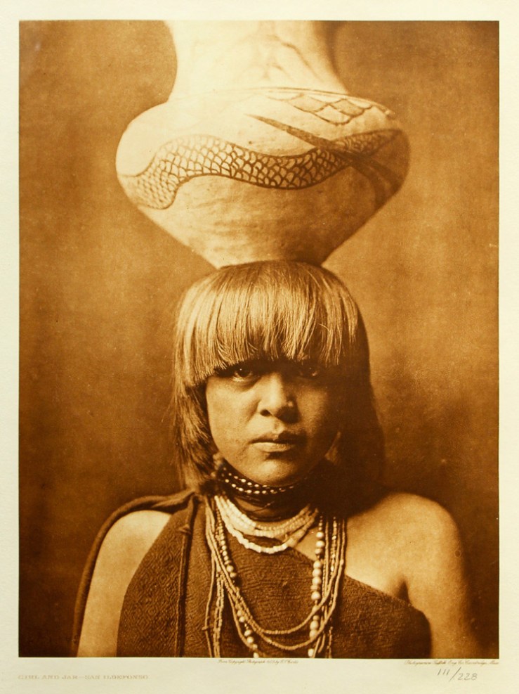
Edward S. Curtis, Girl and Jar, Photogravure

Adolph de Meyer- Marchesa Casati- 1912- Pictorialism- Matthews Gallery Blog

Adolph de Meyer, Marchesa Casati, 1912

Edward S Curtis- Apache Medicine-Man Photogravure- Matthews Gallery Blog

Edward S. Curtis, Apache Medicine-Man, Photogravure

Henry Peach Robinson- Fading Away- 1858- Pictorialism- Matthews Gallery Blog

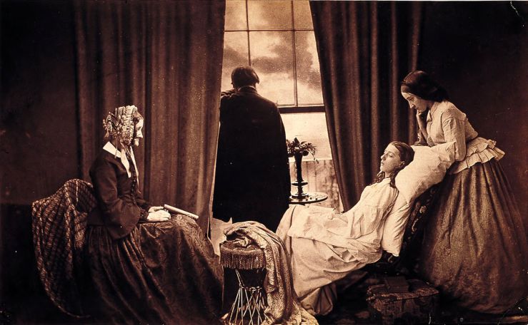
Henry Peach Robinson, Fading Away, 1858

EdwardCurtis-Art-TheRushGatherer

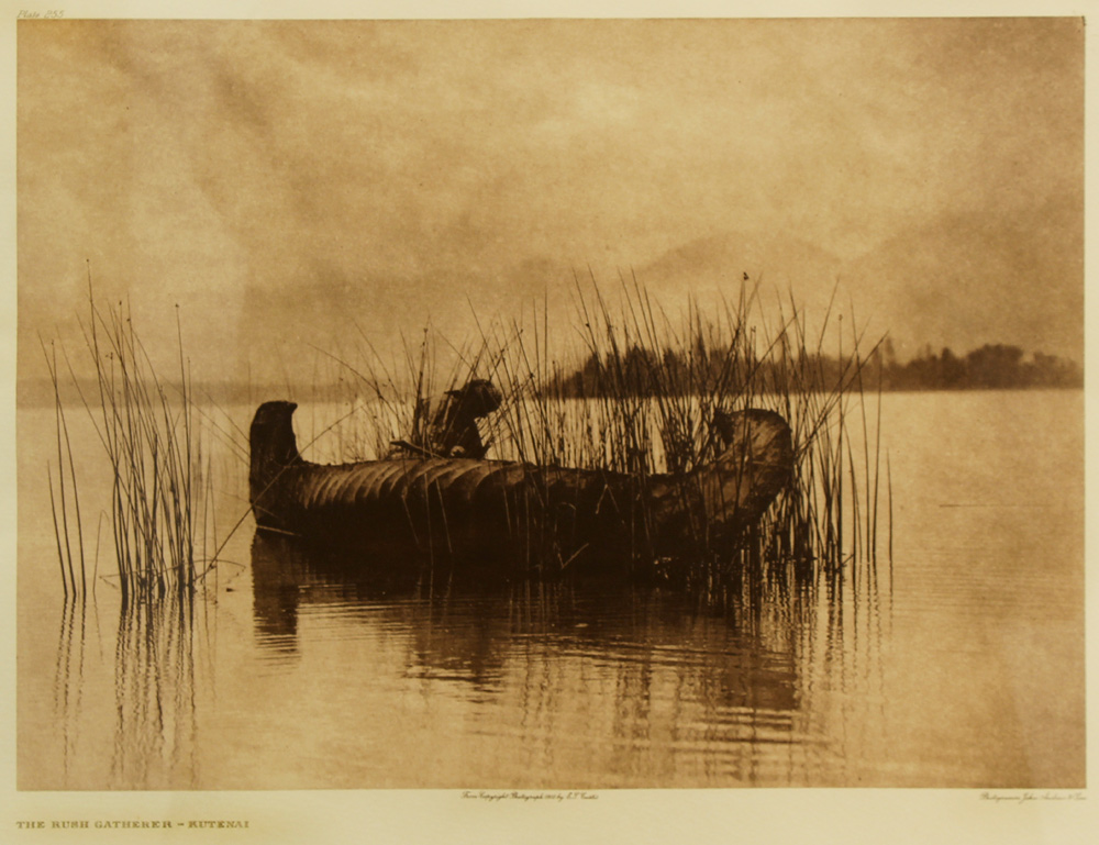
Edward S. Curtis, The Rush Gatherer, Photogravure

Alvin Langdon Coburn- Spiderwebs- 1908- Pictorialism- Matthews Gallery Blog

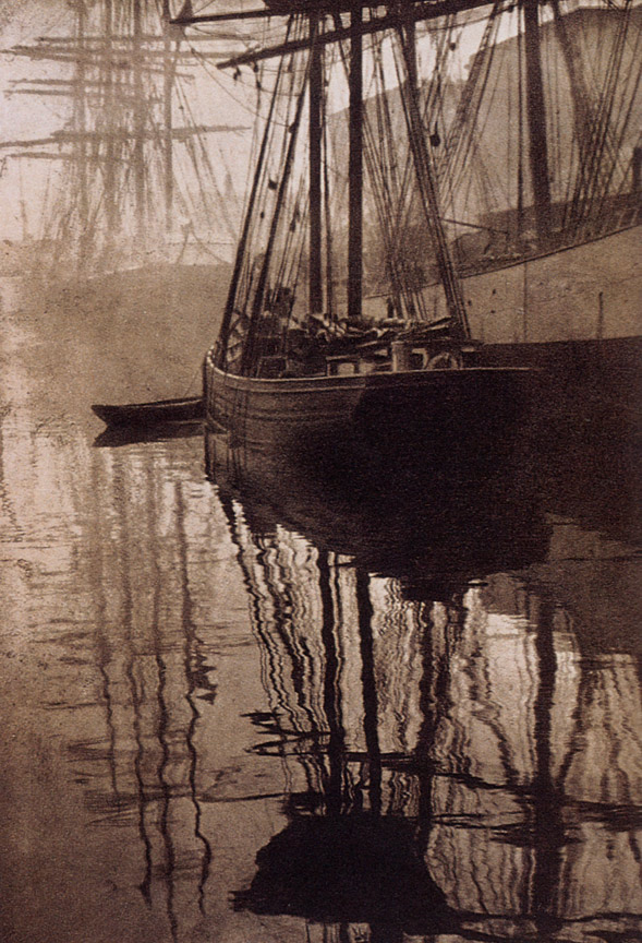
Alvin Langdon Coburn, Spiderwebs, 1908

Edward S Curtis- Waiting the Forest-Cheyenne Photogravure- Matthews Gallery Blog

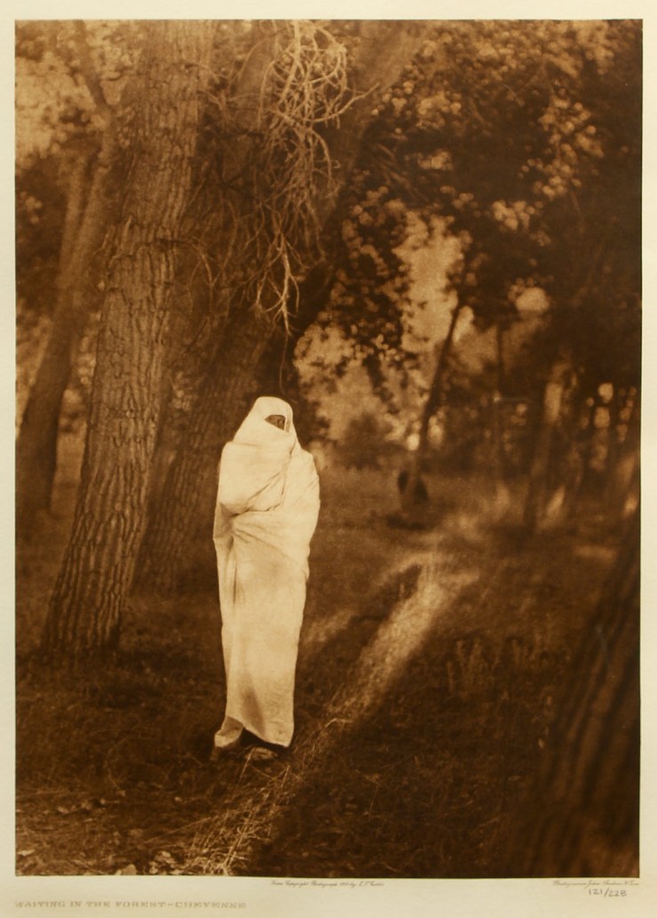
Edward S. Curtis, Waiting in the Forest— Cheyenne, Photogravure

Paul Haviland- Doris Keane- 1912- Pictorialism- Matthews Gallery Blog

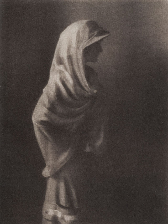
Paul Haviland, Doris Keane, 1912

Edward S Curtis- The Storm-Apache Photogravure- Matthews Gallery Blog

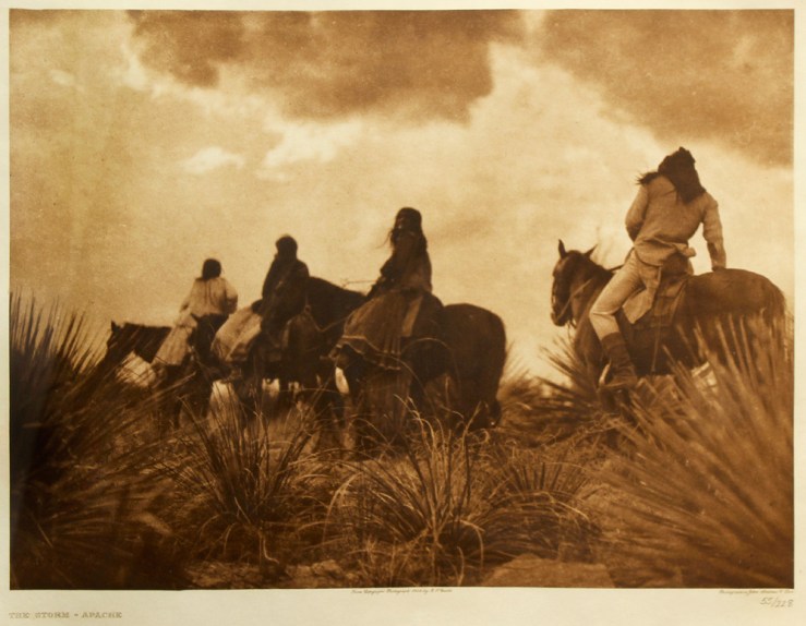
Edward S. Curtis, The Storm-Apache, Photogravure

Alfred Stieglitz- The Terminal- 1893- Pictorialism- Matthews Gallery Blog

Alfred Stieglitz, The Terminal, 1893

Click here to learn more about Edward S. Curtis, his adventures and the rediscovery of his work in the 1970’s, and connect with us on Facebook, Twitter and Instagram for daily gallery news.

OUTSIDER/INSIDER: Abstract Expressionism at Matthews Gallery

Stanley Boxer and Robert Motherwell at Matthews Gallery Boxer (left) and Motherwell

It was Mark Rothko’s 111th birthday this Friday, and the occasion has us pondering one of the 20th century’s most polarizing art movements: abstract expressionism.

Three artworks by renowned abstract expressionists have recently landed on our walls. The first two are heavily impastoed oil paintings by Stanley Boxer, who resolutely clung to the far fringes of the movement. Determined to defy labels, he was furious when art critic Clement Greenberg called him a color field painter, and yet the arc of his creative explorations closely paralleled that of his abstract expressionist contemporaries:

In the manufacture of my art, I use anything and everything which gets the job done without any sentiment or sanctity as to medium. Then, too, I have deliberately made a practice of being “visionless”… this is, I go where my preceding art takes me, and never try to redirect the future as to what my art should look like. This is a general credo and foundation for everything I have ever done and stands firm in its solidity as this is written.

Boxer, who died in 2000, would have loved Grace Glueck’s New York Times review of a 2004 exhibition of his late works. She notes that he was “never part of a movement or trend,” but rather driven by paint’s “physical possibilities without script or program.”

Abstract Paintings by Stanley Boxer- Matthews Gallery Blog Atriumofashreddednight  (top) and Crisppitchofsigh, Oil on Linen

Glueck ends the piece with a brief analysis of Boxer’s titles, lyrical lists of words that are jammed together in unbroken strings. The works in our collection, for example, have names that read like fragments of beat poems: Atriumofashreddednight and Crisppitchofsigh. Glueck writes, “As Boxer joked in his titles, these canvases, more than most, do not really lend themselves to verbal exposition. They live for the eye, to which they bring deep satisfaction.”

Boxer’s titles provide a link to Robert Motherwell, the other abstract expressionist represented in our collection. Unlike many “abex” artists who labeled their canvases using dates or arbitrary numbers, Boxer and Motherwell were unapologetic in their wordplay.

That’s where the similarity ends. While Boxer considered himself an isolated frontiersman of abstract painting, Motherwell was an eager icon of abstract expressionism. He coined the term ‘New York School’ to describe his revolutionary circle, which included Mark Rothko, Jackson Pollock and Willem de Kooning, and acted as a spokesperson for the movement in the world of academia.

If Boxer’s titles were little more than impressionistic quips, Motherwell, who was a scholar before he became a “serious artist” and wrote numerous essays on aesthetics, chose names that have inspired endless analysis. His most famous series of paintings, Elegies to the Spanish Republic, chronicles the Spanish Civil War in bold strokes of black and white and subtle passages of ochre, blue, green and red.

Mainly, I use each color as simply symbolic: ochre for the earth, green for the grass, blue for the sky and sea,” Motherwell wrote. “I guess that black and white, which I use most often, tend to be protagonists.” In varying contexts, each color holds a universe of meanings. To fully understand the use of ochre in Motherwell’s Spanish Elegies, “You would have to know that a Spanish bull ring is made of sand of an ochre color,” the artist wrote.  Other works that feature ochre, like Western Air or Personage, with Yellow Ochre and White, would naturally spark different associations. 

Robert Motherwell- Africa 4- Silkscreen- Matthews Gallery Blog Robert Motherwell, Africa 4, Silkscreen

What to make of our Motherwell silkscreen, titled Africa 4? Motherwell completed the Africa suite in 1970, the same year he created his Basque and London suites. They were his first projects entirely devoted to silkscreens, and a divergence from the heavily layered nuances of his oil paintings. Here his black abstract forms stand crisply against their off-white backgrounds, although on closer inspection, their tumultuous edges still seem to weave in an out of focus.

“All my works [consist] of a dialectic between the conscious (straight lines, designed shapes, weighed color, abstract language) and the unconscious (soft lines, obscured shapes, automatism) resolved into a synthesis,” the artist wrote in 1944.

Motherwell first explored the concepts of automatism and the subconscious with a group of Parisian Surrealists, including Duchamp, Ernst and Masson, who had fled Europe during World War II.  Their ideas would help shape the spiritual side of abstract expressionism, a spontaneous, intuitive element that Motherwell carefully balanced with his more intellectual inclinations.

Motherwell’s connection to the Surrealists lends us a potential clue to the significance of the ‘Africa’ title. In his 1946 essay ‘Beyond the Aesthetics‘, Motherwell discusses the life of French Symbolist poet Arthur Rimbaud, who helped inspire Surrealism. In the final decades of his life Rimbaud quit writing and set off on an African expedition, a leap of faith that Motherwell compares to the Surrealists’ break from Dada and formation of a new movement:

Like Rimbaud before them, the Surrealists abandoned the aesthetic altogether; it takes a certain courage to leave poetry for Africa (as Rimbaud did, fh). They revealed their insight as essentially moral in never forgetting for a moment that most living is a process of conforming to an established order which is inhuman in its drives and consequences. Their hatred sustained them through all the humiliating situations in which the modern artist find himself, and led them to conceptions beyond the reach of more passive souls. For them true ‘poetry’ was freedom from mechanical social responses. No wonder they loved the work of children and the insane – if not the creatures themselves.

Perhaps Motherwell’s Africa suite represents a similar journey, a leap into the unknown that is a clear break from previous adventures. Just as Rimbaud abandoned an intellectual pursuit for one centered on travel and action, and as the Surrealists broke from the societal battles of the Dadaists to explore dreamscapes, so Motherwell’s stark Africa forms landed him in a new realm of image-making. Perhaps he sought to prove that even the most distinctly divided blacks and whites could possess endless shades of grey.

Learn more about Stanley Boxer and Robert Motherwell on our website, and make sure to connect with us on Facebook, Twitter and Flickr for more gallery news.

ONE WORK OF ART: Beatrice Mandelman’s ‘Cool Wind’

Beatrice Mandelman- Cool Wind circa 1950- Matthews Gallery

Beatrice Mandelman, Cool Wind c. 1950, Casein with Collage on Masonite Panel

When John Sloan invited Beatrice Mandelman and Louis Ribak to visit Santa Fe in 1944, the two artists were on the rise among New York City’s avant-garde. They had ties to Hans Hoffman and Fernand Leger, and were often mentioned in the same breath as Jackson Pollock. Sloan, who had been summering in New Mexico for years, had a reputation for spiriting away his favorite artists to the Desert Southwest. During their trip the recently married duo took a train to Taos and decided to stay.

The move marked a radical change in Mandelman and Ribak’s artwork. “We had to start all over again,” Mandelman said. “We spent the first couple years painting landscapes.” They were known for their figurative paintings in New York, but in this radically different environment their focus shifted to pure abstraction. They were trailblazers for a new wave of artists called the Taos Moderns, a movement that enlivened the Taos art colony but enraged an older vanguard of academic painters with ties to the Taos Society of Artists of the 1910’s and 20’s. To this tight clique of romanticists, the newcomers stuck out like colorful cacti—particularly Mandelman.

Portrait of Beatrice Mandelman in her Taos studio circa 1950- Matthews Gallery Beatrice Mandelman, 1950

“She worked with full abstraction at a time when most artists were not daring enough to do so,” writes David L. Witt in his book Taos Moderns, noting that Mandelman considered herself “the first of the second generation of artists in Taos.” The voice of a young, female abstract painter had never been part of the remote art community.

Far from the big city, Mandelman developed a new appreciation for the natural world and humanity’s relationship with it. By the late 1940’s she was developing an abstract symbol system to express her emotional responses to the landscape. Her elegant compositions didn’t mimic the lines or palette of the high desert, but they perfectly evoked the strong, solitary spirit of its inhabitants.

The mixed media painting in our collection was likely done in the 1950’s. Early in her experiments with abstraction Mandelman chose a muted palette, but here brighter colors poke through. This more expressive style was inspired by Henri Matisse and Mandelman’s former teacher Leger, and allowed her to explore the highs and lows of human experience with great vigor. Cool Wind‘s undercurrent of chilly blues and bright accents of orange and red call forth the sensation of a shiver passing up the spine.

As the evenings get cooler in Santa Fe, we’ve developed an ever-evolving passion for this piece and the innovative artist who created it. Learn more about Beatrice Mandelman on our website, and connect with us on Facebook, Twitter and Instagram for daily gallery news.

The Boundless Moment: Words and Images

Eric Thompson- The Photographer- Matthews Gallery blog

 Eric G. Thompson, The Photographer, Oil on Linen

For the past week, excited art pilgrims—determined to visit every gallery on Canyon Road—have marched purposefully into our front room and come to a screeching halt. Our Eric G. Thompson show ‘The Boundless Moment‘ is a little different from most of the exhibitions you’ll see on this famous art route. Accompanying many of Thompson’s serene realist paintings are writings by great American poets, from Elizabeth Bishop to Walt Whitman.

The interplay of words and images has compelled viewers to slow down and look twice, sparking many a fascinating observation. Most notably, journalist Alison Oatman of the Weekly Alibi attended our opening and wrote an elegant, poetry-filled review of the show.

Eric G. Thompson- Coffee Shop Girl- Matthews Gallery blog

Eric G. Thompson, Coffee Shop Girl, Oil on Panel

An excerpt from Oatman’s article:

Robert Lowell’s “Epilogue” [is] paired with the painting “Coffee Shop Girl.” Lowell writes: “I hear the noise of my own voice:/ The painter’s vision is not a lens,/ it trembles to caress the light” [emphasis original]. These lines are reflected in the Coffee Shop Girl’s illuminated face—as pale as rice paper.

Later on, the poem continues: “Pray for the grace of accuracy/ Vermeer gave to the sun’s illumination/ stealing like the tide across a map/ to his girl solid with yearning.” Though large sunglasses hide her face and her meager mouth is expressionless, the Coffee Shop Girl is ravenous. We see her frayed emotional state in the feathery brushstrokes in the background, the squirming reddish-brown tendrils of her ponytail, and the sparkling clusters of dandelion-like fur attached to the hood of her puffy coat.

We spoke with Thompson on the phone today to fill him in on the big response his show has received. The artist was in Santa Fe last week for the opening reception, but now he’s back home in Salt Lake City, Utah. The long drive home gave him time to gather some thoughts on the exhibition. Read our interview below, and make sure to come see ‘The Boundless Moment‘ before it closes on August 28!

Eric G. Thompson- Half Light- Matthews Gallery blogEric G. Thompson, Half Light, Oil on Canvas

Describe your studio. 

My studio is just a few feet away from my house. It has windows with good natural light, so sometimes I can turn off the light and still get what I need. Sometimes I’ll set up my daughter‘s easel next to mine, and we’ll work next to each other. She gets to see what her dad does. Most of the time the kids aren’t allowed in the studio, though. I’ll play underground folk music, and when I’m really inspired it feels like the music is flowing straight through my brush.

You work in oil, egg tempera and watercolor. How do you choose which medium to use for a new painting? 

Between the three of them, if I want to capture something a little more loose and light I go for watercolor. If I want to capture something very solid, heavy and thick I’ll go with oil. If I want to capture something a little more photorealistic, I go with egg tempera. It gives you a lot of freedom to express the story or the emotion that you’re trying to convey with each medium.

It can be refreshing, but it can also be almost maddening. They’re all so different, it’s unbelievable. You have to switch your brain around and remember how to use that medium. It can be completely challenging, which I love. That’s one of the greatest thing about painting, is the challenge. I can always let a painting go as long as I have another challenge.

Eric G. Thompson- Nestled- Matthews Gallery

Eric G. Thompson, Nestled, Oil on Panel

Alison Oatman’s review in The Alibi begins with, “One question contemporary realist painters often get is, ‘Why not simply take a photograph?'” Over the course of the article, she critiques that particular line of thought. What’s your answer to that question? 

To a lot of artists, it’s not a great compliment when a viewer says, “That looks just like a photograph.” Maybe to a photorealist that would be flattering, but I think the greatest artists of all time have that balance of, it looks like a painting but it looks so ‘real.’ I’ve made it come to life.

Why does someone need a painting to look just like a photograph? What’s the power in that? Technically it’s amazing, but where’s the artistic freedom? I need artistic license to change things and blur edges and sharpen edges and change value to make it more ethereal.

I can make a painting look like a photograph but then there’s no energy, there’s no life to it. I think just adding a little more energy with brushstrokes or texture brings it more to life.

One of your influences is the Japanese aesthetic of wabi-sabi. How would you describe it? 

It’s what an object has been through, who used it, who touched it. It’s the patina objects acquire over time, like the rust on an oil can. It just adds to the whole character of the object—I see them as little characters. A cup on a windowsill, an oil can or even pumpkins can have little lives of their own.

Your works seem still at first glance, but a longer look gives me a sense of ‘unfolding,’ of motion. Is that one of our goals?  

It’s about capturing a moment in time that I’d like to freeze and experience for longer than the experienced moments.

I’ve definitely been experimenting with looser brushstrokes toward the outer edges of the painting to give it some energy. I need to experiment to see if I can get the perfect balance of detail and looseness. It’s a way of pushing myself as an artist, and it’s been one of the hardest things I’ve ever attempted.

Eric G. Thompson- Winter Moon- Matthews Gallery blogEric G. Thompson, Winter Moon, Watercolor

Which paintings in ‘The Boundless Moment’ are closest to your heart? 

A few of the watercolors are very powerful to me in an emotional way. Just reminding me of something in my past, at my Grandma’s house in Idaho. She had a farm with all of these different structures. They just remind me of that time, and different feelings come up from my childhood.

Raven’s Hair is a very powerful piece. It’s capturing this emotion of a woman laying on this bed. Her eyes are closed and she’s having a very pleasant thought. It seems to have some nice emotion to it.”

Morning Cup is a portrait of your wife Hilary, and inspired her to write a poem that we’re featuring in the show. Do you often inspire each other like that? 

 We’ve named my paintings every year for 12 years or more. We try to outdo each other with the most poetic titles. The title can say so much in just a couple words. What’s the best title, or the strongest? Hilary is amazing with words.

To learn more about Thompson’s show, connect with us on Twitter, Facebook and Pinterest.