NEW LANDSCAPES, NEW VISTAS: Southwest Premodernism

Nampeyo- Hopi Potter- Matthews Gallery Blog

This is part 2 of our blog series on the history of women artists in New Mexico.
Read part 1 here, and learn more at our May 8-31st exhibition
NEW LANDSCAPES, NEW VISTAS: Women Artists of New Mexico.

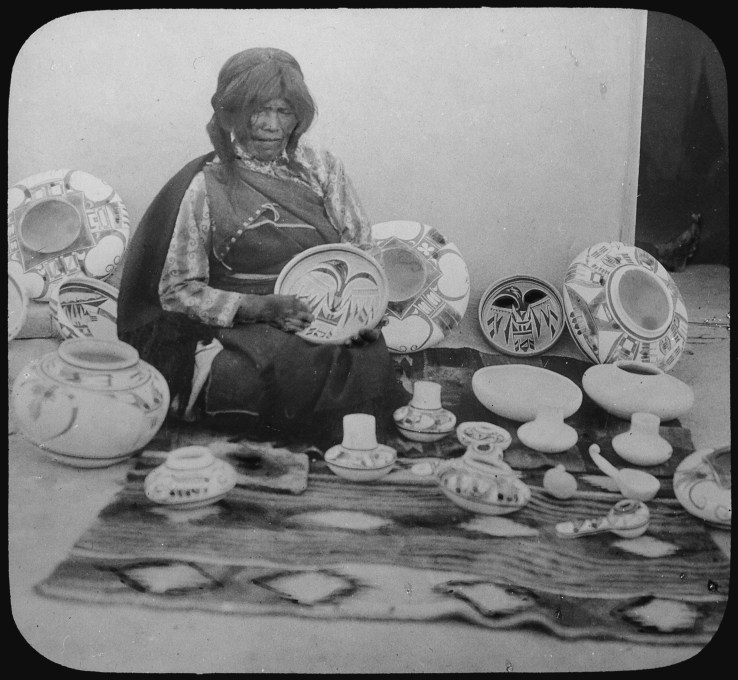
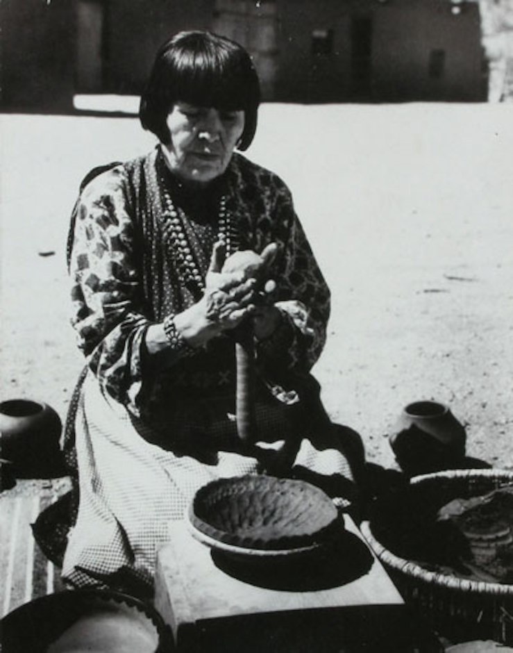
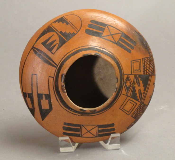
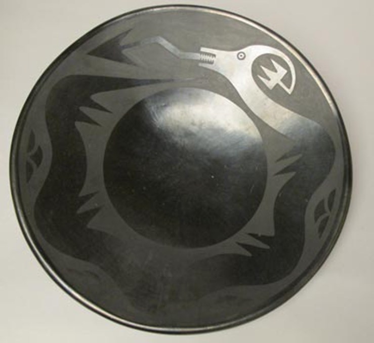
“I have alluded to Nampeyo as a ‘modern artist,’ because the more I understood her life and work, the more her extraordinary career seemed to parallel that path,” writes Steve Elmore in the last chapter of his book In Search of Nampeyo. Elmore stepped in as our guest blogger last week, which gave us some time to study the links between Pueblo aesthetic innovations and the diverse New Mexico art movements that emerged in the 19th and 20th centuries.

What did romanticist painters of the early Santa Fe and Taos art colonies learn from Pueblo traditions that had been around for centuries before they arrived? How did the elegant abstract patterns on San Ildefonso jars and bowls influence abstract expressionists like Beatrice Mandelman and Janet Lippincott?

Nampeyo- Hopi Pottery- Matthews Gallery Blog

Elmore provided the first clues to this investigation in his biography of Nampeyo (1856-1942), a Hopi-Tewa potter whose innovative images bridged the ancient and modern worlds. Here’s more from In Search of Nampeyo:

While much of Nampeyo’s life was that of a traditional Hopi woman, we need to consider her life and work outside of the academic fields of archaeology and anthropology, which have heretofore defined how Nampeyo has been perceived by the public. Today, her masterpieces are mostly displayed in natural history museums next to Anasazi jars or in anthropological exhibits of Pueblo Indians—not in art museums—and certainly not as modern art.

Yet, in the end, Nampeyo was not an ancestral potter, nor even a traditional Pueblo potter, although these conditions were the context for her achievements. While she was trained as a traditional potter, she evolved into a unique artist using modern marketing techniques to sell her work to a new Euro-American audience.

As Elmore stresses, it’s important to understand Nampeyo, Maria Martinez and other influential Pueblo potters not as isolated traditionalists but as artists who interacted with newcomers and adapted to the cultural changes they affected. The realities of frontier living necessitated a constant dialogue between the first artists who emigrated from the East Coast and Pueblo artisans. This interchange continued as the market for Pueblo arts and crafts grew and shifted based on the demands of visitors.

IlaMcAfee

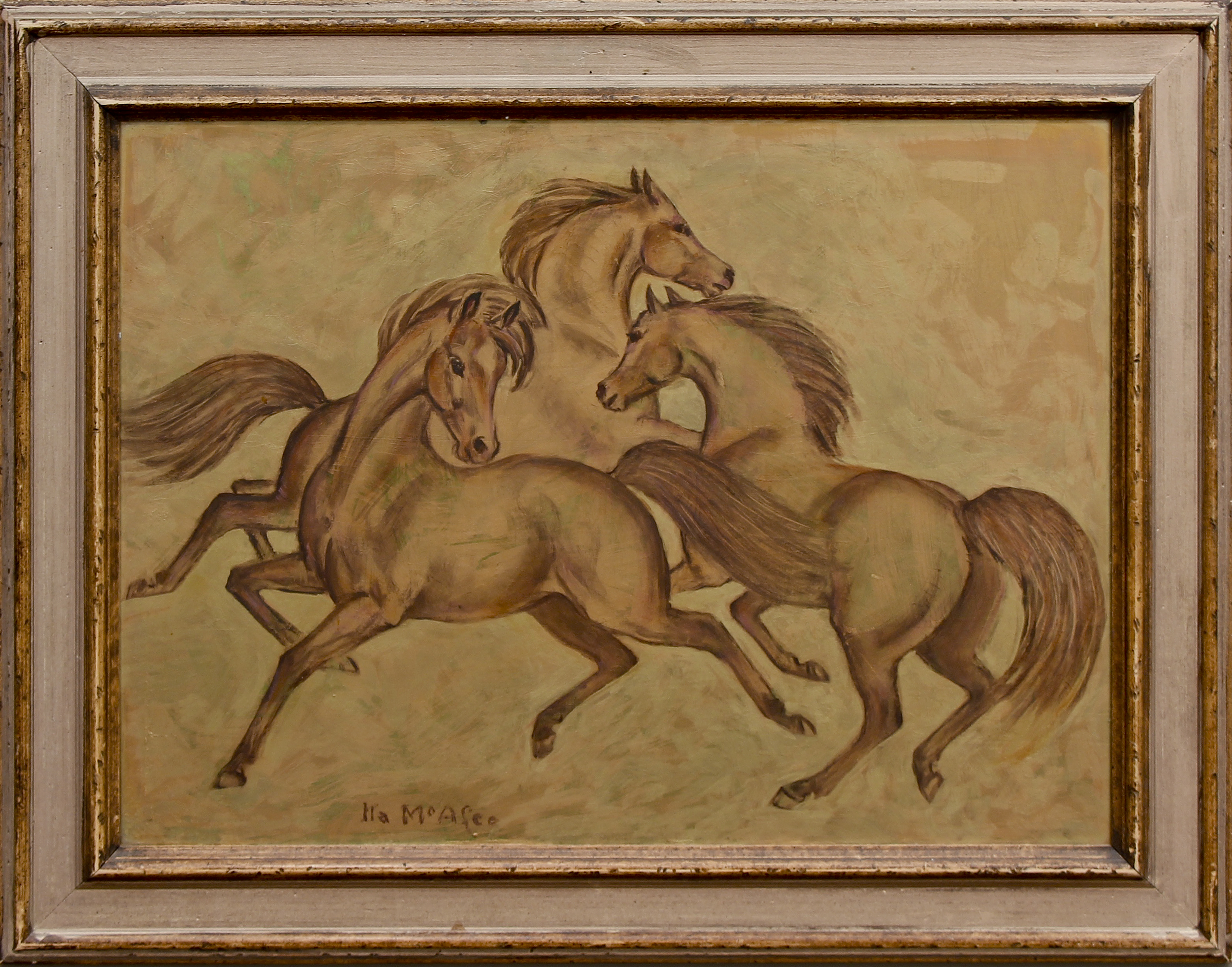
Ila McAfee (1897-1995), one of the early “Euro-American” transplants, drew inspiration from Pueblo traditions in her work. McAfee often painted wild horses in profile, echoing the stark monochrome of pottery designs. In The Golden Triad, three beasts hover before a textured golden-brown field that captures the hues of high desert clay.

Taos art dealer Robert Parsons interviewed McAfee about her early years in Taos:

It was so different then. There was nothing between me and the mountain when we first got here. The village was small and the Indians remained uninfluenced by the invaders. Once I asked one of them, ‘What did you call this country before the Europeans came?’ ‘Ours,’ he told me.

Dorothy-Brett-Artist-Matthews-Gallery

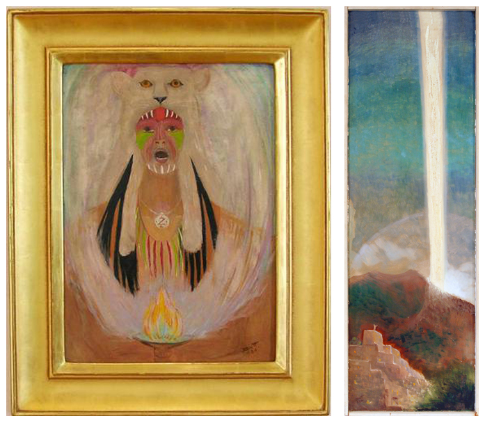
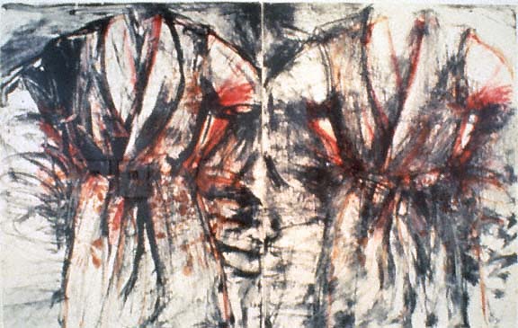
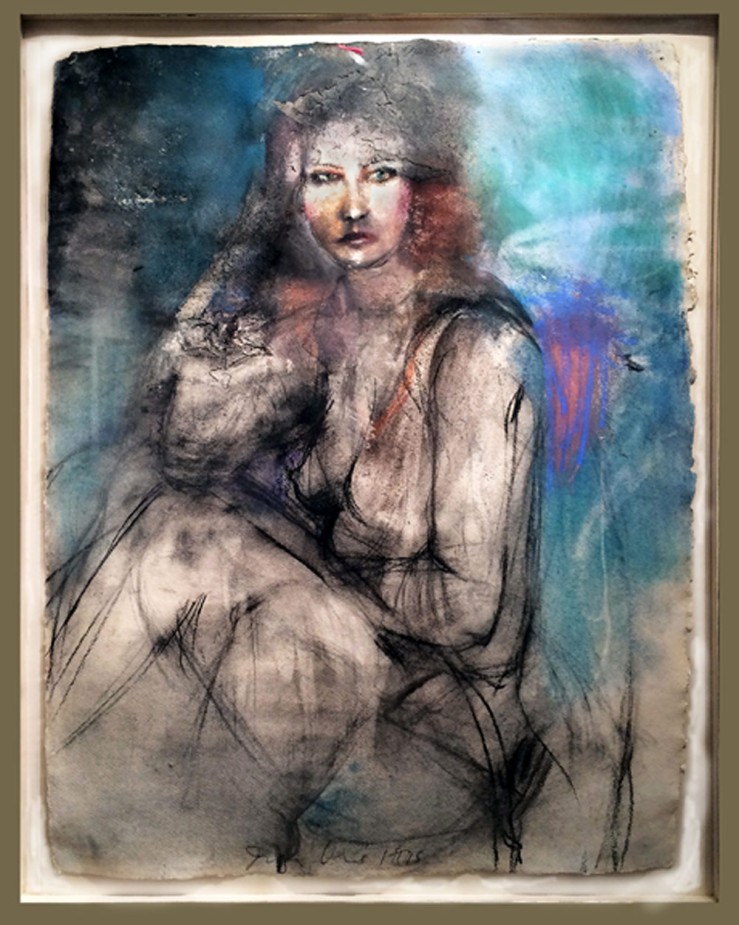
Other early Taos artists such as Helen Greene Blumenschein (1909-1989) and Dorothy Brett (1883-1977) also interacted with the nearby Pueblo. Blumenschein meditated on the relationship between the new settlers and the natives in her Taos memoirs, and Brett spent years making genre paintings of the Taos Poblanos. Later on, Brett switched to more mystical subject matter that was inspired by Native American spirituality. Her paintings Cat Shaman and Moon Ray reflect her mature philosophies that link humanity and nature.

Agnes Sims Artwork with New Mexico Petroglyphs- Matthews Gallery

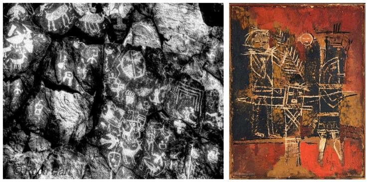
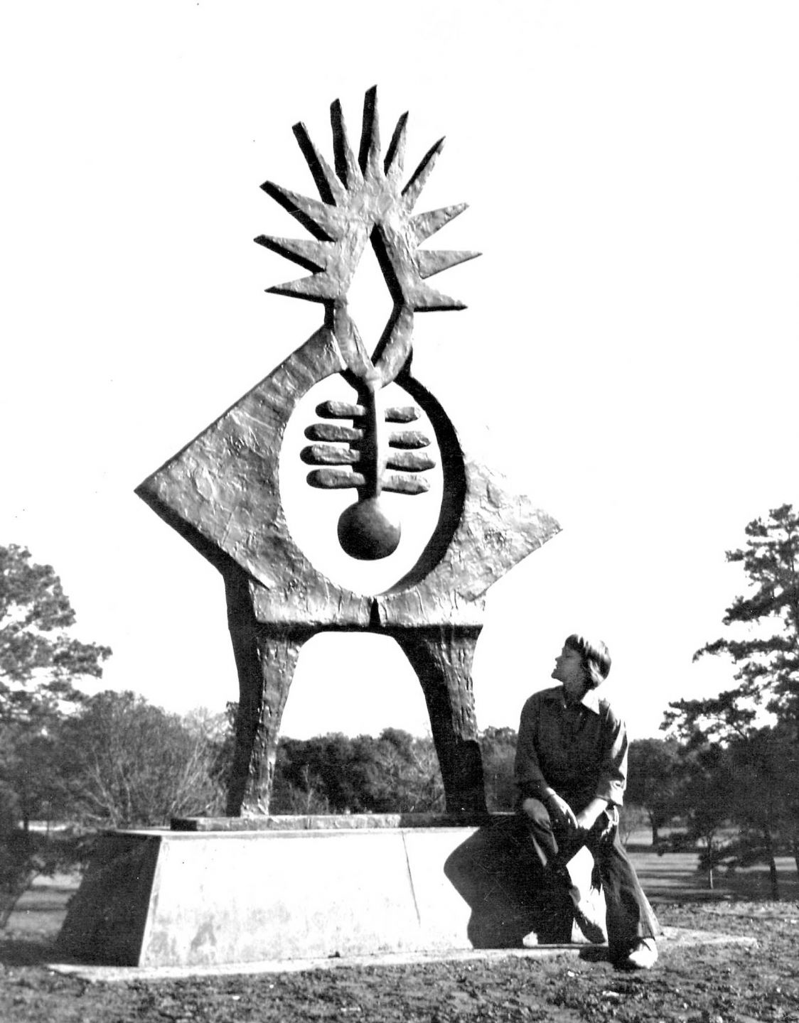
In the 1930s, Santa Fe artist and archaeologist Agnes Sims (1910-1990) arrived in New Mexico and began studying the ancient Pueblo petroglyphs. As she pondered the mysteries of the lost language, she began developing her own abstract symbol system in a series of paintings and sculptures.

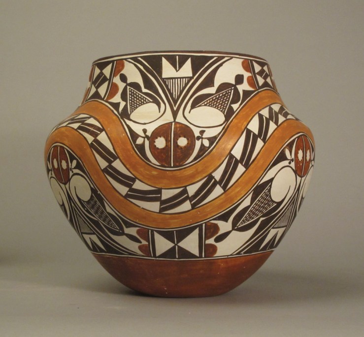
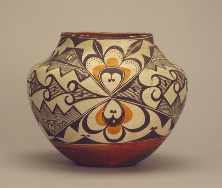
Sims’ abstract experiments prefigured the innovations of Beatrice Mandelman (1912-1998) and Janet Lippincott (1918-2007), abstract expressionists who helped bring a bold new aesthetic to the Desert Southwest in the 1940’s. This wave of modernists surely took note of Pueblo aesthetic innovations that had spread from Nampeyo’s studio to the San Ildefonso Pueblo and beyond. From Elmore:

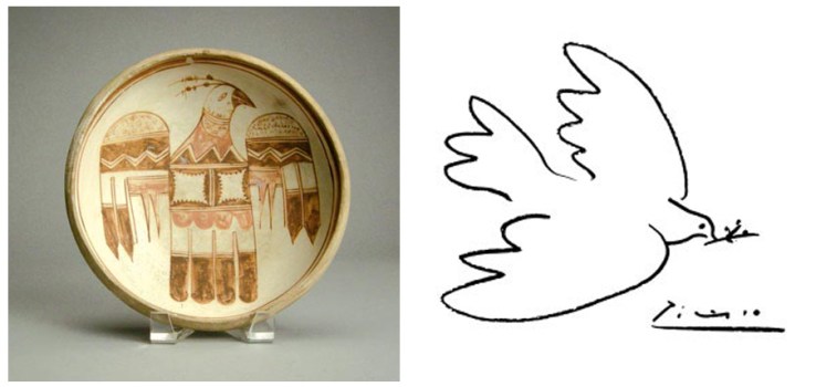
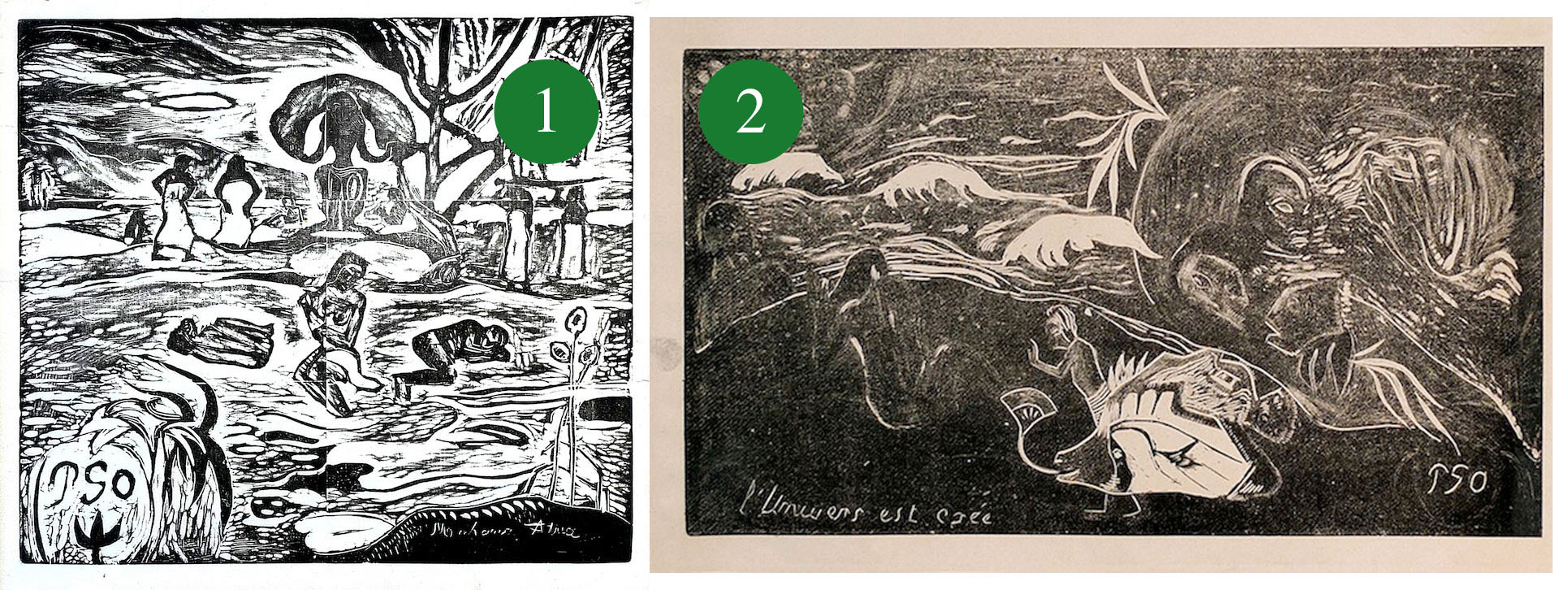
Nampeyo’s abstract drawings are strangely prescient of the abstractions of Euro-American modern art. This remains a large part of her mystique. In particular, critics have noted the comparison between Nampeyo’s abstractions of birds to Pablo Picasso and Georges Braque’s invention of Cubism, wherein an object is shown from multiple views at the same time.

Elmore’s observations complete the circle of influences, revealing a far more interconnected aesthetic evolution than we originally imagined. Check back next week for the continued tale of women artists in New Mexico, and connect with us on Facebook, Twitter and Pinterest for daily gallery news.

Nampeyo and Pablo Picasso- Matthews Gallery Blog*Images of Nampeyo’s pottery courtesy of Steve Elmore. Image of New Mexico petroglyph courtesy of Roch Hart.

NEW LANDSCAPES, NEW VISTAS: Early Pueblo Pottery

 Maria Martinez- Revolutionary San Ildefonso Potter- Matthews Gallery Blog- Photo Courtesy Steve ElmoreThe tale of our current exhibition NEW LANDSCAPES, NEW VISTAS: Women Artists of New Mexico begins twenty-three miles northwest of Santa Fe in the San Ildefonso Pueblo, population 458. The village has a long legacy of women potters, whose innovative ceramics techniques and designs inspired traditional and modernist artists who traveled to New Mexico in the late 19th and early 20th centuries. San Ildefonso is known as the epicenter of Pueblo pottery for good reason, as discussed by our guest blogger Steve Elmore. Elmore’s extensive pottery collection appears in the show. 

From 1875-1925, the polychrome or multicolored pottery produced at San Ildefonso reached a distinguished peak in the creative history of Pueblo pottery in the Southwest. Indeed, the residents of this small Pueblo village on the Rio Grande, northwest of Santa Fe, are direct descendants of the prehistoric Pueblo peoples of Mesa Verde and Chaco Canyon, whose tradition of potting spans a thousand years of human history.

Juana Leno- Acoma Polychrome Olla circa 1965- Matthews Gallery BlogJuana Leno, Acoma Polychrome Olla, c. 1965

San Ildefonso remains a small village. In 1900 there were only 30 households and in 1910 eight women are noted in the census as potters. We are fortunate to the know the names of these early potters. At the turn of the century, the most established potters were the husband and wife team of Martina Vigil (1856-1916) and Florentino Monotoya (1858-1918). Martina’s excellent molding combined with Florentino’s skilled painting produced many exquisite jars, including many fine large storage jars. Most are polychromes. Born in the 1850s, they were certainly potting by the 1870s if not earlier, and their joint efforts became a model for the production of San Ildefonso polychromes: a family effort involving both partners.

Traditionally, San Ildefonso pottery was decorated with black designs over a gray slip on a bulbous rounded form. The use of red clay was confined to the rim and a narrow band around the base of the jar. With arrival of the Santa Fe Railway in the region, potters at San Ildefonso began introducing red clay into the painted design on the main body of the jars. What prompted this introduction of red is unknown, but most scholars suggest that the arrival of thousands of travelers from the Eastern United States on the new railroad sparked the change. The tourists were eager to purchase pottery, and the polychrome wares of Acoma Pueblo quickly led the market. Acoma pottery, with precise four-color drawings on thin symmetrical jars, set the standards for the tourist trade.

Acoma Polychrome Olla- Matthews Gallery BlogAcoma Polychrome Olla

Certainly the innovators of their time, Montoya and Vigil might have been the first at San Ildefonso to use red with the black design. Perhaps a trader suggested it directly or merely showed them the brightly colored Acoma pieces which were their competition. By the early 1880s, hundreds of polychrome jars were being produced annually by the skilled potters of San Ildefonso for the tourist and museum trade. In response to this demand, and for almost fifty years thereafter, the potters of San Ildefonso created well molded pots traditionally decorated in black and red, whose size and beauty have not been surpassed.

Most traditional San Ildefonso water jars were painted with a mix of black geometric and floral patterns. With the addition of red paint, the drawings themselves begin to develop into elaborate flowing motifs covering the entire jar. The addition of red heightens the intensity of the black design and seems to urge the painter on to larger, more complex drawing. Previously simple designs are repeated in a larger and more intricate manner.

Nampeyo- Black on Red Hopi Seed Jar, c. 1900- Matthews Gallery BlogNampeyo- Black on Red Hopi Seed Jar, c. 1900

Beginning in the 1880s, an amazing array of both realistic and abstract bird motifs are also introduced along with other pictorial elements. I suspect Nampeyo‘s Sikyatki Revival in Hopi pottery influenced this emphasis upon bird designs. Her seed jar form was clearly copied repeatedly by at least one San Ildefonso potter along with her curvilinear drawings. The shape of the San Ildefonso vessels also evolves, from bulbous jars with small necks to elegant tapered vases with small bases and flared out rims: the classic “Tunyo” form. For fifty years of San Ildefonso pottery making, we can study the steady growth and development of an art form as it crests into a peak!

As Pueblo pottery enjoyed increasing popularity with the American public, many distinguished potters took the polychromes to new heights of creativity and expression. Among these were Maria (1887-1980) and Julian Martinez (1879-1940), Maria’s sister Anna and her husband Crescencio, and Tonita and Juan Roybal. Montoya and Vigil were perfect role models for the younger Martinezes who built upon their success.

Maria and Julian Martinez- San Ildefonso Blackware Plate circa 1925- Matthews Gallery BlogMaria and Julian Martinez, San Ildefonso Blackware Plate, c. 1925

This florescence of polychrome production was brought to an abrupt halt by the Martinezes’ invention of painted blackware around 1920. As Ruth Bunzel, author of The Pueblo Potter, observes, the attraction of the blackware is the minimized painted matte designs which emphasize a dominant polished slip. This subtle, monochromatic aesthetic is the exact opposite of the polychromes where intricate black and red designs were sharply contrasted against the midtone grey sip. In time the blackware style won the marketing war and by 1925 Bunzel could no longer find a single piece of polychrome ware in the village.

It is perhaps ironic that the Martinezes, known best for their blackware, themselves began as polychrome potters and were among the greatest of them. Although most of their output became blackware, Maria and Julian continued to produce occasional polychrome masterpieces up until Julian’s death in 1943. One cannot help but wonder if the bold artistic tradition of the polychrome pottery didn’t occupy a special place in their hearts. Martinez family members and other San Ildefonso potters have continued to produce the polychromes in limited numbers, particularly Popovi Da, his son Tony Da, and today, of course, Cavan Gonzales and Russell Sanchez.

Stay tuned for next week’s blog, where we’ll explore the links between early Pueblo pottery designs and modernist aesthetic innovations. See all of the artwork from NEW LANDSCAPES, NEW VISTAS on our homepage, and connect with us on Instagram, Twitter and Pinterest for daily gallery news. 

Hannah Holliday Stewart: Open-Ended Questions

Houston Chronicle's article on Hannah Holliday Stewart among her sculptures- Matthews Gallery

Our exhibition Hannah Holliday Stewart: An Artistic Legacy Rediscovered
runs through July 24, 2014

Two weeks ago, Houston Chronicle arts editor Molly Glentzer appeared at our door with a camera around her neck and notebook in hand. We figured that if anyone could find answers to our burning questions about Hannah Holliday Stewart’s life, it would be a reporter from the city where she rose to prominence. Last Sunday her findings appeared on the front page of the Chronicle. Early on in the article, Glentzer outlines the challenges she faced in her investigation:

Stewart left Houston without saying goodbye in 1987, just as the art scene she helped establish finally began to blossom. Few friends knew where the pioneering sculptor went: not her most recent art dealer, nor her agent, nor people who’d been close enough to visit her weekly.

The beautifully detailed report lays out the highlights of Stewart’s art career. As Glentzer discusses Stewart’s accomplishments—from monumental public art commissions to solo exhibitions at prestigious institutions across the nation—she’s careful to outline the sculptor’s struggle for recognition:

Her success came at a time when women sculptors were rare birds in a man’s world. […] it was a coup when Houston accepted “Atropos Key” …. in 1972. Stewart’s sculpture was unlike anything else in the landscape.

When it comes to Stewart’s departure from Houston and the art world, Glentzer arrives at the same conclusions we did. Stewart first returned to Birmingham to care for her ailing brother, and chose the Southwest as a part-time home because she was drawn to the “light and open landscape”. However, her move to Albuquerque in the final years of her life hinted at grander plans.

“How many people do you know who at age 80 would move 1,000 miles away, where they had no relatives, and build a house and studio with 20-foot ceilings?” [Stewart’s nephew Rusty Stewart] said. “She wasn’t out there to retire.”

Sculptor Hannah Stewart with her cocker-poodle, Major, in 1967- Houston Chronicle

Stewart with her cocker-poodle, Major, in 1967; Photo from Houston Chronicle

And so the answer to one question opens up another mystery. What did Stewart plan to do next? Her friend Dayton Smith told us she may have intended to complete some larger projects and return to Houston. In her sketchbooks from the 2000s Stewart often mentioned a series of sculptures called ‘Harmonic Resonance’ that may have been her forthcoming magnum opus.

Other friends of Stewart who have called or visited us since the appearance of the Chronicle article had few answers. An acquaintance who took yoga classes with Stewart for years said he’d lost contact with her in the 1980s before she left Houston. Another friend who stopped by told us vivid stories from Stewart’s life in Houston, but had just as many questions about her Southwestern exploits.

Last week we switched gears and teased out some of the mysteries of Stewart’s artwork. As Smith told Glentzer, Stewart “always preferred her work be talked about rather than her life.” Perhaps she didn’t want us to know what happened in Houston, or what her future plans were. In a note from Stewart’s sketchbook dated 2007, the 83-year-old artist wrote,”Tired—work to finish FINALLY!! Move on to others in series…”


1440x1440-5

Stewart with “Atropos Key” in Hermann Park; Houston Chronicle

Then, late last week, we received a call from Dr. Liam Purdon in Nebraska. We recognized his name from an elegant essay in Stewart’s files. In the 1980s, Purdon was working on a PhD in medieval literature from Rice University. He had seen Stewart’s “Atropos Key” sculpture in Hermann Park and was inspired to contact her.

“I literally stumbled upon it as I walked up the hill in the park,” he said. “You come over a rise and suddenly there it is in front of you. You’re startled by it, and the first question you ask yourself is, ‘What is it, and why is it here?’ When you read the name of it, then you suddenly realize it’s tied to Greek mythology.”

Purdon said the shock and curiosity he experienced was Stewart’s overarching goal. “She wanted to startle the observer into recollecting the whole mythology of a time when humans lived in harmony,” he explained. Stewart agreed to let Purdon observe her in the studio for three weeks, but kept a careful distance from the scholar. Later on they became good friends, and Stewart told Purdon her plans for the future.

“She felt that being in the Southwest… would be more supportive of her vision,” he says. “She loved the natural beauty of the Southwest. In some of her pieces, you do see it. In others you may not recognize it, but if you look at them for a while and meditate on them, it starts to become apparent.”

The two stayed in contact after Purdon took a teaching job at Doane College in Nebraska, and Stewart expressed interest in applying for public art commissions from the Nebraska Arts Council. When nothing materialized, Stewart was discouraged.

1440x1440-4

Stewart in 1960 with a sculpture she recently completed; Houston Chronicle

“I think that probably underscored the fact that she felt… uncomfortable revealing the work until the time was right, until we re-cycled into an age when we wanted to hear the narrative again,” Purdon said. “She would have to wait for a period of time to introduce her work to people who were ready to understand.”

That’s the closest we’ve gotten to answering the ever-shifting riddle of Stewart’s twilight years, but perhaps it’s enough to know that people are ready to hear the artist’s stories again. We’ve had a huge response from collectors in Houston who read the article, and art lovers from across the country have discovered her work as a result of the press coverage our show has received.

“In general, i think that people are wanting narrative more,” said Purdon. “It is so remarkably different, her work… That’s why it needs a narrative. There has to be a starting point.”

Come see Hannah Holliday Stewart: An Artistic Legacy Rediscovered through Thursday, July 24, and learn more about the artist on our website. Make sure to connect with us on Facebook, Twitter and Pinterest for more gallery news!

Hannah Holliday Stewart: The Messengers

Hannah-Stewart-Blog1

Candid shots of the secretive artist with her sculpture “Survivor“, Hannah Holliday Stewart archives

At last Friday’s opening for Hannah Holliday Stewart: An Artistic Legacy Rediscovered, art enthusiasts who saw the press coverage for the show came armed with a diverse array of questions.

“What was her family like?”

“Where did the full-scale models in those photos end up?”

“What’s ‘Ockum’s Razor‘ ?”

“Who’s Brad?”

Of course, the most frequent question was also Stewart’s most impenetrable mystery: why did the sculptor abruptly leave Houston, the launching point and epicenter of her nationally renowned artistic career? In our explorations of Stewart’s archives over the past few weeks, we’ve stirred up as many questions as answers.

Stewart was resolutely private, preferring to tightly focus on her artwork in interviews, exhibition materials and even her diaries. A catalog for her 1975-6 solo exhibition at the Houston Contemporary Arts Museum provides little more information on Stewart’s personal life than a birth year and a brief sketch of her educational history.

“Hannah was a very private person with a lot going on in her head,” close friend Dayton Smith told us. “I learned when to be around her and when not.”

Many of Stewart’s works, on the other hand, were always in the public eye. Kids lounged in the crook of her 11-foot sculpture in Hermann Park, students at St. Thomas University studied under her concrete-and-steel work on campus, and politicians were often photographed beside her “Libertad” fountain as they passed through the courtyard of Houston’s World Trade Center building.

For this week’s blog, we’re taking cues from Stewart’s ghost and focusing on the rich universe of her sculptures. Look below for new insight on five artworks, with behind-the-scenes materials from the artist’s files.

Hannah Stewart- Atropos Key Sculpture with Preparatory Sketch and Full-Scale Model- Matthews Gallery Blog


 Preparatory sketch for ‘Atropos Key’ and full-scale plaster model in Stewart’s studio

Atropos Key’ remains Hannah Holliday Stewart’s most well-known sculpture in Houston. Our maquette’s monumental counterpart stands on a hill in Hermann Park, measuring at 11 feet tall and 1,200 pounds. It debuted to much fanfare in 1972. From the Houston Chronicle’s August 11, 1972 edition:

“Out on the hill beyond Miller Theatre the blanket lollers who tune in to night concerts and shows from a horizontal position will have fresh ‘company.’ Overlooking the stage, now, is a bronze vertical figure.

‘Atropos Key,’ the title of which derived from one of the three fates in Greek mythology, was given to the city by Mrs. Patricia S. Woodward of Houston.

Strollers in the park may well stare at it and wonder what it all means…. Miss Stewart’s piece, in its new location, deserves the looking at, the ‘experiencing’ and the consideration of its meaning for you. Is it birth and, more encompassing than that, renewal?”

Hannah Stewart- Messenger Sculpture with Preparatory Sketch- Matthews Gallery BlogPreparatory sketch for ‘Messenger’ dated August 1973

Stewart’s ‘Messenger’ appeared on the cover of Houston Arts Magazine’s performing arts edition in October, 1982. Stewart was a fan of Russian composer Alexander Scriabin, and often listened to classical music in her studio.

A blurb inside the magazine traces the musical roots of ‘Messenger’:

“Sculptor Hannah Stewart… sees her work as an artist’s shorthand using symbols to communicate complex and abstract ideas— like a composer uses the symbols of musical notes to convey a spiritual idea in a sensuous form.

In Messenger… Stewart sees a parallel between the structure-strength-shapes interplay of her work and compositions played by Nathan Milstein and Bella Davidovich.”

Hannah Holliday Stewart- Ockum's Razor Sculpture with Original Typewritten Label- Matthews Gallery BlogOriginal typewritten label for ‘Ockum’s Razor’

Stewart was known for her mythology-inspired artwork, but that was far from the only subject she explored.

“Her studies in literature, mythology, metaphysics, esoteric philosophy, religion, science, astrology, dance and yoga suffuse her output, revealing in form and textures,” wrote Stewart’s friend Dayton Smith in a letter to the gallery.

In ‘Ockum’s Razor’, Stewart turned to science for inspiration. The title refers to a problem-solving principle devised by 14th century logician and Franciscan friar William of Ockham (c. 1287-1347). The principle states that “Entities should not be multiplied unnecessarily.” In other words, the simplest path to an answer is the best one.

Hannah Holliday Stewart- Maquette and Full-Scale Survivor Sculptures- Matthews Gallery blog


 Maquette and full-scale versions of ‘Survivor’

An article about Stewart’s work appeared in the local paper of her childhood home of Birmingham in 1994. In the story, Stewart explains the inspiration for ‘Survivor‘. From the August 1, 1994 edition of the Birmingham Post-Herald:

“I was teaching welding at the university, and I’d go to the welding studio and talk to friends of mine, and there were a lot of men coming down from Detroit who’d lost their jobs, and they were so tense and angry about having to reform themselves, to learn to do welding or something else at the age of 55, after having been an auto worker. I reacted to that force within them, and the drastic changes people have to make to survive.”

 Hannah Holliday Stewart- Einsteins Song and Polaroid of Hannah Holliday Stewart working on the sculpture in her studio- Matthews Gallery blog

Polaroid of Hannah Holliday Stewart in her Albuquerque studio working on ‘Einstein’s Song’

Stewart was 80 years old in the Polaroid above and still hard at work on her bronze forms, though she never exhibited again in her lifetime.

Here’s an excerpt from a typewritten artist statement Stewart wrote a year later:

“For me, the image should be an intellectual and emotional symbol plucked from the fringe of the imagination, it should suggest a classic truth and not be confused with social comment. The image at its most successful strikes a common chord of sensations in every viewer, and yet leaves each viewer with his/her own particular interpretation.”

See Hannah Holliday Stewart: An Artistic Legacy Rediscovered through July 18, and connect with us on Facebook, Twitter and Instagram for more information on the artist.

Hannah Holliday Stewart: Letter from Houston

Hannah Holliday Stewart in her Houston Studio- Matthews Gallery

Our exhibition Hannah Holliday Stewart: An Artistic Legacy Rediscovered
begins with an opening reception on Friday, July 4 from 5-7 pm

“In a day in which so many things in Art are merely exercises in Media and devoid of any real significance, it is refreshing to discover an expression which transcends the cerebral prison of its own time and manifests itself in forms poetically germane to a more cosmic significance,” wrote Dayton Smith, with poetic flair of his own, in a typewritten statement dated March 22, 1991.

Smith was referring to the sculptures of his close friend Hannah Holliday Stewart (1924- 2010), whose monumental forms caught the eye of the nation in the 1970s and 80s. As chronicled in our last blog post, Smith and Stewart met in Houston in the late 1960s as Stewart’s career was taking off. He assisted Stewart in various ways for a number of years, and watched as the artist found success in galleries and museums across the country.

More from the note:

Her art mirrors a consciousness expanded beyond the pragmatic doctrinal limits of our milieu. Her commissions stand to prick our higher sensibilities in a world which, it would seem, affords little for the pursuit of what may be a neglected cosmic heritage. In an age in which “symmetry does not balance make” (but which, nevertheless seems to be the applied solution for everything), her bold compositions embody a superbly balanced abstract expression of form and function suggestive of the anthropomorphic with its attendant graces and imperfections.

More than two decades later, Smith admits with a chuckle that the write-up can be a bit “over the top”, but it survives as an illuminating statement about an artist whose cosmic creations were at times misunderstood. After we contacted him, Smith was inspired to return to the typewriter—or, keyboard—and draft another statement on Stewart’s work. His musings provide new insight into the life and artwork of the dynamic sculptor.

Hannah Holliday Stewart in her Houston studio- Matthews Gallery

From Dayton Smith:

Hannah Remembered

It can be said with clarity and confidence that the monumental sculptural work of Hannah Holliday Stewart is cosmic in scope and spiritual in dimension and process. At the peak of her production in the 1970s and ’80s, there emerged from her studio great plaster forms, many well over ten feet in height. These graceful mammoths, cast in bronze, would weigh hundreds to thousands of pounds, and command public spaces in Houston and other cities. A major exhibition of these large plasters was mounted in January 1976 at Contemporary Arts Museum Houston, and another in the ’80s at One Houston Center. In the 1990s, she established studios in Flagstaff, Arizona, and later in Birmingham, Alabama, and finally in Albuquerque.

Born in 1924 in Marion, Alabama to a prominent family, she studied art in Alabama and Georgia (BFA), and at Cranbrook Academy of Art in Michigan (MFA); studied ceramics in California with the legendary Bauhaus potter Marguerite Wildenhain; worked in foundries in Florida and Mexico; moved to Texas to teach at Museum of Fine Arts Houston, the University of Houston, and the University of St. Thomas. Her notable public works include Atropos Key, installed in 1972 on the hill at Houston’s Miller Outdoor Theatre in Hermann Park; Libertad, a smoothly elegant birdlike bronze at World Trade Center Houston; works in Samuels Park in Dallas and New Harmony in Indiana; and Passage, at University of St. Thomas Houston. Her public commissions are claimed as example of landmark achievement by women in the arts. Respected among Houston architects and adept in various media she developed sand-blasted and sand-cast relief panels for specific architectural settings. Her works of smaller scale are to be found in notable private collections.

Her studies in literature, mythology, metaphysics, esoteric philosophy, religion, science, astrology, dance and yoga suffuse her output, revealing in form and textures. Her earlier smaller works reflect ineffable humanity, humor, elegant charm and always superb craftsmanship. She was disciplined, intelligent and well-read, possessed of an intense work ethic, compassionate and understanding and encouraging of others, and an inspiring teacher, respected and loved by friends in business, academia and the arts. Whether attired in her usual studio denim or occasional Dior, she moved among interesting people and was an accomplished host and gourmet. Music was her creative keynote and the atmosphere mystical, always stimulating and, on occasion, convivial. On so many occasions when I would assist her in some project: photographing, gallery installation and lighting, foundry, studio, even building repair, I was aware that I was only facilitating much greater work. I think she really did come to ‘see’ the wind, and must have stood in awe of that which materialized from her consciousness and hands. I can still hear her warm southern voice and motto – Nil desperandum!, and her memory, towering as her work, is quite, quite treasured.

D.A. Smith
Public Broadcasting, University of Houston, retired

Make sure to attend the opening reception of our exhibition Hannah Holliday Stewart: An Artistic Legacy Rediscovered on Friday, July 4 from 5-7 pm. To learn more, check out our previous blog post and our Hannah Holliday Stewart artist page. For daily gallery news, connect with us on Facebook, Twitter and Pinterest.

Hannah Holliday Stewart in her Houston studio- Matthews Gallery

HANNAH HOLLIDAY STEWART: Cosmic Mysteries

Hannah Holliday Stewart in her studio- Matthews Gallery

It’s not a stretch to call Hannah Holliday Stewart‘s (1924-2010) sculptures cosmic. In the artist’s heyday, the bronze forms that emerged from her Houston studio were often over 10 feet tall and thousands of pounds. She aspired to create physical manifestations of complex ideas in science, mythology and other fields, a system of “pure [abstract] symbols as constant as numbers and letters of the alphabet,” as Paul Klee said in one of Stewart’s favorite quotes. The themes she explored were so vast that Stewart’s work was at times cosmically misunderstood.

In preparation for our posthumous solo exhibition of Stewart’s work this July, we’ve been digging through the sculptor’s carefully organized personal files. One folder marked “Press” holds a 1994 newspaper article from Stewart’s childhood home of Birmingham. By that time Stewart had lived far away from Alabama for a lifetime, building a reputation in Texas and the Desert Southwest as one of the first female sculptors to win competitive public art commissions. “Ms. Stewart talks of such abstract notions as harmony and energy and spiritual awakening,” puzzled the Birmingham Post-Herald reporter. Throughout the rest of the article Stewart scratched out or rewrote swaths of the writer’s analysis in black ink, clarifying concepts and modifying terms. “[I] always go back to classical order and laws,” she scribbled at the bottom.

Hannah Holliday Stewart- Artist Process 1- Matthews Gallery

Stewart was born in 1924 in Marion, Alabama. She studied art in Alabama and Georgia for her BFA, and completed her MFA at Cranbrook Academy of Art in Michigan. After working at foundries in Florida and Mexico, she landed a teaching job at the Museum of Fine Arts in Houston and later at the University of Houston.

By the 1960s Stewart’s work had grown to a monumental scale, and a passionate group of Texas art enthusiasts rose to support it. In an era when female sculptors had to fight for recognition, Stewart’s bronze monoliths were popping up all over Houston—and beyond. In 1962 a swooping, Brancusi-esque bird form called “Libertad” appeared in the courtyard of Houston’s World Trade Center, and in 1972 an 11-foot-tall sculpture titled “Atropos Key” landed on a hill in Hermann Park. A commission for a monumental work in Dallas’ Samuels Park spread her name across the state.

“I found myself devoted to her work very early, I think,” says Dayton Smith, who befriended Stewart around 1969 when he was working for a Houston photography studio. “I realized the significance of it, the weight of it, shall we say.” Over the next few years Smith helped Stewart in various ways, photographing her artwork, transporting sculptures, and organizing a 1973 solo exhibition at Houston’s Jamison Gallery on Hermann Park.

Hannah Holliday Stewart- Artist Process 2- Matthews Gallery

“As I got to know her, I became aware that she was a very literate person, very intelligent,” says Smith. “Her work really did relate to what she encountered in her learning.” Smith noted that Stewart explored many fields of knowledge, from science and architecture to music and mythology, allowing concepts in each field to influence her three-dimensional objects. In 1975 and 1976 she mounted her first major solo show at the Houston Contemporary Arts Museum, exhibiting a series of large plaster models (including “Adam’s Rib“, from the photographs in this blog post) that were based on smaller bronze maquettes. But even as Stewart’s legend grew, Smith says misconceptions about her work persisted.

“The word spiritual often comes to mind, but spiritual is such a misunderstood term in our society,” explains Smith. “If you look at the word itself, the Latin root of it is ‘spiritus’. That means ‘wind.’ We can see the wind when it carries things, when it moves things.” Stewart worked to bring the invisible—a musical note, kinetic energy or a wisp of air—into the physical world.

Hannah Holliday Stewart- Artist Process 3- Matthews Gallery

More mysterious still to many of Stewart’s friends in Houston was her abrupt disappearance from the art world. Smith last saw Stewart in the late 1980s, when she was teaching at St. Thomas University and exhibiting in an impressive array of art institutions across the country. A few years later Stewart packed up and moved away from Houston, settling in Arizona, Alabama and then Albuquerque, New Mexico. She never exhibited her artwork publicly again. Why would a woman who once showed at the Smithsonian Institution, the Getty Museum and prominent galleries in New York, New Orleans and many other cities suddenly leave it all behind?

Smith has a few hunches. Stewart often said that she was inspired by the Desert Southwest, and sent Smith an image of her working in her new studio in Flagstaff. The move to Birmingham probably had to do with the declining health of Stewart’s brother and two sisters, who lived in the area. When it came to her art career, Smith thinks Stewart may have needed room to spread her wings and find new inspiration.

“Once we were talking about something she’d observed,” recalls Smith. “That sometimes to make it in your own town you have to leave and come back with something big. That people could get too used to you, but that perhaps you could come back and be accepted. Maybe she was planning that.”

Follow our blog in the coming weeks as we unravel the mysteries of Hannah Holliday Stewart’s life and artwork, and make sure to attend the opening of HANNAH HOLLIDAY STEWART: An Artistic Legacy Rediscovered on July 4 from 5-7 pm.  Also pick up the July/August issue of American Fine Art Magazine to read more about the show, and follow our investigations on Facebook, Twitter and Instagram.

SCULPTOR’S PROCESS: Frank makes a fountain

Frank Morbillo- Sculptor- Matthews Gallery

It all started with a sculpture you may recognize if you’ve been to Matthews Gallery in the past few years. Frank Morbillo‘s ‘Complement’ was a fountain that stood outside our building for a time, enchanting Canyon Road tourists with its elegant lines and soothing sounds:

Frank Morbillo- Complement- Matthews Gallery

“It was inspired by the figure, a relationship between people or entities,” says Frank. “The two sides have a connection in terms of how the line of one complements the line of the other.”

Two gallery visitors who were particularly charmed by the sculpture kept it in mind as they built their new home. Nearing the end of construction, they got in touch with Frank and asked him to create a similar piece for their front entryway. Just like the two pillars of the sculpture, Frank says the commission was all about maintaining a carefully balanced dynamic.

“During the course of the commission, I am constantly sending images that are going back and forth between myself and my client,” the artist explains. “Six times throughout this process or more, we were exchanging information and tweaking and getting approval.”

Below you’ll see images from their correspondence, starting with a cardboard model and ending with the stainless steel fountain in its beautiful new space. Follow Frank on his artistic journey…

Frank Morbillo- Artist Process- Matthews Gallery Blog


First, Frank marked up an image of the original sculpture (left). ‘Complement’ was larger than his clients wanted, so he adjusted the scale and used the new measurements to resize some cardboard cutouts from the original project (center). The new, smaller cardboard pieces came together to create a full-scale model of the new piece (right).

“When I’m building it in the studio, it’s important to have the model at the level that it’s going to be viewed. In the clients’ home, it’s going to be up a few steps from the ground level. I elevated it to make sure the proportions were working. I want there to be a good interaction of elements.”

“Different materials make the water flow differently. A rough material creates some surface tension, while a slick material will let the water run very fast.”

 Frank Morbillo- Sculpture Process- Matthews Gallery blog
Next, Frank manipulated images of the cardboard model in Photoshop to show the flow of the fountain. The blue line you see on the edited photograph is where the water will fall on one side. The white piece of cardboard under the sculpture represents its base, which presented a unique problem.

“From the very beginning, I had to be very careful about water flow because I had a limited landing pad for the water to fall. The basin was much smaller and narrower than in the original sculpture.”

Frank Morbillo- Artist Process- Matthews Gallery Blog

After tweaking the cardboard model, Frank took it apart and traced the pieces on stainless steel (left). He used tack welding to create a rough version of the piece (center and right). Tack welds allowed Frank to alter the form based on his client’s feedback.

 “The dark buttons going up the edge are the tack welds. The tack weld is very strong; a series of four down the side can hold it mostly in place. Once you’re at this step, you want to make sure that everything is right. Afterwards, there are several days worth of work to make the elements seamless.”

Frank Morbillo- Artist Process- Matthews Gallery Blog


It took about a week to create the shiny sculpture you see on the left. The two red arrows mark openings for the water. Next Frank worked on the base of the sculpture, installing a pump and carefully feeding the electrical cord through a riser tube that holds it above the water (center and right).

“All of those edges have been welded and sanded. This is my first rough pass on putting the finish on the metal.”

“One of the things you look for is the pump’s capacity to go vertical. I size it at a slightly greater capacity than my need is going to be so that I’m sure the water will reach the top.”

“The water enhances and adds to the whole scheme of the project. By placing the pump on the foam pads, it reduces noise vibration from the pump, allowing the viewer to focus on the sound of the fountain.”

Frank Morbillo- Sculpture Process- Matthews Gallery Blog


Frank cut mesh and steel plates to cover the base and prevent splashing. The slots you see around the sides of the sculpture are one of Frank’s latest innovations.

“Because of the size of the basin, I have less latitude with what the water does and how it falls. I knew I had to create a slot around the base of both sculptures so as the water falls it goes into this slot. It worked really well, and I learned something from it. It’s changed how I deal with water capture in a small basin.”

“In every sculpture project, there’s always the opportunity to say, ‘What can I do different in the future?’”

Frank Morbillo- Artist Process- Matthews Gallery Blog

Careful tests of the water flow followed. Frank got the final approval from the client and shipped it.

“There’s a lot of structure in there that you’re not seeing that supports all of the different elements. When all of this is said and done, you don’t see any of that but it’s all happening because of it.”

“I took a good long look at it and liked what I was seeing in terms of how I thought it would look on site.”

And PRESTO!

Frank-Morbillo-SculptureProcessFinal

Frank’s clients sent back images of the piece in its new home, and the sculptor couldn’t be happier.

 “The experience of walking up the steps and around the sculpture must be pretty awesome.”

“It’s interesting, the sculpture is the only thing with curves in the space. Everything else is really hard and geometric. That’s cool that it’s really different than anything else line-wise in the space.”

“When you can have fun going through the process of doing it, for me that’s where my thoughts go when I’m working. There’s a lot of opportunities to have fun.”

“When I saw the contemporary design of the house, I said, ‘Great project.’ I’m really happy that this sculpture became part of it.”

See more of Frank Morbillo’s artwork on the Matthews Gallery website, and connect with us on Twitter, Facebook and Instagram for daily gallery news.


THE STORYTELLER: From petroglyphs to pinewood

Roch Hart- Fine Furniture- Matthews Gallery

 Roch Hart with his pie safe “The Storytellers”

“Furniture is art,” says Roch Hart. It’s a credo the Albuquerque fine furniture maker repeats every time he brings a new creation to the gallery. In Hart’s case, it’s true: each hand-carved piece of sugar pine is as unique as a painting on our wall. This is nothing you’d find at IKEA.

Check out our blog post chronicling Roch’s journey from Spanish Colonial furniture enthusiast to bona fide sculptor, and then delight in the details of his latest creation. This pie safe, dubbed “The Storytellers“, holds quite a few tales…

SPIRAL

Roch Hart- Fine Furniture Detail- Matthews Gallery

Hart often draws inspiration from New Mexico petroglyphs.

“A spiral can mean a lot of different things depending on its context, but here it represents eternity or travel,” Hart says. In particular, this symbol refers to a journey from the depths of the earth.

FACES

Roch Hart- Fine Furniture Detail- Matthews Gallery

These symbols on the sides of the pie safe tend to appear together in glyphs. The one on the left with its mouth shut tight is the “listener”, and the one on the right is the “storyteller”. It’s the yin-yang of cultures that depend on the voice to pass down vital knowledge.

The designs surrounding the faces also have an important meaning. Just like the Zia on the New Mexico state flag, they represent the sacred, pervasive number four: four compass directions, four seasons, four stages of a person’s life.

PATTERNS

Roch Hart- Fine Furniture Detail- Matthews Gallery

“This is mimicking the Navajo rugs,” explains Hart. “I thought it would be a great border for the faces.”

Hart uses white ash to make his patterns bolder, rubbing it into the cracks by hand atop a layer of shellac. The finishing touch is a light coat of wax.

JOINTS

Roch Hart- Fine Furniture Detail- Matthews Gallery

Near the beginning of his journey to furniture mastery, Hart visited the Nicolai Fechin House in Taos. Fechin was a Russian painter and carpenter who moved to New Mexico in 1923 and purchased a small adobe home that he would greatly expand over the years. The home is now a museum, and when Hart visited to study the furniture he had a chance encounter with Fechin’s daughter Eya. She taught him about the different joints that her father used, including the sliding dovetail joint pictured here.

“That changed my life,” Hart says.  “I looked at [Fechin’s work] and said, ‘I can do anything. Nobody told him what to do.'”

WINDOW

Roch Hart- Fine Furniture Detail- Matthews Gallery

The grid Hart uses as a window for the pie safe doesn’t have an age-old legend behind it. It’s one of Hart’s signature designs that appears in many different manifestations in his work. Myriad influences come together in Hart’s exquisite furniture, but each piece is imbued with his unique sensibility.

See more of Roch’s creations on his artist page, and connect with us on Facebook, Twitter and Instagram for daily gallery updates. Also, check out our upcoming exhibition FOUR CENTURIES: European Art from 1600 to 1950, opening June 13!

NOT A POP ARTIST: Five Sides of Jim Dine

Jim Dine Rainbow- Matthews Gallery Blog


78-year-old artist Jim Dine has earned his place in any good post-war art history textbook. Picking exactly when to spotlight the artist must be a difficult task for scholars. The painter, sculptor, illustrator, printmaker, stage designer and performance artist has a way of diverging from the status quo and ending up at the forefront of new art movements. Just when things get established, he’s off on his own again.

A mixed media drawing  by Dine recently found its way to Matthews Gallery, so we took the opportunity to explore 5 manifestations of the chameleonic artist:

Fluxus Performer

Dine grew up in Cincinatti and got his BFA from Ohio University. When he arrived in New York in 1958, the art world was fixated on a type of work you couldn’t sell in a gallery. Some critics called them “wacky nightmares“, others described them as “a three-ringed circus with undertones of group therapy“, but Dine and his friends Claes Oldenberg, Allan Kaprow and John Cage dubbed their performance art pieces “Happenings”.

Happenings were designed to be as ephemeral and unpredictable as day-to-day life—but a little weirder. Battles between ballerinas and roller-skaters, reenactments of the Lincoln assassination, bikini stripteases and blue ice cream feasts were all passionately performed, often in rapid sequence. Whether you call it though-provoking or senseless, the Fluxus movement was one-of-a-kind. For Dine, all the world was a stage until…

Pop Progenitor

Jim Dine- Robe Diptych- Matthews Gallery Blog


Jim Dine, Red and Black Diptych Robe, 1980

In 1962, Dine’s paintings appeared alongside work by Andy Warhol, Roy Lichtenstein, Ed Ruscha and others in the Pasadena Art Museum’s show New Painting of Common Objects. Curated by Walter Hopps of Ferus Gallery (site of Warhol’s first solo show), the exhibition was a seminal moment for a new movement: Pop Art.

Dine’s inclusion in the exhibition made perfect sense at the time. He was experimenting with serial imagery of familiar objects and symbols like bathrobes, hearts and tools. However, the artist’s expressive style and often tender subject matter clashed with the postmodern angst of other Pop progenitors. Soon enough, he was plotting his escape…

Modernist

Jim Dine- Paris- Matthews Gallery Blog

Jim Dine, Paris Smiles in Darkness, 1976

Dine moved to London in 1967, a strange decision considering his controversial history with the United Kingdom. A year before his solo exhibition at London’s Fraser Gallery was raided by police and the owner was fined for showing “indecent” images.

The artist defiantly continued to his relationship with Fraser and used his time in Europe to study the work of Van Gogh, Picasso, Matisse and other modernists. In 1971 he returned to the United States, ready to chart a new course…

Neo-Expressionist

Jim Dine- A Lady Sitting Drawing- Matthews Gallery Blog

 Jim Dine, A Lady Sitting, Mixed Media, 1975

Minimalism was en vogue when Dine arrived in New York, but the artist wasn’t interested. Instead he focused on figure drawing, refining his skills in various mediums and earning a reputation as a master draftsman. The mixed media drawing in our collection is from this period. A stunningly realistic face painted in oil is framed by confident charcoal marks and a glowing crayon color field.

In the years to come Dine’s figurative work would mark him as a founder of Neo-Expressionism, but critics could never assign the artist a particular label for long…

Modern Individualist

2008_JimDine_23220011

Installation shot, Jim Dine: Poet Singing (The Flowering Sheets)

 Perhaps Dine’s artistic identity is best summed up by MoMA:

This commitment to a personally invested, image-dictated content and a continuing interest in the technical and expressive potential of every medium has characterized Dine’s work as a whole. Thus, Dine has often been out-of-step with the major movements of the post-World War II period and must be considered a modern individualist.

It’s a bit of a non-title, but Dine defies labels at every turn. The almost-octogenarian is still working his way into new chapters of art history.

Check out our website for more on Jim Dine, and connect with us on Facebook, Twitter and Flickr for to-the-minute gallery news.

CURATE THIS, CURATE THAT: Place your votes!

Collectors-Choice-Social1

The selection process for our social media-curated show COLLECTOR’S CHOICE is underway, and fans on Facebook, Instagram, TwitterTumblr and other networks have placed their votes. It’s time for some tie breakers on WordPress! Check out the match-ups below and vote for your favorites in the comments section. From January 31 to February 5, we’ll unveil your selections in the gallery and online.

JAMIE CHASE

Jamie Chase- Collector's Choice- Matthews Gallery blog

ROUND 1! Jamie Chase is known for his figurative work like image #1, and also his abstracted landscapes like #2. Which one should appear in the show? Take the curatorial reins!

WILLIAM LUMPKINS

William Lumpkins- Collector's Choice Show- Matthews Gallery Blog

Do you prefer William Lumpkins‘ careful watercolor brushstrokes (#1) or experimental wild felt-tip pen marks (#2)? Read more about the influential Santa Fe modernist here before you decide…

KATE RIVERS

Kate Rivers- Collector's Choice Show- Matthews Gallery

Curate this! Should we feature a Kate Rivers book collage in the show, or one of her nests? Read about her mixed media work in this blog post, and vote for #1 or #2 in the comments.

HANNAH HOLLIDAY STEWART

Hannah Holliday Stewart- Collector's Choice- Matthews Gallery Blog

These tall, spindly bronzes might be very different, but they’re both by powerhouse feminist sculptor Hannah Holliday Stewart. Figurative or abstract? Curate that!

PAUL GAUGUIN

Paul-Gauguin-Collectors-Choice

Two Tahitian myths inspired these woodblock prints by Paul Gauguin. Which do you prefer? Read about them in this blog post, and vote now!

Thanks for participating in COLLECTOR’S CHOICE! To place your vote on other social networks, connect with us through the links on our About Page.