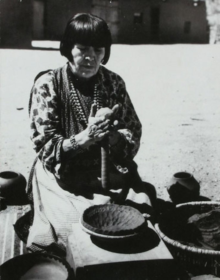
 The tale of our current exhibition NEW LANDSCAPES, NEW VISTAS: Women Artists of New Mexico begins twenty-three miles northwest of Santa Fe in the San Ildefonso Pueblo, population 458. The village has a long legacy of women potters, whose innovative ceramics techniques and designs inspired traditional and modernist artists who traveled to New Mexico in the late 19th and early 20th centuries. San Ildefonso is known as the epicenter of Pueblo pottery for good reason, as discussed by our guest blogger Steve Elmore. Elmore’s extensive pottery collection appears in the show.
From 1875-1925, the polychrome or multicolored pottery produced at San Ildefonso reached a distinguished peak in the creative history of Pueblo pottery in the Southwest. Indeed, the residents of this small Pueblo village on the Rio Grande, northwest of Santa Fe, are direct descendants of the prehistoric Pueblo peoples of Mesa Verde and Chaco Canyon, whose tradition of potting spans a thousand years of human history.
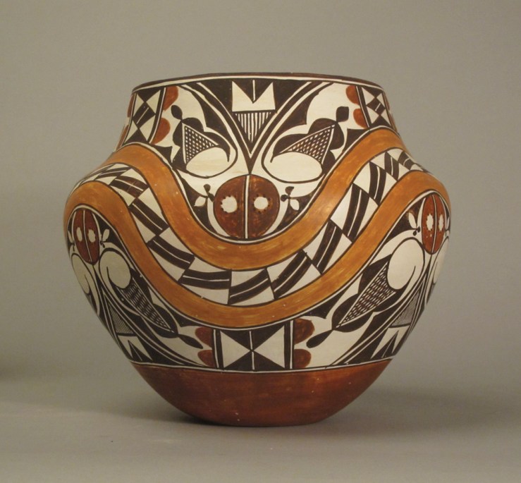 Juana Leno, Acoma Polychrome Olla, c. 1965
San Ildefonso remains a small village. In 1900 there were only 30 households and in 1910 eight women are noted in the census as potters. We are fortunate to the know the names of these early potters. At the turn of the century, the most established potters were the husband and wife team of Martina Vigil (1856-1916) and Florentino Monotoya (1858-1918). Martina’s excellent molding combined with Florentino’s skilled painting produced many exquisite jars, including many fine large storage jars. Most are polychromes. Born in the 1850s, they were certainly potting by the 1870s if not earlier, and their joint efforts became a model for the production of San Ildefonso polychromes: a family effort involving both partners.
Traditionally, San Ildefonso pottery was decorated with black designs over a gray slip on a bulbous rounded form. The use of red clay was confined to the rim and a narrow band around the base of the jar. With arrival of the Santa Fe Railway in the region, potters at San Ildefonso began introducing red clay into the painted design on the main body of the jars. What prompted this introduction of red is unknown, but most scholars suggest that the arrival of thousands of travelers from the Eastern United States on the new railroad sparked the change. The tourists were eager to purchase pottery, and the polychrome wares of Acoma Pueblo quickly led the market. Acoma pottery, with precise four-color drawings on thin symmetrical jars, set the standards for the tourist trade.
Certainly the innovators of their time, Montoya and Vigil might have been the first at San Ildefonso to use red with the black design. Perhaps a trader suggested it directly or merely showed them the brightly colored Acoma pieces which were their competition. By the early 1880s, hundreds of polychrome jars were being produced annually by the skilled potters of San Ildefonso for the tourist and museum trade. In response to this demand, and for almost fifty years thereafter, the potters of San Ildefonso created well molded pots traditionally decorated in black and red, whose size and beauty have not been surpassed.
Most traditional San Ildefonso water jars were painted with a mix of black geometric and floral patterns. With the addition of red paint, the drawings themselves begin to develop into elaborate flowing motifs covering the entire jar. The addition of red heightens the intensity of the black design and seems to urge the painter on to larger, more complex drawing. Previously simple designs are repeated in a larger and more intricate manner.
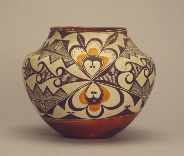
 Nampeyo- Black on Red Hopi Seed Jar, c. 1900
Beginning in the 1880s, an amazing array of both realistic and abstract bird motifs are also introduced along with other pictorial elements. I suspect Nampeyo‘s Sikyatki Revival in Hopi pottery influenced this emphasis upon bird designs. Her seed jar form was clearly copied repeatedly by at least one San Ildefonso potter along with her curvilinear drawings. The shape of the San Ildefonso vessels also evolves, from bulbous jars with small necks to elegant tapered vases with small bases and flared out rims: the classic “Tunyo” form. For fifty years of San Ildefonso pottery making, we can study the steady growth and development of an art form as it crests into a peak!
As Pueblo pottery enjoyed increasing popularity with the American public, many distinguished potters took the polychromes to new heights of creativity and expression. Among these were Maria (1887-1980) and Julian Martinez (1879-1940), Maria’s sister Anna and her husband Crescencio, and Tonita and Juan Roybal. Montoya and Vigil were perfect role models for the younger Martinezes who built upon their success.
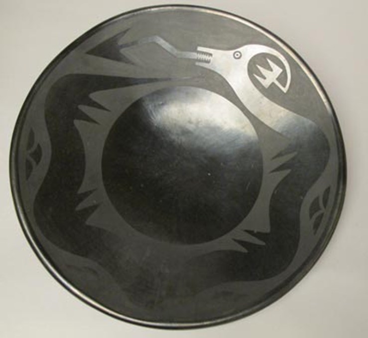 Maria and Julian Martinez, San Ildefonso Blackware Plate, c. 1925
This florescence of polychrome production was brought to an abrupt halt by the Martinezes’ invention of painted blackware around 1920. As Ruth Bunzel, author of The Pueblo Potter, observes, the attraction of the blackware is the minimized painted matte designs which emphasize a dominant polished slip. This subtle, monochromatic aesthetic is the exact opposite of the polychromes where intricate black and red designs were sharply contrasted against the midtone grey sip. In time the blackware style won the marketing war and by 1925 Bunzel could no longer find a single piece of polychrome ware in the village.
It is perhaps ironic that the Martinezes, known best for their blackware, themselves began as polychrome potters and were among the greatest of them. Although most of their output became blackware, Maria and Julian continued to produce occasional polychrome masterpieces up until Julian’s death in 1943. One cannot help but wonder if the bold artistic tradition of the polychrome pottery didn’t occupy a special place in their hearts. Martinez family members and other San Ildefonso potters have continued to produce the polychromes in limited numbers, particularly Popovi Da, his son Tony Da, and today, of course, Cavan Gonzales and Russell Sanchez.
Stay tuned for next week’s blog, where we’ll explore the links between early Pueblo pottery designs and modernist aesthetic innovations. See all of the artwork from NEW LANDSCAPES, NEW VISTAS on our homepage, and connect with us on Instagram, Twitter and Pinterest for daily gallery news.


