FOUR CENTURIES: Monnoyer’s Mark

Still life attributed to Jean-Baptiste Monnoyer- Matthews Gallery blog

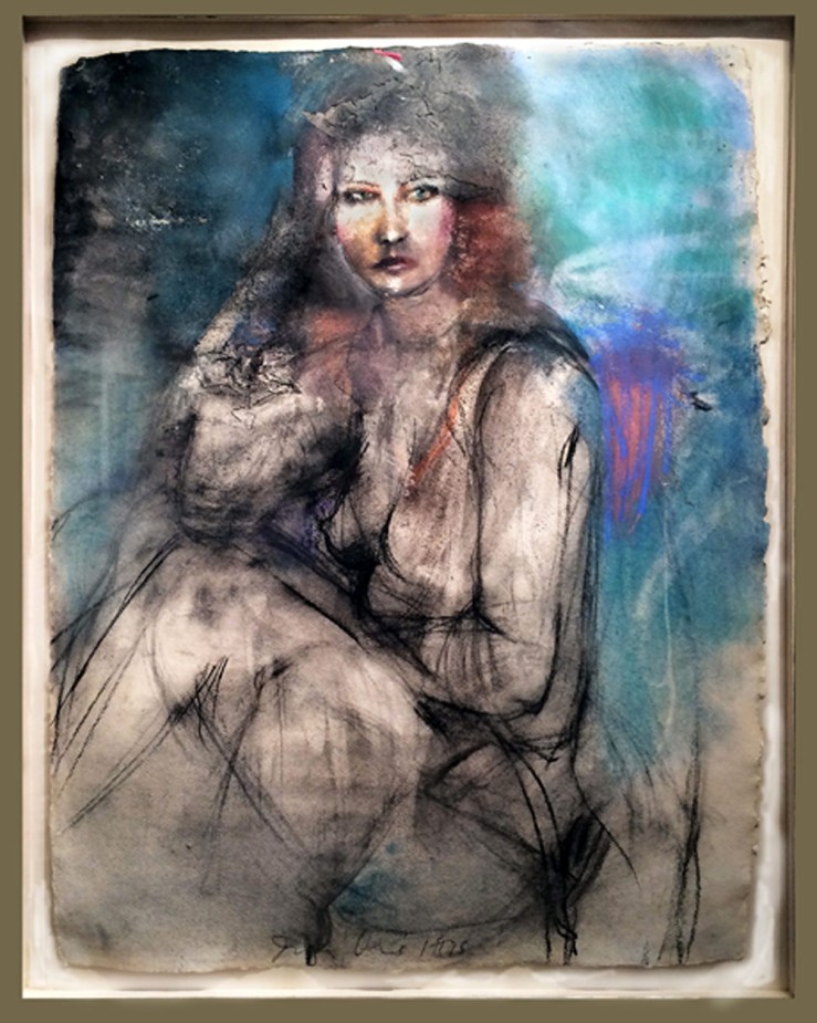
We discovered this still life at the preview of a Santa Fe estate sale. It was tucked in a dark upstairs corner of the house, far from the Picasso print and treasure trove of art books on prominent display in the living room. Lawrence lingered for a while to take in the flamboyant bouquet with its rich rosy tones. There was an excited glint in his eye.

A few months later, the painting has found a home under the glowing lights of our European art room. We know a lot more about it now than when it first caught Lawrence’s fancy. It’s attributed to Jean-Baptiste Monnoyer (1636-1699), a 17th century Franco-Flemish painter who wielded his brush for Louis XIV. Its siblings hang in some of France and England’s most famous estates.

Our adobe art abode is a very different venue, but this 300-year-old artwork gives us the opportunity to transport gallery visitors across the sea and through the ages. Look below to chase Monnoyer through the palaces where he left his mark, and don’t miss the painting’s debut at our opening for FOUR CENTURIES: European Art from 1600 to 1950 on Friday, June 13 from 5-7 pm.

Hôtel Lambert- Site of artwork by Jean-Baptiste Monnoyer- Matthews Gallery Blog

Our first stop is the Hotel Lambert on the Ile Saint-Louis, site of Monnoyer’s first Parisian commission in 1650. The artist grew up in Lille, France and trained in Antwerp, but it was the lavish estates in and around Paris that claimed his considerable interior decorating talents. Monnoyer’s floral designs in the grand mansion would delight its many owners and guests for centuries to come, from a famous Polish political salon to Voltaire, Chopin, Balzac, Delacroix and Dali. Unfortunately, the Hotel Lambert was badly damaged in a 2013 fire and is under renovation.

Chateau de Marly- Site of artwork by Jean-Baptiste Monnoyer-  Matthews Gallery Blog


Artist Charles Le Brun, who painted a series of renowned ceiling frescoes at the Hotel Lambert, brought Monnoyer along for a commission at Louis XIV’s Chateau de Marly. The (relatively) small country estate was the king’s escape from the more rigid world of Versailles, and aristocrats fiercely battled for a chance to stay there. Alas, the twelve pavilions that flanked the water and their intricately adorned interiors are long gone, but the commission launched Monnoyer into a new stratosphere.

Palace of Versailles- Site of artwork by Jean-Baptiste Monnoyer- Matthews Gallery Blog

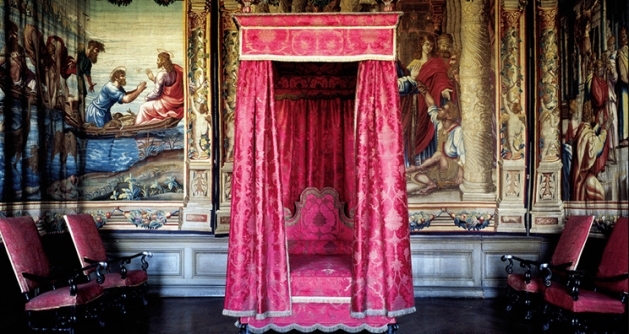
Monnoyer worked with Le Brun once again on the ornamentation of the Palace of Versailles. For this and other high profile royal projects, he developed a style that was far removed from his training in the subdued still life painting techniques of the Low Countries. The bold, ornamental approach is in full force in our still life, recalling the spectacular garlands of flowers he painted on the ceiling of the Queen’s pavilion at the Chateau de Vincennes. Monnoyer also made reference sketches and etchings for French tapestry workshops, greatly influencing European decorative styles for years to come.

Boughton House- Site of artwork by Jean-Baptiste Monnoyer- Matthews Gallery Blog

A commission from the Montagu House in London drew Monnoyer away from Paris in 1690. He adorned dozens of panels with fruits and vegetables and painted several portraits, some of which now reside in the state rooms of Northamptonshire’s Boughton House. The artist remained in England until his death in 1699, but his distinctly French style lived on in the artwork of two of his sons.

Make sure to attend the opening of our FOUR CENTURIES exhibition on Friday, June 13 from 5-7 pm, and follow us on Facebook, Twitter and Tumblr for daily gallery news.

SCULPTOR’S PROCESS: Frank makes a fountain

Frank Morbillo- Sculptor- Matthews Gallery

It all started with a sculpture you may recognize if you’ve been to Matthews Gallery in the past few years. Frank Morbillo‘s ‘Complement’ was a fountain that stood outside our building for a time, enchanting Canyon Road tourists with its elegant lines and soothing sounds:

Frank Morbillo- Complement- Matthews Gallery

“It was inspired by the figure, a relationship between people or entities,” says Frank. “The two sides have a connection in terms of how the line of one complements the line of the other.”

Two gallery visitors who were particularly charmed by the sculpture kept it in mind as they built their new home. Nearing the end of construction, they got in touch with Frank and asked him to create a similar piece for their front entryway. Just like the two pillars of the sculpture, Frank says the commission was all about maintaining a carefully balanced dynamic.

“During the course of the commission, I am constantly sending images that are going back and forth between myself and my client,” the artist explains. “Six times throughout this process or more, we were exchanging information and tweaking and getting approval.”

Below you’ll see images from their correspondence, starting with a cardboard model and ending with the stainless steel fountain in its beautiful new space. Follow Frank on his artistic journey…

Frank Morbillo- Artist Process- Matthews Gallery Blog


First, Frank marked up an image of the original sculpture (left). ‘Complement’ was larger than his clients wanted, so he adjusted the scale and used the new measurements to resize some cardboard cutouts from the original project (center). The new, smaller cardboard pieces came together to create a full-scale model of the new piece (right).

“When I’m building it in the studio, it’s important to have the model at the level that it’s going to be viewed. In the clients’ home, it’s going to be up a few steps from the ground level. I elevated it to make sure the proportions were working. I want there to be a good interaction of elements.”

“Different materials make the water flow differently. A rough material creates some surface tension, while a slick material will let the water run very fast.”

 Frank Morbillo- Sculpture Process- Matthews Gallery blog
Next, Frank manipulated images of the cardboard model in Photoshop to show the flow of the fountain. The blue line you see on the edited photograph is where the water will fall on one side. The white piece of cardboard under the sculpture represents its base, which presented a unique problem.

“From the very beginning, I had to be very careful about water flow because I had a limited landing pad for the water to fall. The basin was much smaller and narrower than in the original sculpture.”

Frank Morbillo- Artist Process- Matthews Gallery Blog

After tweaking the cardboard model, Frank took it apart and traced the pieces on stainless steel (left). He used tack welding to create a rough version of the piece (center and right). Tack welds allowed Frank to alter the form based on his client’s feedback.

 “The dark buttons going up the edge are the tack welds. The tack weld is very strong; a series of four down the side can hold it mostly in place. Once you’re at this step, you want to make sure that everything is right. Afterwards, there are several days worth of work to make the elements seamless.”

Frank Morbillo- Artist Process- Matthews Gallery Blog


It took about a week to create the shiny sculpture you see on the left. The two red arrows mark openings for the water. Next Frank worked on the base of the sculpture, installing a pump and carefully feeding the electrical cord through a riser tube that holds it above the water (center and right).

“All of those edges have been welded and sanded. This is my first rough pass on putting the finish on the metal.”

“One of the things you look for is the pump’s capacity to go vertical. I size it at a slightly greater capacity than my need is going to be so that I’m sure the water will reach the top.”

“The water enhances and adds to the whole scheme of the project. By placing the pump on the foam pads, it reduces noise vibration from the pump, allowing the viewer to focus on the sound of the fountain.”

Frank Morbillo- Sculpture Process- Matthews Gallery Blog


Frank cut mesh and steel plates to cover the base and prevent splashing. The slots you see around the sides of the sculpture are one of Frank’s latest innovations.

“Because of the size of the basin, I have less latitude with what the water does and how it falls. I knew I had to create a slot around the base of both sculptures so as the water falls it goes into this slot. It worked really well, and I learned something from it. It’s changed how I deal with water capture in a small basin.”

“In every sculpture project, there’s always the opportunity to say, ‘What can I do different in the future?’”

Frank Morbillo- Artist Process- Matthews Gallery Blog

Careful tests of the water flow followed. Frank got the final approval from the client and shipped it.

“There’s a lot of structure in there that you’re not seeing that supports all of the different elements. When all of this is said and done, you don’t see any of that but it’s all happening because of it.”

“I took a good long look at it and liked what I was seeing in terms of how I thought it would look on site.”

And PRESTO!

Frank-Morbillo-SculptureProcessFinal

Frank’s clients sent back images of the piece in its new home, and the sculptor couldn’t be happier.

 “The experience of walking up the steps and around the sculpture must be pretty awesome.”

“It’s interesting, the sculpture is the only thing with curves in the space. Everything else is really hard and geometric. That’s cool that it’s really different than anything else line-wise in the space.”

“When you can have fun going through the process of doing it, for me that’s where my thoughts go when I’m working. There’s a lot of opportunities to have fun.”

“When I saw the contemporary design of the house, I said, ‘Great project.’ I’m really happy that this sculpture became part of it.”

See more of Frank Morbillo’s artwork on the Matthews Gallery website, and connect with us on Twitter, Facebook and Instagram for daily gallery news.


FAMILIAR STRANGERS: Almost Lost

Familiar Strangers Found Photography Show- Matthews Gallery Blog

Editor’s Note: No original photographs were harmed in the making of this blog

The messages were all the same. “Why do found photographs hold allure for you?” we wrote to members of Flickr’s robust vernacular photography community. “What is it about anonymous photographers and their subjects that makes collecting these artworks special or important?” 

As we explained in our last blog post, we’ve been wearing many different hats as we prepare for the May 16 opening of FAMILIAR STRANGERS: Vernacular Photography. Judging by the diverse answers we received from this query, it seems longtime found photography fans follow a similar process.

“At the time they were taken, they meant something to the photographer,” writes Gary Moyer, who runs a Flickr Group called Found Photos. “It’s a shame to think they can’t live on in this digital age.” But although part of Moyer’s mission is to bring this ephemera to the virtual realm, he’s also charmed by the objects themselves. “The photos are real, something to hold in your hand,” he concludes. 

For John Van Noate, administrator of several vernacular photography groups, it’s more about the immediacy of the image. “They provide a slice of life unfiltered, unmediated,” he writes. “Life in the raw, so to speak.”

Dave Bass‘ interest in vernacular photography started with a childhood fascination for taking snapshots. “I still recall the anxiety felt when retrieving a processed roll from the drugstore and opening the package to discover my treasures,” he recalls. Hunting down “orphan” photos seemed like a natural extension of his passion, and over years of collecting he’s learned a lot about human nature from the pictures he’s found.

I truly believe that such photographs are authentic cultural artifacts that portray who we as humans were, who we have become, and where we will likely go,” Bass writes. He uses Flickr group Vernacular Photo to connect with like-minded folks across the world. 

All of these intrepid collectors’ answers did have one thing in common: a sense of loss, and a desire to subvert it. As Moyer puts it, “Each [photograph] represents a moment that is gone forever.” In a way, these collections preserve memories that would otherwise have vanished long ago. 

On that hopeful note, we leave you with an excerpt from Paul Jackson‘s correspondence. The UK resident runs the Flickr group Found Photographs, and has a lot to say about vernacular photos and the power of the online community to uncover their secrets. It’s enough to make you believe that nothing is lost forever. Attend our FAMILIAR STRANGERS exhibition, opening May 16 from 5-7 pm, to untangle more mysteries!

Familiar Strangers Found Photography Show- Matthews Gallery Blog

From Paul Jackson:

I went to art school here in the UK in the 1970s and my interest in vernacular photographs stems from then. In those days you could often buy old postcards and snapshots in charity shops for virtually nothing. Often just arranged in old shoe boxes. You can rarely do that now as these things have become very collectable.

I think it is a shame when dealers break up old photograph albums as all the clues that would help place these images in context get wiped away. You may be interested in some subsidiary groups we run on Flickr. One is called “What’s That Picture” where we invite people to post pre-1945 images that they want help identifying. Sometimes this is a tall order but the Flickr community acts a bit like a hive mind and we have had some astonishing successes. A lot of these can be found in another group “The Astonishing Power of Flickr“. Here many images that have been successfully identified have been posted and some other extraordinary events such as people recognising themselves or other serendipitous events have occurred. 

You ask what the allure is for me. Well, there is something awfully poignant about old snap shots/vernacular photographs. The lives of strangers’ births deaths marriages, love, hearth and home..all life is there and with the knowledge that all that life has probably by now slipped away. These things end up in sales almost always through a death and the death of someone who either has no remaining family, or a family that cannot or will not preserve these fragile family histories. It is a very sobering thought.

I am at a period in my life when I am beginning to realise that even my own family photographs and the ones of my parents and grandparents are going to be vulnerable to be “lost” when I die and it does make you dwell on the ephemeral nature of life, the impermanence of the structures we build around ourselves and how easily it can fade away.

One of my favourite quotes is the famous one in Blade Runner when Roy Batty the replicant is dying:

“I’ve… seen things you people wouldn’t believe… Attack ships on fire off the shoulder of Orion. I watched c-beams glitter in the dark near the Tannhäuser Gate. All those. moments will be lost in time, like tears in rain. Time… to die…”

Looking at so many old and found photographs I often think that “I’ve seen things you people wouldn’t believe” the person behind the camera has seen these things, lived that life..you know, we can sometimes almost taste it.


Familiar Strangers Found Photography Show- Matthews Gallery Show

THE LUMPKINS LEGACY: Bill’s Last Request

William Lumpkins Jr- Matthews Gallery Art Opening

William Lumpkins Jr. next to his father’s serigraph “Abstract Landscape #3

At last Friday’s opening of NEW MEXICO MODERNS: The Lumpkins Files, William Lumpkins Jr. was a quiet presence. He stood to the side surveying his father’s work or chatted softly with visitors, many of whom were family friends. One woman had known his dad, who died in 2000, through an art discussion group that met at local coffeehouses. “Whenever Bill spoke, we all had to lean in. He was such a lovely, gentle man,” she said.

Will’s father may have passed down his mild temperament, but both men are also legendary for their fierce artistic passion. Will has carefully preserved the artwork in The Lumpkins Files show for years, and meanwhile has developed his own artistic style. The jacket he wore to the show was emblazoned with intricate celtic knots and a dragonfly.

When we asked about his dad, the more colorful side of Will’s personality emerged. Here’s William Lumpkins’ son on his father’s never-before-seen artwork, and why he decided to release it more than 15 years after Lumpkins’ death.

 What’s it like to see your dad’s work hanging in the gallery? 

Well, his work was all around us growing up, so it’s not that strange. The gallery did an excellent job though.

When did you first bring the work to Matthews Gallery?

About a year and a half ago. I had shopped around and didn’t relate to anybody until I met Larry.

Where did you keep it for all these years? 

I had it in a case between sheets of acid-free paper. When I was teaching at Virginia Commonwealth University, I was in charge of museology. It was a whole print and painting conservation training program. So my dad knew that I could take care of them. Watercolors in particular are a sensitive thing for archiving.

Why didn’t he want you to release them until now? 

It didn’t have to do with the work. He said to me, ‘Okay, you wait until after you’re 70 because by then your personal artistic statement will be you. You won’t have to mimic me.’ So at 70, my artwork was me and I brought these out again.

Were you ever tempted to release them before that? 

No, it just didn’t seem right until I started looking around recently. I trusted you guys.

One of the biggest surprises in this body of work was the watercolor from 1937. That’s one of the earliest Lumpkins pieces we’ve ever seen. Did you know it was in there?

I knew that the work spanned a lot of time. When Dad was closing down the studio, he picked these out because these were the ones that he really liked from different points in his career. He felt that they were significant, and that they weren’t typical. His typical work is pretty well-known, but these he wanted to hold out so that they’d be totally new.

What was your vision for this show? 

I gave the work to Larry and said, ‘Do you what you think is best.’ I just want them to be out in the open where they can be seen. If people want them enough, if people like them a lot, that’s good.

Hear more from Will Lumpkins in this week’s Pasatiempo, and visit the show at Matthews Gallery through Friday, April 25. For more images from the opening, check out our photos page and connect with us on Facebook and Instagram.

NOT A POP ARTIST: Five Sides of Jim Dine

Jim Dine Rainbow- Matthews Gallery Blog


78-year-old artist Jim Dine has earned his place in any good post-war art history textbook. Picking exactly when to spotlight the artist must be a difficult task for scholars. The painter, sculptor, illustrator, printmaker, stage designer and performance artist has a way of diverging from the status quo and ending up at the forefront of new art movements. Just when things get established, he’s off on his own again.

A mixed media drawing  by Dine recently found its way to Matthews Gallery, so we took the opportunity to explore 5 manifestations of the chameleonic artist:

Fluxus Performer

Dine grew up in Cincinatti and got his BFA from Ohio University. When he arrived in New York in 1958, the art world was fixated on a type of work you couldn’t sell in a gallery. Some critics called them “wacky nightmares“, others described them as “a three-ringed circus with undertones of group therapy“, but Dine and his friends Claes Oldenberg, Allan Kaprow and John Cage dubbed their performance art pieces “Happenings”.

Happenings were designed to be as ephemeral and unpredictable as day-to-day life—but a little weirder. Battles between ballerinas and roller-skaters, reenactments of the Lincoln assassination, bikini stripteases and blue ice cream feasts were all passionately performed, often in rapid sequence. Whether you call it though-provoking or senseless, the Fluxus movement was one-of-a-kind. For Dine, all the world was a stage until…

Pop Progenitor

Jim Dine- Robe Diptych- Matthews Gallery Blog


Jim Dine, Red and Black Diptych Robe, 1980

In 1962, Dine’s paintings appeared alongside work by Andy Warhol, Roy Lichtenstein, Ed Ruscha and others in the Pasadena Art Museum’s show New Painting of Common Objects. Curated by Walter Hopps of Ferus Gallery (site of Warhol’s first solo show), the exhibition was a seminal moment for a new movement: Pop Art.

Dine’s inclusion in the exhibition made perfect sense at the time. He was experimenting with serial imagery of familiar objects and symbols like bathrobes, hearts and tools. However, the artist’s expressive style and often tender subject matter clashed with the postmodern angst of other Pop progenitors. Soon enough, he was plotting his escape…

Modernist

Jim Dine- Paris- Matthews Gallery Blog

Jim Dine, Paris Smiles in Darkness, 1976

Dine moved to London in 1967, a strange decision considering his controversial history with the United Kingdom. A year before his solo exhibition at London’s Fraser Gallery was raided by police and the owner was fined for showing “indecent” images.

The artist defiantly continued to his relationship with Fraser and used his time in Europe to study the work of Van Gogh, Picasso, Matisse and other modernists. In 1971 he returned to the United States, ready to chart a new course…

Neo-Expressionist

Jim Dine- A Lady Sitting Drawing- Matthews Gallery Blog

 Jim Dine, A Lady Sitting, Mixed Media, 1975

Minimalism was en vogue when Dine arrived in New York, but the artist wasn’t interested. Instead he focused on figure drawing, refining his skills in various mediums and earning a reputation as a master draftsman. The mixed media drawing in our collection is from this period. A stunningly realistic face painted in oil is framed by confident charcoal marks and a glowing crayon color field.

In the years to come Dine’s figurative work would mark him as a founder of Neo-Expressionism, but critics could never assign the artist a particular label for long…

Modern Individualist

2008_JimDine_23220011

Installation shot, Jim Dine: Poet Singing (The Flowering Sheets)

 Perhaps Dine’s artistic identity is best summed up by MoMA:

This commitment to a personally invested, image-dictated content and a continuing interest in the technical and expressive potential of every medium has characterized Dine’s work as a whole. Thus, Dine has often been out-of-step with the major movements of the post-World War II period and must be considered a modern individualist.

It’s a bit of a non-title, but Dine defies labels at every turn. The almost-octogenarian is still working his way into new chapters of art history.

Check out our website for more on Jim Dine, and connect with us on Facebook, Twitter and Flickr for to-the-minute gallery news.

HART & SOUL: Fine Furniture with New Mexican Roots

Roch-Hart-Southwestern-Furniture

Roch in our Southwestern Art Room with his hand crafted pie safe and bench

Roch Hart‘s first steps into fine furniture making were the result of a big dilemma.

“I fell in love with Spanish colonial furniture. I had to have it, but I couldn’t afford it,” he says. He had never learned a craft before, but he was determined to do something. He started by buying all the books he could find on building furniture.

More than two decades later, Roch pulls up to Matthews Gallery in a big red jeep. He takes two impeccably hand crafted pieces of furniture from the trunk. One is a tall corner table emblazoned with a Cochiti Pueblo-inspired design, and the other is a pie safe with intricate latticework and a special type of dovetail joint in the door. Roch is the very first fine furniture maker to join our stable, and his mastery of the craft is truly spectacular. In a way, these beautiful objects are generations in the making.

Roch’s great grandmother came to Santa Fe in 1881. She was a single 16-year-old woman who braved the Old Santa Fe Trail, probably to escape an arranged marriage. Soon after her arrival she married a German man and they opened a mercantile near Canyon Road.

“She came from an aristocratic family. She had lots of money, but she chose the poor man’s way in,” Roch says. Her daughter, Roch’s grandma, grew up among the local tribespeople and learned their language and lifestyle. “My grandmother would go out and show me edible plants, and she could even butcher things,” Roch explains. “She could take a rabbit, take and a stick and ‘Bang!’ Then she would show you how to prepare it.”

She was also a great admirer of native art. She taught Roch about kachina dolls and paintings she collected. Roch’s mother took it one step further, trying her hand at retablo painting.

Roch took a different path, enrolling at New Mexico State University and then studying to be a police officer. He spent 20 years at the Albuquerque Police Department, but his love for New Mexico’s multicultural history always stuck with him.

Roch-Hart-Furniture-Corner-Table

Corner table with Cochiti design detail

When he got interested in furniture making in the early 1990’s, Roch started by studying the intricacies of the Spanish colonial style. He learned that a particularly sturdy joint, the mortise and tennen joint, was the only one Spanish colonists were legally allowed to use. He also discovered that the pervasiveness of trasteros (a Southwestern style cabinet) was due to a high colonial tax on closets.

“At the same time that I was learning all this, I realized I wanted to do something different,” Roch says. “I didn’t want to keep replicating colonial.” The budding craftsman’s big breakthrough came on a visit to the Nicolai Fechin House museum in Taos.

Fechin (1881-1955) was a Russian painter and craftsman who settled in New Mexico in 1927. He purchased a two-story adobe home and greatly expanded it over the next few years, carving intricate doors, windows and furniture pieces that were inspired by European and Native American aesthetics.

On that first visit to the museum, Hart was busy crawling on the floor and inspecting every angle of Fechin’s furniture when the artist’s daughter Eya appeared. They started talking, and she recognized his passion for the craft. “She had so much in-depth knowledge, and I didn’t even know who she was,” Hart says. She walked him through the house and pointed out different styles and techniques her father used.

“Fechin blew me away,” Hart says. “He took art and applied it to furniture. I had felt caged in by the things I was learning, but all of a sudden I realized I could do anything I want.” Just as Fechin had drawn from multiple influences in his work, Hart began to use styles and motifs from the different cultures around him.

Roch-Hart-Furniture-Pie-Safe

Pie safe with rosette detail 

Hart carries his latest works through the gallery to our freshly painted Southwestern art room, carefully placing two pieces in opposite corners. He’s eager to point out his stylistic choices. The rosettes on the sides of the pie safe are inspired by Native American metalworking techniques, his choice of joints was influenced by Fechin and the gridded design in the front is all his own. On the front of the corner table, a stepped carving bordered by elegant curves represents a Cochiti blessing.

“I incorporate my love for the Native arts, for the Spanish and for my European ancestry,” Hart says. “I try to tie a little bit of everything into every piece.” The works before us bear clear markings of the artist’s rich ancestry and influences, but they also hold a heaping dose of something else: Hart’s soul.

“I think furniture should be art,” Hart says. “It’s unique and really fits my love for Santa Fe and New Mexico.”

For more news about Roch Hart’s latest work, check out his artist page on our website and connect with Matthews Gallery on Facebook, Twitter and Pinterest.

From MoMA to Matthews: Gauguin’s Metamorphoses

Paul Gauguin - Mahana No Atua - Matthews Gallery Blog

Paul Gauguin, The Day of God (Mahana No Atua), woodcut

There’s no record of what Paul Gauguin’s last lover Marie-Rose Vaeoho thought of him, but their courtship must have been rough. By the time Gauguin reached the Marquesan island of Hiva Oa in 1901, he had eczema, syphilis, malaria, tooth rot, a heart condition and a very bad liver. Local teen Marie-Rose gave birth to his daughter in September of 1902, and he died on May 8, 1903. Gauguin’s body was already rotting in the tropical heat during the burial.

This distasteful finale is an ill-fitting epilogue to Noa Noa, Gauguin’s fanciful (and mostly false) account of his early travels in Polynesia. The artist’s twilight years may have been ruled by destruction and decay, but he clung to themes of rebirth, transformation, divinity and utopia in his art and writing. The New York MoMA’s new exhibition Gauguin: Metamorphoses centers on woodblock prints and other works on paper that he produced between 1889 and the time of his death. At Matthews Gallery we have two Gauguin woodblock prints from the same period that he made to accompany his Noa Noa memoir.

From MoMA:

 These remarkable works on paper reflect Gauguin’s experiments with a range of mediums, [including] radically “primitive” woodcuts that extend from the sculptural gouging of his carved wood reliefs […]. Gauguin’s creative process often involved repeating and recombining key motifs from one image to another, allowing them to evolve and metamorphose over time and across mediums.

For Gauguin, the printmaking process was a natural extension of this mercurial philosophy. It allowed him to mirror and tweak imagery between prints and even in different runs of the same print.

 In New York, you can see several versions of Gauguin’s Noa Noa woodblock prints. In Santa Fe, come track the evolution of the series through two of our works. Here’s a peek—

Paul Gauguin- Mahana No Atua- Woodblock print and painting- Matthews Gallery Blog

The Day of God (Mahana No Atua), our woodblock print and the painting

Our woodblock print and its oil counterpart were created around the same time and are close mirror images of each other. Both show three women on a shore with a Polynesian sculpture (based on carved Buddhist reliefs from Java) rising above them. In the painting, our eyes are drawn to the bright colors and wild abstract forms of the water. In the print, the women and the statue stand out as bold graphic elements, highlighting the symmetry of the composition.

Gauguin’s decision to reverse the composition from one work to the other brings up some interesting interpretive questions. The three women in the foreground may represent birth, life and death. If their positions can be so easily flipped, perhaps life’s course isn’t so linear either. Viewed together, the works form a loop that reflect Buddhist beliefs concerning rebirth.

Paul Gauguin- LUnivers Est Cree- 5 Versions- Matthews Gallery Blog

Five versions of Paul Gauguin’s L’Univers Est Cree, including ours (center)

We’ve written about our version of L’Univers Est Cree on the blog before, but Gauguin, his son Pola and artist Louis Roy made several print runs from the block. Some are crisply defined and others are murky with only a few details clearly in view. Some incorporate bright reds and yellows, while others are starkly monochrome.

When Gauguin presented his Noa Noa prints in a private studio show in Paris in 1894, he hung several versions of each print. The decision seems like the artist’s acknowledgment of his futile struggle to embrace a paradaisical version of his island experiences. As scholar Alaistar Wright puts it, the repeated, ever-changing images “allowed him to reflect on the impossibility of having any authentic experience in his dreamed-of Polynesian idyll.”

Visit us at Matthews Gallery to see Paul Gauguin’s incredible woodblock prints. To learn more, read our blog post about “L’Univers Est Cree” and listen to Lawrence’s accompanying podcast.  For daily gallery news, connect with us on Facebook, Twitter and Tumblr.

MEMORY IN BLUE: Jan van Leeuwen

Jan van Leeuwen- Barbed Wire Number 1- Matthews Gallery Blog

Jan van Leeuwen, Barbed Wire No. 1 (Cyanotype), Matthews Gallery

What color is memory? Is the human soul tinted by life’s great joys and sorrows?

Jan van Leeuwen‘s darkest recollections are a deep blue tide. His self-portraits take shape much like memories do. It’s a long process with details fading in and out of focus, projecting visions of the self that never feel quite complete. It took a lifetime for the photographer to discover his medium, but when he did the images came spilling out.

Jan van Leeuwen- Cyanotype Portraits- Matthews Gallery Blog

Leeuwen was born in Amsterdam in 1932. In 1940, when the artist was 8 years old, the Dutch surrendered to the Nazis and Leeuwen watched as his community fell apart. Jewish neighbors and schoolmates fled or were taken. Over the course of the four-year occupation, the young boy’s confusion turned to anger, frustration and guilt.

Leeuwen’s first career was as a kitchen wares distributor, and he learned how to work a camera by photographing the products. He took his first serious stab at the medium in 1986 when he was in his 50’s, mostly so he’d have something to do when he retired.

Jan Van Leeuwen- Cyanotype Portraits- Matthews Gallery Blog

Drawing inspiration from the innovative spirit of the Dutch Renaissance masters, Leeuwen developed his own method of producing photographs. He uses a 100-year-old wood camera to capture an image on resin-coated paper, creates a negative and then makes a contact print using a UV-B lightbox.

The process of capturing and transferring the images echoes the artist’s struggles with the trauma he experienced in his youth and the impact it has had on his identity. For the cyanotype in our collection, the artist used a long exposure to fracture himself into eight meshed figures. The only thing starker than their furrowed brows is the strand of barbed wire that stands in their way.

Jan Van Leeuwen- Cyanotype Portraits- Matthews Gallery Blog

Leeuwen created Barbed Wire No. 1 in 1993. A year later he quit his job to pursue photography full-time. Since then he’s had a stellar contemporary art career, with shows across the world and artwork in The Photo Review, Art in America and many other publications.

The artist’s success hasn’t dampened the intimacy of his self-portraits, or lightened the burden of his memories. However, Leeuwen reminds us that sadness is accompanied by beauty, and creation always surmounts the pain of destruction.

Learn more about Jan van Leeuwen’s art and life on the Matthews Gallery homepage, and connect with us on Facebook, Twitter and Pinterest for more gallery news.

PICASSO GETS BURNED: 5 strange facts about the Vollard Suite

Pablo Picasso- Personnages Masques et Femme Oiseau- Matthews Gallery blog

Pablo Picasso, Personnages Masques et Femme Oiseau, aquatint and etching

When it came to marketing himself, art dealer Ambroise Vollard (1866-1939) was a pro. He had a knack for scouting out young artists with rockstar potential and he wasn’t afraid to ask for favors later on. Vollard gave Pablo Picasso his very first gallery show in 1901. By 1930, Picasso was world-famous and Vollard enlisted him for a special commission. In exchange for paintings by Renoir and Cezanne, Picasso would create a series of 100 etchings ending with three portraits of Vollard.

What better way to immortalize yourself? Picasso completed the Vollard Suite over the next seven years, and it would become one of his most famous print suites. The first etchings in the series are in the neoclassical style and show a sculptor in the studio with his beautiful muse. As World War II set in, Picasso turned to darker subject matter culled from Greek mythology. A friendly minotaur appears, but soon grows agitated and violent. By the end of the series the minotaur has lost his vision and wanders aimlessly.

At Matthews Gallery we have the 24th print from the series, titled “Masked Characters and Bird Woman“. In our research on the print, we’ve discovered some pretty weird facts about the Vollard Suite. Five things you (almost surely) didn’t know:

1.  Armed Art Critics Attack! 

Guerrilleros de Cristo Rey tear down Picasso's Vollard Suite- Matthews Gallery Blog

Spanish paramilitary group Guerrilleros de Cristo Rey on the march

Aside from Steve Wynn 0r Olga Dogaru, Picasso’s most violent critics might just be fascist paramilitary group Guerrilleros de Cristo Rey. Picasso finished the Vollard Suite in 1937, but Vollard’s untimely death in 1939 and World War II prevented the prints from going on the market until the 1950s. In the 1970s, the series starred in a short-lived exhibition in Madrid. In protest of Picasso’s political views on the Spanish Civil War the Guerrilleros stormed the show, tore down the prints and burned them with acid. Ouch.

2. Death by Foot

Honore de Balzac's The Unknown Masterpiece inspired Picasso's Vollard Suite- Matthews Gallery Blog

Image from Honore de Balzac’s The Unknown Masterpiece

Sometimes, art kills. Scholars have tied the Vollard Suite to Honore de Balzac’s short story “The Unknown Masterpiece.” The tragic tale chronicles an artist’s frustration at his inability to capture a model’s supreme beauty on canvas. He manages to paint her foot, but soon gives up and commits suicide in despair. Picasso explores similar themes in his etchings. His lover Marie-Therese Walter appears throughout the series, at first as his adoring model and then as a girlish guide to the blind minotaur. The artist has lost his power to capture his model in his art, and now she nimbly leads him toward death.

3. Sweet Art

Pablo Picasso used a sugar life aquatint technique in his Vollard Suite- Matthews Gallery Blog

Sugar lift aquatint from the Vollard Suite

It seems Picasso had a sweet tooth. The ever innovative artist experimented with new printmaking techniques for the Vollard commission, including dry point and aquatinting. The latter method allows the artist to create varying tones on the print using particles of rosin and an acid. Sugar lift aquatinting is a sweet variation. A layer of sugar syrup is applied to parts of the print and then burned off with acid to create dark fields on a white ground (see the dark patches in the image above).

4. Clairvoyant Pablo

Was Pablo Picasso psychic? - Matthews Gallery Blog

Picasso possessed many artistic talents, but was he also a fortune-teller? One of the Vollard prints shows a model who is a doppelgänger for Picasso’s lover Francoise Gilot, though it prefigures their relationship by over ten years. Third eye or not, the artist noted Gilot’s resemblance to his archetypal female figures when he met her. It made quite the flattering pick-up line.

5. Vollarchitecture

Vollard Suite in Brazil named after Picasso Print Series - Matthews Gallery

The Vollard Suite in Curitiba, Brazil

In more recent news, the world’s first rotating building is named after the Vollard Suite. The futuristic residential complex in Brazil opened in 2001 with an exhibition of Picasso’s prints. Its design resembles a Greek pillar, a reference to Picasso’s neoclassical style in the suite (check out the bird lady’s perch in our print). The skyscraper’s $400,000 apartments turn 360 degrees every hour. It might sound dizzying, but something tells us the extravagant artist would approve.

Learn more about our Vollard print here, and connect with us on Facebook, Twitter and Pinterest for more news from Matthews Gallery!

ONE WORK OF ART: Marc Chagall’s “Paris L’Opera”

Marc Chagall- Paris L'Opera- Matthews Gallery Blog

Marc Chagall, Paris L’Opera poster, Color Lithograph

When Marc Chagall (1887-1985) was commissioned to redo the ceiling of the Paris Opera in 1963, not everyone in the City of Lights was happy about it. The Russian-Jewish artist didn’t have a drop of French blood, and he was also a modernist. Critics worried that his vibrant palette and “primitive” style would clash with the pseudo-classical interior of the building. It was sure to be “die Faust auf’s Auge“—a punch in the eye—for cultured opera fans.  
Chagall might not have been everyone’s favorite, but he certainly had good credentials. Before moving from Russia to Paris in 1910, he studied under a well-known theatre designer in St. Petersburg. Years later in 1958 the Paris Opera hired him to design the sets and costumes for Maurice Ravel’s ballet Daphnis et Chloe. That same year, he embarked on his monumental stained glass project for the Metz Cathedral
Paris Opera- Marc Chagall's Ceiling- Matthews Gallery Blog
Paris Opera
After he saw a performance of Daphnis et Chloe, French minister of culture Andre Malraux had no doubt Chagall was capable of covering the 560-square-meter stretch of ceiling surrounding the opera house’s crystal chandelier. Ignoring the bluster of the arterati, he set Chagall to work painting panels for an enormous removable frame that would cover the original Baroque-style mural by Jules-Eugene Lenepvue. 
Chagall divided the space into several color zones and wove together scenes and characters from the most beloved operas and ballets. The mural would honor the works of fourteen composers, from Mussorgsky to Mozart and Beethoven to Tchaikovsky.
Chagall’s ceiling (or, in French, le plafond de Chagall) was unveiled on September 23, 1964 during the finale of a Mozart symphony, the artist’s favorite composer. As the music swelled the great chandelier lit up to reveal the mural. Et voilà:
Marc Chagall's Ceiling at the Paris Opera- Matthews Gallery Blog
Chagall’s critics were (for the moment) struck dumb as opera goers first set eyes on what is now considered one of the great marvels of Paris.
The mural was quite a novel sight, but there’s one portion of the work that Parisians would’ve found familiar. The opera house also asked Chagall to design a limited edition poster for the ceiling’s debut. The artist based the poster on a portion of the mural featuring Tchaikovsky’s Romeo and Juliet. The famous lovers hover in the air above Paris, perhaps locked in a heavenly embrace after their tragic deaths.
Marc Chagall's Ceiling detail- Paris Opera- Matthews Gallery Blog
Detail of Chagall’s Ceiling showing Romeo and Juliet
Just 5,000 “Paris L’Opera” prints were made. The poster at Matthews Gallery is signed in pencil by Chagall himself.
To get this artwork for your sweetheart, make sure to contact us before February 7 so we can ship it in time for Valentine’s Day. Connect with us on Twitter, Facebook and Pinterest for more gallery news!
*Special thanks to our friend and fellow art lover Paul, who gave us this idea and provided some of the images*