Picasso: Past, Present and Future!

Pablo Picasso and sister Lola- Matthews Gallery blog
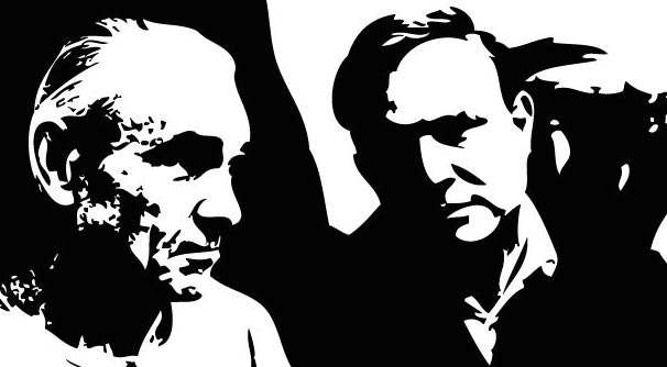
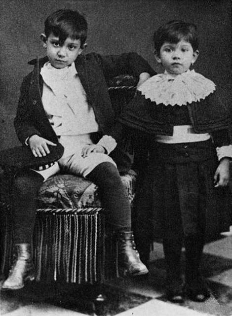
Picasso and his sister Lola. He was about 8 years old
in this picture, and already had some swagger.

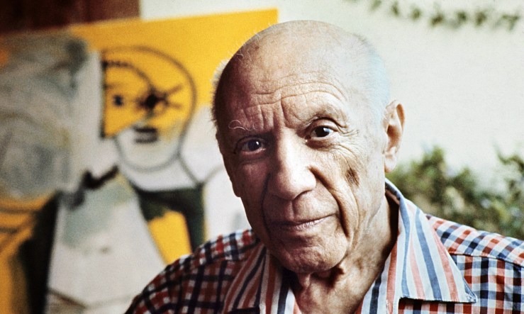
In the art world, it’s a holiday. Pablo Picasso was born in Málaga, Spain on October 25, 1881. In the 133 years since, the artist has irrevocably changed the way we look at art— and the world around it.

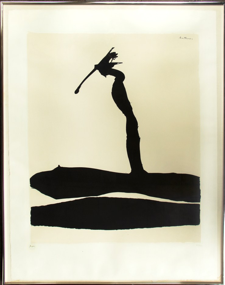
We’re frequently struck by the way Picasso would capture an artist’s attention and radically alter his or her course. Just look at this 1955 lithograph by Italian futurist Gino Severini, which is often mistaken for a Picasso by gallery visitors. French artist Jean-Pierre Jouffroy shifted from figurative artwork to pure abstraction after studying Picasso and his contemporaries, and Robert Motherwell‘s decision to become an artist hinged on a European tour of modern masterworks.

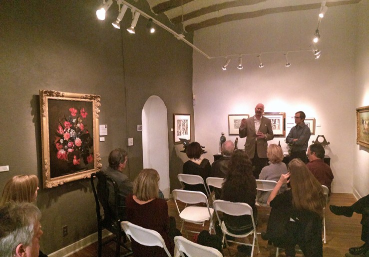
On this momentous day, we’re looking back at every Picasso that has passed through our gallery. Each one has a fascinating story… Pablo Picasso- Les Saltimbanque- Matthews Gallery blog 
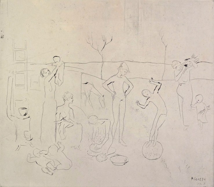
Les Saltimbanques is the earliest work by Picasso we’ve ever exhibited. It’s a drypoint from 1905, when the artist was about 24. It was commissioned by legendary art dealer Ambroise Vollard, who gave Picasso his first gallery show in 1901. The frolicking figures are characters from an opera-comique about a circus troupe. An early appearance by the harlequin (far right) is notable, as the archetype would become one of Picasso’s most-used personal symbols.

Pablo Picasso- Personnages Masques et Femme Oiseau- Matthews Gallery blog

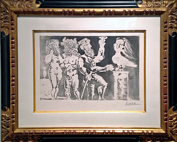
Fast forward to 1930. With the help of Vollard, Picasso had built his name into the first true global artistic brand. In yet another stroke of marketing genius, Vollard commissioned Picasso to create a series of 100 etchings—including several portraits of the dealer himself. The star of the Vollard Suite is the minotaur (second from left), another one of Picasso’s personal symbols. At the beginning of the series the minotaur is a virile beast, but by the end he is blind and weak, relying on a beautiful young muse to guide him. Completed in 1937, it’s the middle-aged Picasso’s meditation on his waning virility.

Pablo Picasso- Alex Maguy Gallery- Matthews Gallery blog

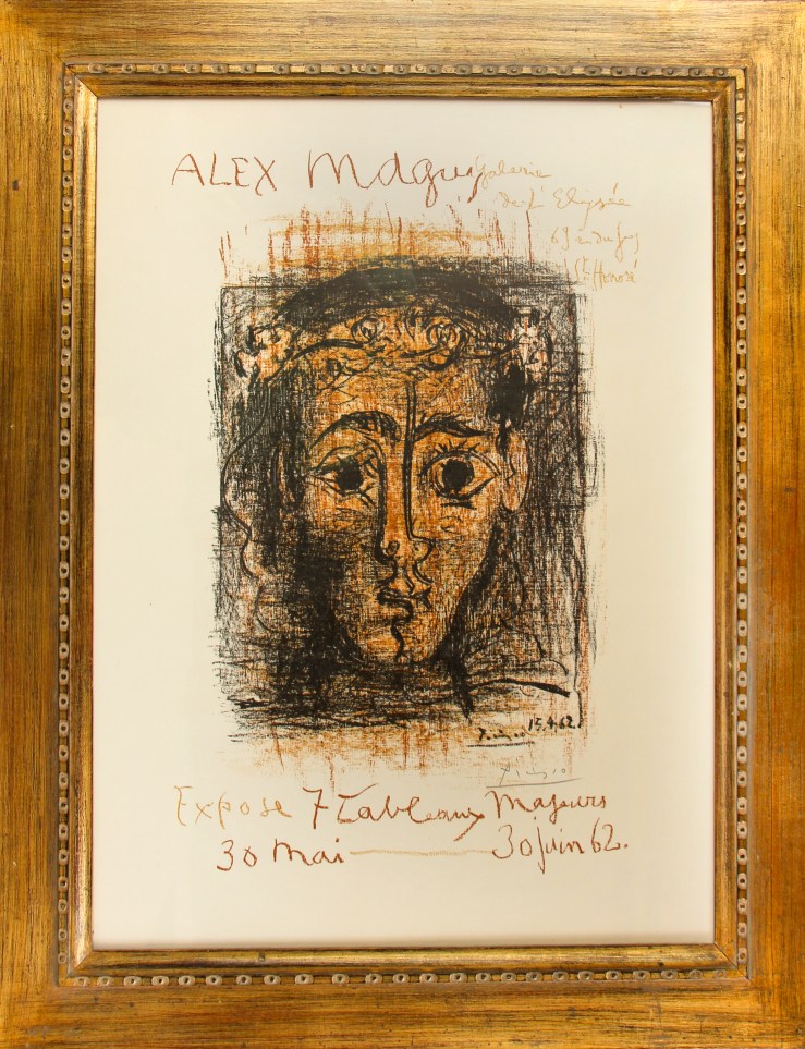
A youthful face peers from this offset lithograph Picasso designed for the Alex Maguy gallery in 1962. The exhibition was a retrospective of his artwork, but those captivating, wonder-filled eyes hardly hint at the darker themes the octogenarian turned to in his later years.

Pablo Picasso- 156 Suite- Matthews Gallery blog 
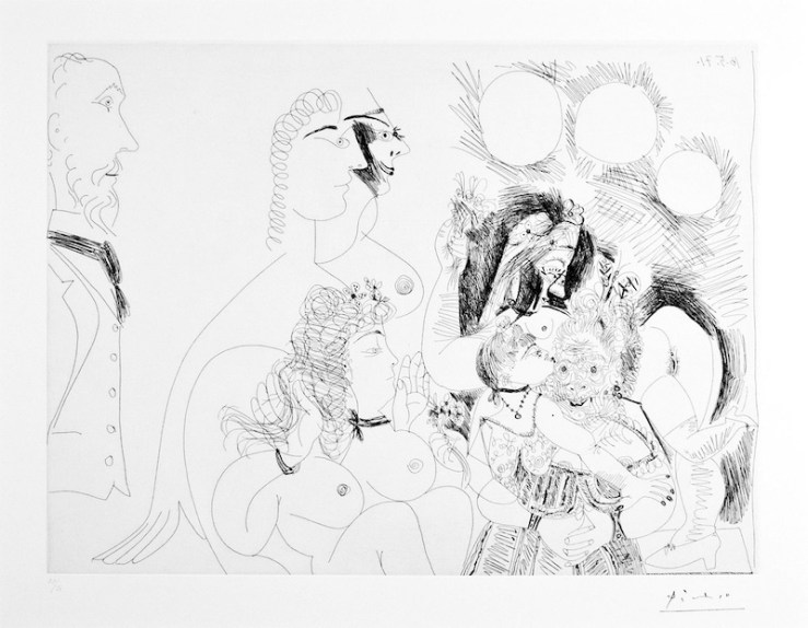
Picasso created the 156 Suite in 1971, not long before his death. Some consider the etchings to be his most personal series, a diary of a man struggling with impotence and pushing helplessly against the inevitable.

In contrast to our print from the Vollard Suite, women take the dominant role in these works. Models turn on artists, witch doctors stab at their patients and—in the case of this print—prostitutes tangle at a brothel while a man looks on, paralyzed. The gentleman is Degas, who appears in several prints in the series and with whom Picasso felt solidarity in his struggles.

Pablo Picasso 1971- Matthews Gallery blog Check out our Twitter, Tumblr and Pinterest profiles today for more insight on Picasso, and learn more about all of the artwork in this post on our homepage.

COLLECTOR’S FORUM: The Passionate Pursuit

Our first COLLECTOR’S FORUM workshop was this Friday, and the gallery was packed! We covered every angle of art collecting, from buying and selling to consignment agreements, insurance and art conservation. Event participants received a special packet at the end of the event with a comprehensive write-up on art collecting by Lawrence. Check out his beautiful introduction on the ‘passionate pursuit’ below, and come to our second workshop on Friday, October 24 to see our presentation and get the rest of the packet. Seats are limited, so make sure to contact us if you’d like to reserve a spot.

Collector's Forum- Art Collectors Workshop- Matthews Gallery blogLawrence Matthews and Matt Horowitz discuss a 17th century painting attributed to Jean-Baptiste Monnoyer

Close your eyes for a moment and think of a great piece of art you’ve seen and remember the way it made you feel. Was it was a sculpture, a painting or a drawing? Maybe it was a portrait or a landscape or an abstract. Maybe you saw it in a hometown gallery, in an artist’s studio, or in Paris walking through the Louvre. Wherever it was, remember that moment where you were overcome by that artwork, when you were flooded with a feeling that that swept you outside of yourself and put you in touch with something powerful and moving.

That is the true essence of art. The feeling you remember connects you to something deep within the human spirit and reminds you of what it means to be truly alive. It has nothing to do with money or the fame of the artist or how the art decorates a room. It has to do with the pure joy of imagination and creativity and our desire for beauty and intellectual enrichment.

Art Conservator Matt Horowitz at Collectors Forum- Matthews Gallery

Fine art conservator Matt Horowitz talks about caring for art with our oil painting by A.J. Barry

Now, imagine another scenario. You and your spouse live in a small apartment. You both have low paying jobs but are passionate about art. You develop a plan and over the course of several years of collecting you amass 4,782 artworks many of which are considered masterpieces. You even give 2500 works from your collection to 50 museums around the country. You do all this when the highest yearly salary you ever earned was $23,000. This is the story of Herb and Dorothy Vogel – two of the greatest art collectors in recent memory.

How did they do it with so little money? First, they developed a plan, then they learned as much as they could about art – they read; they took classes; they talked to artists, gallery owners, museum curators and other collectors. They became knowledgeable, focused on the type of collection they wanted, and excited about building it. Eventually they built it into one of the greatest art collections of the 20th century.

Collecting art can enrich your life and potentially create a valuable asset for you and your heirs. Following are strategies you will need to create, maintain and grow your art collection whether you decide to focus on just a few pieces or enough to fill a museum. These insights and practical advice will help you achieve your collecting goals.

Building an art collection involves four main areas:
1. Learning About Art
2. Buying Art
3. Caring For Art
4. Selling Art

Get the details on all  of these pursuits next Friday at COLLECTOR’S FORUM Workshop 2, and connect with us on Facebook, Twitter and Instagram for daily gallery news.

OUTSIDER/INSIDER: Abstract Expressionism at Matthews Gallery

Stanley Boxer and Robert Motherwell at Matthews Gallery Boxer (left) and Motherwell

It was Mark Rothko’s 111th birthday this Friday, and the occasion has us pondering one of the 20th century’s most polarizing art movements: abstract expressionism.

Three artworks by renowned abstract expressionists have recently landed on our walls. The first two are heavily impastoed oil paintings by Stanley Boxer, who resolutely clung to the far fringes of the movement. Determined to defy labels, he was furious when art critic Clement Greenberg called him a color field painter, and yet the arc of his creative explorations closely paralleled that of his abstract expressionist contemporaries:

In the manufacture of my art, I use anything and everything which gets the job done without any sentiment or sanctity as to medium. Then, too, I have deliberately made a practice of being “visionless”… this is, I go where my preceding art takes me, and never try to redirect the future as to what my art should look like. This is a general credo and foundation for everything I have ever done and stands firm in its solidity as this is written.

Boxer, who died in 2000, would have loved Grace Glueck’s New York Times review of a 2004 exhibition of his late works. She notes that he was “never part of a movement or trend,” but rather driven by paint’s “physical possibilities without script or program.”

Abstract Paintings by Stanley Boxer- Matthews Gallery Blog Atriumofashreddednight  (top) and Crisppitchofsigh, Oil on Linen

Glueck ends the piece with a brief analysis of Boxer’s titles, lyrical lists of words that are jammed together in unbroken strings. The works in our collection, for example, have names that read like fragments of beat poems: Atriumofashreddednight and Crisppitchofsigh. Glueck writes, “As Boxer joked in his titles, these canvases, more than most, do not really lend themselves to verbal exposition. They live for the eye, to which they bring deep satisfaction.”

Boxer’s titles provide a link to Robert Motherwell, the other abstract expressionist represented in our collection. Unlike many “abex” artists who labeled their canvases using dates or arbitrary numbers, Boxer and Motherwell were unapologetic in their wordplay.

That’s where the similarity ends. While Boxer considered himself an isolated frontiersman of abstract painting, Motherwell was an eager icon of abstract expressionism. He coined the term ‘New York School’ to describe his revolutionary circle, which included Mark Rothko, Jackson Pollock and Willem de Kooning, and acted as a spokesperson for the movement in the world of academia.

If Boxer’s titles were little more than impressionistic quips, Motherwell, who was a scholar before he became a “serious artist” and wrote numerous essays on aesthetics, chose names that have inspired endless analysis. His most famous series of paintings, Elegies to the Spanish Republic, chronicles the Spanish Civil War in bold strokes of black and white and subtle passages of ochre, blue, green and red.

Mainly, I use each color as simply symbolic: ochre for the earth, green for the grass, blue for the sky and sea,” Motherwell wrote. “I guess that black and white, which I use most often, tend to be protagonists.” In varying contexts, each color holds a universe of meanings. To fully understand the use of ochre in Motherwell’s Spanish Elegies, “You would have to know that a Spanish bull ring is made of sand of an ochre color,” the artist wrote.  Other works that feature ochre, like Western Air or Personage, with Yellow Ochre and White, would naturally spark different associations. 

Robert Motherwell- Africa 4- Silkscreen- Matthews Gallery Blog Robert Motherwell, Africa 4, Silkscreen

What to make of our Motherwell silkscreen, titled Africa 4? Motherwell completed the Africa suite in 1970, the same year he created his Basque and London suites. They were his first projects entirely devoted to silkscreens, and a divergence from the heavily layered nuances of his oil paintings. Here his black abstract forms stand crisply against their off-white backgrounds, although on closer inspection, their tumultuous edges still seem to weave in an out of focus.

“All my works [consist] of a dialectic between the conscious (straight lines, designed shapes, weighed color, abstract language) and the unconscious (soft lines, obscured shapes, automatism) resolved into a synthesis,” the artist wrote in 1944.

Motherwell first explored the concepts of automatism and the subconscious with a group of Parisian Surrealists, including Duchamp, Ernst and Masson, who had fled Europe during World War II.  Their ideas would help shape the spiritual side of abstract expressionism, a spontaneous, intuitive element that Motherwell carefully balanced with his more intellectual inclinations.

Motherwell’s connection to the Surrealists lends us a potential clue to the significance of the ‘Africa’ title. In his 1946 essay ‘Beyond the Aesthetics‘, Motherwell discusses the life of French Symbolist poet Arthur Rimbaud, who helped inspire Surrealism. In the final decades of his life Rimbaud quit writing and set off on an African expedition, a leap of faith that Motherwell compares to the Surrealists’ break from Dada and formation of a new movement:

Like Rimbaud before them, the Surrealists abandoned the aesthetic altogether; it takes a certain courage to leave poetry for Africa (as Rimbaud did, fh). They revealed their insight as essentially moral in never forgetting for a moment that most living is a process of conforming to an established order which is inhuman in its drives and consequences. Their hatred sustained them through all the humiliating situations in which the modern artist find himself, and led them to conceptions beyond the reach of more passive souls. For them true ‘poetry’ was freedom from mechanical social responses. No wonder they loved the work of children and the insane – if not the creatures themselves.

Perhaps Motherwell’s Africa suite represents a similar journey, a leap into the unknown that is a clear break from previous adventures. Just as Rimbaud abandoned an intellectual pursuit for one centered on travel and action, and as the Surrealists broke from the societal battles of the Dadaists to explore dreamscapes, so Motherwell’s stark Africa forms landed him in a new realm of image-making. Perhaps he sought to prove that even the most distinctly divided blacks and whites could possess endless shades of grey.

Learn more about Stanley Boxer and Robert Motherwell on our website, and make sure to connect with us on Facebook, Twitter and Flickr for more gallery news.

ONE WORK OF ART: Beatrice Mandelman’s ‘Cool Wind’

Beatrice Mandelman- Cool Wind circa 1950- Matthews Gallery

Beatrice Mandelman, Cool Wind c. 1950, Casein with Collage on Masonite Panel

When John Sloan invited Beatrice Mandelman and Louis Ribak to visit Santa Fe in 1944, the two artists were on the rise among New York City’s avant-garde. They had ties to Hans Hoffman and Fernand Leger, and were often mentioned in the same breath as Jackson Pollock. Sloan, who had been summering in New Mexico for years, had a reputation for spiriting away his favorite artists to the Desert Southwest. During their trip the recently married duo took a train to Taos and decided to stay.

The move marked a radical change in Mandelman and Ribak’s artwork. “We had to start all over again,” Mandelman said. “We spent the first couple years painting landscapes.” They were known for their figurative paintings in New York, but in this radically different environment their focus shifted to pure abstraction. They were trailblazers for a new wave of artists called the Taos Moderns, a movement that enlivened the Taos art colony but enraged an older vanguard of academic painters with ties to the Taos Society of Artists of the 1910’s and 20’s. To this tight clique of romanticists, the newcomers stuck out like colorful cacti—particularly Mandelman.

Portrait of Beatrice Mandelman in her Taos studio circa 1950- Matthews Gallery Beatrice Mandelman, 1950

“She worked with full abstraction at a time when most artists were not daring enough to do so,” writes David L. Witt in his book Taos Moderns, noting that Mandelman considered herself “the first of the second generation of artists in Taos.” The voice of a young, female abstract painter had never been part of the remote art community.

Far from the big city, Mandelman developed a new appreciation for the natural world and humanity’s relationship with it. By the late 1940’s she was developing an abstract symbol system to express her emotional responses to the landscape. Her elegant compositions didn’t mimic the lines or palette of the high desert, but they perfectly evoked the strong, solitary spirit of its inhabitants.

The mixed media painting in our collection was likely done in the 1950’s. Early in her experiments with abstraction Mandelman chose a muted palette, but here brighter colors poke through. This more expressive style was inspired by Henri Matisse and Mandelman’s former teacher Leger, and allowed her to explore the highs and lows of human experience with great vigor. Cool Wind‘s undercurrent of chilly blues and bright accents of orange and red call forth the sensation of a shiver passing up the spine.

As the evenings get cooler in Santa Fe, we’ve developed an ever-evolving passion for this piece and the innovative artist who created it. Learn more about Beatrice Mandelman on our website, and connect with us on Facebook, Twitter and Instagram for daily gallery news.

ROCH HART: Mystery of the Petroglyphs

Roch-Hart-New-Mexico-Jeep-Tours Roch Hart’s jeep outside Matthews Gallery

Roch Hart is the first and only fine furniture maker in our stable, but he also has a pretty awesome day job. As the owner of New Mexico Jeep Tours, Hart takes visitors on rugged expeditions across a 20,000 acre private ranch between Santa Fe and Albuquerque. The property is home to wild horses and numerous petroglyphs left behind by ancient Pueblo cultures.

We first met Hart through the image sharing website Flickr, where he posts stunning photographs from his adventures. We had no idea that he was also a master craftsman until he reached out to us. Not long after, a big red jeep full of beautiful hand-carved benches appeared outside the gallery. When we saw how good Hart’s work looked in our Southwestern art room, we knew it was a perfect match.

It didn’t take long to realize that Hart’s adventurous occupation and his impressive hobby were connected. As chronicled in previous posts, many of his works feature symbols from the petroglyphs he discovers on the ranch. The ancient marks are part of a complex language, and their meanings are partly lost to history. Luckily, Hart is a passionate detective. We asked him to show us some of his photos and tell the stories of petroglyphs that have inspired his work.

Take it away, Roch:

New-Mexico-Flag-Roch-Hart

New Mexico state flag, and a cross from Roch’s pie chest ‘The Way

In petroglyphs, the same symbol can hold multiple meanings. Take for example the Zia symbol on our state flag. Our European or Western paradigms might lead us to interpret the Zia as a simple, decorative depiction of the sun, but in the Pueblo culture these symbols were a communication form rather than an art form.  The circle of the Zia represents the circle of life. The four rays radiating from the circle represent many different things: the four directions, the seasons, the elements or even four stages in a person’s life. In the Pueblo culture, the four is a sacred number. I have found petroglyphs with faces whose mouths are in a square shape, perhaps speaking of the fours.

Roch-Hart-The-Way-Petroglyphs

Roch Hart with New Mexico petroglyphs, a similar design on Hart’s pie safe ‘The Way

Sometimes petroglyphs mimic the lines and rhythms of nature. I’ve been told by a trusted, unnamed native source that the triangular petroglyphs in the photo above represent mountains. The straight lines below the mountains may represent mesas, and below that is a mark that resembles a body of water. This could be a map of sorts. Not far from this petroglyph, there is a small pond with a view of mesas and the Jemez Mountains. On my latest pie safe, ‘The Way, I carved a similar pattern to represent mountains.

Roch-Hart-Petroglyph-Shield-WarriorShield Warrior petroglyph, photo by Roch Hart

In the world of petroglyphs there is a common theme of anthropomorphism (I really just like saying that word). Humans will sometimes take on the form of an animal, insect, or warrior shield. In the simple petroglyph above, a circled cross with a head and eyes represents a Shield Warrior. If we were still doing petroglyphs, this one could have represented me during my days as a cop. As you can see, this little guy also has the cross in his shield, representing the fours or ‘the way.’

Roch-Hart-Bear-Claw-PetroglyphsBear claw petroglyphs with storyteller and listener faces, photo by Roch Hart


Another common theme in petroglyphs is the ‘yin and yang.’ For instance, every storyteller needs a listener. The images above show petroglyphs that represent bear tracks. The tracks come in pairs, and each track has a face inside it representing a storyteller or a listener.

Roch-Hart-Storyteller-Faces

 ‘Marriage’ petroglyph, faces on Hart’s pie safe ‘The Storytellers

I call the petroglyph above ‘The Marriage.’ You can see two distinct people occupying one checkerboard body. If you look carefully, the square head appears to be speaking while the round head has its mouth closed. My pie safe called ‘The Storytellers‘ explores this theme of opposites. The listener and the speaker depend on each other.

Roch-Hart-New-Mexico-Petroglyphs

New Mexico petroglyphs, a spiral design on a bench by Roch Hart

Another common symbol is the spiral.  Spirals or concentric circles often represent time or travel.  I have found that cracks are often incorporated into these petroglyphs and I will find a spiral with the outer end going to or ending in a crack.  A common legend amongst the Pueblo natives is that they originated under the earth’s crust and made the journey to surface.  I believe these spirals convey that journey.  On one of my early pie safes, I placed a spiral on the door with the tail leading up to the middle joint of the door.

 Screen Shot 2014-09-11 at 6.22.02 PMNew Mexico petroglyphs

Petroglyphs are very complex and have multiple layers of meaning and legend.  This blog post just scratches the surface, so to speak.  We have lost much knowledge of petroglyphs because early Spanish priests saw them as spiritualism apart from Catholicism. Catholicism was the state religion and the only legal one, so petroglyphs were outlawed.  In fact we often find crucifixes etched into the stones near these sites, placed there by the early priests to exorcise the place of evil spiritualism and to remind the Pueblo natives that this was not longer an accepted practice.

While part of me is upset about how we lost the knowledge of these ancient symbols, I enjoy that I don’t completely understand the mystery.  I love the idea that in some respects it is open to the interpretation of the beholder. Only the maker knew.

To make my fine furniture, I blend influence from the native cultures with my knowledge of Spanish colonial carpentry laws. That’s how I arrive on how to make a piece down to the joinery. But that’s for another blog post!

To see more photos by Hart, make sure to check out his Flickr account. See all of his furniture on our website, and connect with us on Facebook, Twitter and Pinterest for daily gallery news.


Hannah Holliday Stewart: The Messengers

Hannah-Stewart-Blog1

Candid shots of the secretive artist with her sculpture “Survivor“, Hannah Holliday Stewart archives

At last Friday’s opening for Hannah Holliday Stewart: An Artistic Legacy Rediscovered, art enthusiasts who saw the press coverage for the show came armed with a diverse array of questions.

“What was her family like?”

“Where did the full-scale models in those photos end up?”

“What’s ‘Ockum’s Razor‘ ?”

“Who’s Brad?”

Of course, the most frequent question was also Stewart’s most impenetrable mystery: why did the sculptor abruptly leave Houston, the launching point and epicenter of her nationally renowned artistic career? In our explorations of Stewart’s archives over the past few weeks, we’ve stirred up as many questions as answers.

Stewart was resolutely private, preferring to tightly focus on her artwork in interviews, exhibition materials and even her diaries. A catalog for her 1975-6 solo exhibition at the Houston Contemporary Arts Museum provides little more information on Stewart’s personal life than a birth year and a brief sketch of her educational history.

“Hannah was a very private person with a lot going on in her head,” close friend Dayton Smith told us. “I learned when to be around her and when not.”

Many of Stewart’s works, on the other hand, were always in the public eye. Kids lounged in the crook of her 11-foot sculpture in Hermann Park, students at St. Thomas University studied under her concrete-and-steel work on campus, and politicians were often photographed beside her “Libertad” fountain as they passed through the courtyard of Houston’s World Trade Center building.

For this week’s blog, we’re taking cues from Stewart’s ghost and focusing on the rich universe of her sculptures. Look below for new insight on five artworks, with behind-the-scenes materials from the artist’s files.

Hannah Stewart- Atropos Key Sculpture with Preparatory Sketch and Full-Scale Model- Matthews Gallery Blog


 Preparatory sketch for ‘Atropos Key’ and full-scale plaster model in Stewart’s studio

Atropos Key’ remains Hannah Holliday Stewart’s most well-known sculpture in Houston. Our maquette’s monumental counterpart stands on a hill in Hermann Park, measuring at 11 feet tall and 1,200 pounds. It debuted to much fanfare in 1972. From the Houston Chronicle’s August 11, 1972 edition:

“Out on the hill beyond Miller Theatre the blanket lollers who tune in to night concerts and shows from a horizontal position will have fresh ‘company.’ Overlooking the stage, now, is a bronze vertical figure.

‘Atropos Key,’ the title of which derived from one of the three fates in Greek mythology, was given to the city by Mrs. Patricia S. Woodward of Houston.

Strollers in the park may well stare at it and wonder what it all means…. Miss Stewart’s piece, in its new location, deserves the looking at, the ‘experiencing’ and the consideration of its meaning for you. Is it birth and, more encompassing than that, renewal?”

Hannah Stewart- Messenger Sculpture with Preparatory Sketch- Matthews Gallery BlogPreparatory sketch for ‘Messenger’ dated August 1973

Stewart’s ‘Messenger’ appeared on the cover of Houston Arts Magazine’s performing arts edition in October, 1982. Stewart was a fan of Russian composer Alexander Scriabin, and often listened to classical music in her studio.

A blurb inside the magazine traces the musical roots of ‘Messenger’:

“Sculptor Hannah Stewart… sees her work as an artist’s shorthand using symbols to communicate complex and abstract ideas— like a composer uses the symbols of musical notes to convey a spiritual idea in a sensuous form.

In Messenger… Stewart sees a parallel between the structure-strength-shapes interplay of her work and compositions played by Nathan Milstein and Bella Davidovich.”

Hannah Holliday Stewart- Ockum's Razor Sculpture with Original Typewritten Label- Matthews Gallery BlogOriginal typewritten label for ‘Ockum’s Razor’

Stewart was known for her mythology-inspired artwork, but that was far from the only subject she explored.

“Her studies in literature, mythology, metaphysics, esoteric philosophy, religion, science, astrology, dance and yoga suffuse her output, revealing in form and textures,” wrote Stewart’s friend Dayton Smith in a letter to the gallery.

In ‘Ockum’s Razor’, Stewart turned to science for inspiration. The title refers to a problem-solving principle devised by 14th century logician and Franciscan friar William of Ockham (c. 1287-1347). The principle states that “Entities should not be multiplied unnecessarily.” In other words, the simplest path to an answer is the best one.

Hannah Holliday Stewart- Maquette and Full-Scale Survivor Sculptures- Matthews Gallery blog


 Maquette and full-scale versions of ‘Survivor’

An article about Stewart’s work appeared in the local paper of her childhood home of Birmingham in 1994. In the story, Stewart explains the inspiration for ‘Survivor‘. From the August 1, 1994 edition of the Birmingham Post-Herald:

“I was teaching welding at the university, and I’d go to the welding studio and talk to friends of mine, and there were a lot of men coming down from Detroit who’d lost their jobs, and they were so tense and angry about having to reform themselves, to learn to do welding or something else at the age of 55, after having been an auto worker. I reacted to that force within them, and the drastic changes people have to make to survive.”

 Hannah Holliday Stewart- Einsteins Song and Polaroid of Hannah Holliday Stewart working on the sculpture in her studio- Matthews Gallery blog

Polaroid of Hannah Holliday Stewart in her Albuquerque studio working on ‘Einstein’s Song’

Stewart was 80 years old in the Polaroid above and still hard at work on her bronze forms, though she never exhibited again in her lifetime.

Here’s an excerpt from a typewritten artist statement Stewart wrote a year later:

“For me, the image should be an intellectual and emotional symbol plucked from the fringe of the imagination, it should suggest a classic truth and not be confused with social comment. The image at its most successful strikes a common chord of sensations in every viewer, and yet leaves each viewer with his/her own particular interpretation.”

See Hannah Holliday Stewart: An Artistic Legacy Rediscovered through July 18, and connect with us on Facebook, Twitter and Instagram for more information on the artist.

Hannah Holliday Stewart: Letter from Houston

Hannah Holliday Stewart in her Houston Studio- Matthews Gallery

Our exhibition Hannah Holliday Stewart: An Artistic Legacy Rediscovered
begins with an opening reception on Friday, July 4 from 5-7 pm

“In a day in which so many things in Art are merely exercises in Media and devoid of any real significance, it is refreshing to discover an expression which transcends the cerebral prison of its own time and manifests itself in forms poetically germane to a more cosmic significance,” wrote Dayton Smith, with poetic flair of his own, in a typewritten statement dated March 22, 1991.

Smith was referring to the sculptures of his close friend Hannah Holliday Stewart (1924- 2010), whose monumental forms caught the eye of the nation in the 1970s and 80s. As chronicled in our last blog post, Smith and Stewart met in Houston in the late 1960s as Stewart’s career was taking off. He assisted Stewart in various ways for a number of years, and watched as the artist found success in galleries and museums across the country.

More from the note:

Her art mirrors a consciousness expanded beyond the pragmatic doctrinal limits of our milieu. Her commissions stand to prick our higher sensibilities in a world which, it would seem, affords little for the pursuit of what may be a neglected cosmic heritage. In an age in which “symmetry does not balance make” (but which, nevertheless seems to be the applied solution for everything), her bold compositions embody a superbly balanced abstract expression of form and function suggestive of the anthropomorphic with its attendant graces and imperfections.

More than two decades later, Smith admits with a chuckle that the write-up can be a bit “over the top”, but it survives as an illuminating statement about an artist whose cosmic creations were at times misunderstood. After we contacted him, Smith was inspired to return to the typewriter—or, keyboard—and draft another statement on Stewart’s work. His musings provide new insight into the life and artwork of the dynamic sculptor.

Hannah Holliday Stewart in her Houston studio- Matthews Gallery

From Dayton Smith:

Hannah Remembered

It can be said with clarity and confidence that the monumental sculptural work of Hannah Holliday Stewart is cosmic in scope and spiritual in dimension and process. At the peak of her production in the 1970s and ’80s, there emerged from her studio great plaster forms, many well over ten feet in height. These graceful mammoths, cast in bronze, would weigh hundreds to thousands of pounds, and command public spaces in Houston and other cities. A major exhibition of these large plasters was mounted in January 1976 at Contemporary Arts Museum Houston, and another in the ’80s at One Houston Center. In the 1990s, she established studios in Flagstaff, Arizona, and later in Birmingham, Alabama, and finally in Albuquerque.

Born in 1924 in Marion, Alabama to a prominent family, she studied art in Alabama and Georgia (BFA), and at Cranbrook Academy of Art in Michigan (MFA); studied ceramics in California with the legendary Bauhaus potter Marguerite Wildenhain; worked in foundries in Florida and Mexico; moved to Texas to teach at Museum of Fine Arts Houston, the University of Houston, and the University of St. Thomas. Her notable public works include Atropos Key, installed in 1972 on the hill at Houston’s Miller Outdoor Theatre in Hermann Park; Libertad, a smoothly elegant birdlike bronze at World Trade Center Houston; works in Samuels Park in Dallas and New Harmony in Indiana; and Passage, at University of St. Thomas Houston. Her public commissions are claimed as example of landmark achievement by women in the arts. Respected among Houston architects and adept in various media she developed sand-blasted and sand-cast relief panels for specific architectural settings. Her works of smaller scale are to be found in notable private collections.

Her studies in literature, mythology, metaphysics, esoteric philosophy, religion, science, astrology, dance and yoga suffuse her output, revealing in form and textures. Her earlier smaller works reflect ineffable humanity, humor, elegant charm and always superb craftsmanship. She was disciplined, intelligent and well-read, possessed of an intense work ethic, compassionate and understanding and encouraging of others, and an inspiring teacher, respected and loved by friends in business, academia and the arts. Whether attired in her usual studio denim or occasional Dior, she moved among interesting people and was an accomplished host and gourmet. Music was her creative keynote and the atmosphere mystical, always stimulating and, on occasion, convivial. On so many occasions when I would assist her in some project: photographing, gallery installation and lighting, foundry, studio, even building repair, I was aware that I was only facilitating much greater work. I think she really did come to ‘see’ the wind, and must have stood in awe of that which materialized from her consciousness and hands. I can still hear her warm southern voice and motto – Nil desperandum!, and her memory, towering as her work, is quite, quite treasured.

D.A. Smith
Public Broadcasting, University of Houston, retired

Make sure to attend the opening reception of our exhibition Hannah Holliday Stewart: An Artistic Legacy Rediscovered on Friday, July 4 from 5-7 pm. To learn more, check out our previous blog post and our Hannah Holliday Stewart artist page. For daily gallery news, connect with us on Facebook, Twitter and Pinterest.

Hannah Holliday Stewart in her Houston studio- Matthews Gallery

FOUR CENTURIES: Monnoyer’s Mark

Still life attributed to Jean-Baptiste Monnoyer- Matthews Gallery blog

We discovered this still life at the preview of a Santa Fe estate sale. It was tucked in a dark upstairs corner of the house, far from the Picasso print and treasure trove of art books on prominent display in the living room. Lawrence lingered for a while to take in the flamboyant bouquet with its rich rosy tones. There was an excited glint in his eye.

A few months later, the painting has found a home under the glowing lights of our European art room. We know a lot more about it now than when it first caught Lawrence’s fancy. It’s attributed to Jean-Baptiste Monnoyer (1636-1699), a 17th century Franco-Flemish painter who wielded his brush for Louis XIV. Its siblings hang in some of France and England’s most famous estates.

Our adobe art abode is a very different venue, but this 300-year-old artwork gives us the opportunity to transport gallery visitors across the sea and through the ages. Look below to chase Monnoyer through the palaces where he left his mark, and don’t miss the painting’s debut at our opening for FOUR CENTURIES: European Art from 1600 to 1950 on Friday, June 13 from 5-7 pm.

Hôtel Lambert- Site of artwork by Jean-Baptiste Monnoyer- Matthews Gallery Blog

Our first stop is the Hotel Lambert on the Ile Saint-Louis, site of Monnoyer’s first Parisian commission in 1650. The artist grew up in Lille, France and trained in Antwerp, but it was the lavish estates in and around Paris that claimed his considerable interior decorating talents. Monnoyer’s floral designs in the grand mansion would delight its many owners and guests for centuries to come, from a famous Polish political salon to Voltaire, Chopin, Balzac, Delacroix and Dali. Unfortunately, the Hotel Lambert was badly damaged in a 2013 fire and is under renovation.

Chateau de Marly- Site of artwork by Jean-Baptiste Monnoyer-  Matthews Gallery Blog


Artist Charles Le Brun, who painted a series of renowned ceiling frescoes at the Hotel Lambert, brought Monnoyer along for a commission at Louis XIV’s Chateau de Marly. The (relatively) small country estate was the king’s escape from the more rigid world of Versailles, and aristocrats fiercely battled for a chance to stay there. Alas, the twelve pavilions that flanked the water and their intricately adorned interiors are long gone, but the commission launched Monnoyer into a new stratosphere.

Palace of Versailles- Site of artwork by Jean-Baptiste Monnoyer- Matthews Gallery Blog

Monnoyer worked with Le Brun once again on the ornamentation of the Palace of Versailles. For this and other high profile royal projects, he developed a style that was far removed from his training in the subdued still life painting techniques of the Low Countries. The bold, ornamental approach is in full force in our still life, recalling the spectacular garlands of flowers he painted on the ceiling of the Queen’s pavilion at the Chateau de Vincennes. Monnoyer also made reference sketches and etchings for French tapestry workshops, greatly influencing European decorative styles for years to come.

Boughton House- Site of artwork by Jean-Baptiste Monnoyer- Matthews Gallery Blog

A commission from the Montagu House in London drew Monnoyer away from Paris in 1690. He adorned dozens of panels with fruits and vegetables and painted several portraits, some of which now reside in the state rooms of Northamptonshire’s Boughton House. The artist remained in England until his death in 1699, but his distinctly French style lived on in the artwork of two of his sons.

Make sure to attend the opening of our FOUR CENTURIES exhibition on Friday, June 13 from 5-7 pm, and follow us on Facebook, Twitter and Tumblr for daily gallery news.