NEW RELEASE: Fremont Ellis of Los Cinco Pintores

Fremont Ellis- La Plata Mountains- Matthews Gallery Blog


In 1921, Fremont F. Ellis and his friends Jozef Bakos, Walter Mruk, Willard Nash and Will Shuster founded an avant garde art society that would change Santa Fe forever. The five men were in their early 20s, and most of them had recently migrated there from the East Coast. They chose a name inspired by their new life in the Southwest: Los Cinco Pintores (The Five Painters).

In December of that year, Los Cinco Pintores mounted their first group exhibition at Santa Fe’s Museum of Fine Arts. Their work was diverse in subject matter, but their rallying point was modernism and the art of early Taos painters Robert Henri and John Sloan of the Ashcan School.

“These men believe in color and are not afraid to use it,” wrote a critic who attended the inaugural show. “Upon entering the galleries, visitors are greeted with a great shout of color that’s almost stimulating.”

Fremont Ellis - Watercolors - Matthews Gallery Blog

Over the next few years, Los Cinco Pintores worked together to build a row of casitas along Camino del Monte Sol near Canyon Road. This earned them another nickname, “The Five Nuts in the Adobe Huts”. Meanwhile, word of their exploits had reached other artists back home.

By 1923 another group called the New Mexico Painters was exhibiting paintings of sweeping Southwestern landscapes across the Midwest and the East Coast. Artists like Randall Davey, Andrew Dasburg and Theodore Van Soelen settled in the area, and the Santa Fe Art Colony was born. The City Different has fostered a vibrant art community ever since.

Fremont Ellis- Watercolor Diptychs- Matthews Gallery Blog

These newly released works on paper are by Fremont Ellis (1897-1985), who was the last surviving member of Los Cinco Pintores. Ellis grew up in Montana and was inspired to become an artist at 14 when he saw Albert Bierstadt’s paintings on a trip to New York City. He worked as a photographer in California before settling in Santa Fe, and used his photographs of landscapes to inspire his painted compositions. This body of work holds the vigor and immediacy of the artist’s many outdoor adventures.

Learn more about Fremont Ellis on our website, and connect with us on Facebook, Twitter and Tumblr for daily gallery news. Also, don’t forget to mark your calendar for our exhibition NEW MEXICO MODERNS: The Lumpkins Files, opening next week!

NOT A POP ARTIST: Five Sides of Jim Dine

Jim Dine Rainbow- Matthews Gallery Blog


78-year-old artist Jim Dine has earned his place in any good post-war art history textbook. Picking exactly when to spotlight the artist must be a difficult task for scholars. The painter, sculptor, illustrator, printmaker, stage designer and performance artist has a way of diverging from the status quo and ending up at the forefront of new art movements. Just when things get established, he’s off on his own again.

A mixed media drawing  by Dine recently found its way to Matthews Gallery, so we took the opportunity to explore 5 manifestations of the chameleonic artist:

Fluxus Performer

Dine grew up in Cincinatti and got his BFA from Ohio University. When he arrived in New York in 1958, the art world was fixated on a type of work you couldn’t sell in a gallery. Some critics called them “wacky nightmares“, others described them as “a three-ringed circus with undertones of group therapy“, but Dine and his friends Claes Oldenberg, Allan Kaprow and John Cage dubbed their performance art pieces “Happenings”.

Happenings were designed to be as ephemeral and unpredictable as day-to-day life—but a little weirder. Battles between ballerinas and roller-skaters, reenactments of the Lincoln assassination, bikini stripteases and blue ice cream feasts were all passionately performed, often in rapid sequence. Whether you call it though-provoking or senseless, the Fluxus movement was one-of-a-kind. For Dine, all the world was a stage until…

Pop Progenitor

Jim Dine- Robe Diptych- Matthews Gallery Blog


Jim Dine, Red and Black Diptych Robe, 1980

In 1962, Dine’s paintings appeared alongside work by Andy Warhol, Roy Lichtenstein, Ed Ruscha and others in the Pasadena Art Museum’s show New Painting of Common Objects. Curated by Walter Hopps of Ferus Gallery (site of Warhol’s first solo show), the exhibition was a seminal moment for a new movement: Pop Art.

Dine’s inclusion in the exhibition made perfect sense at the time. He was experimenting with serial imagery of familiar objects and symbols like bathrobes, hearts and tools. However, the artist’s expressive style and often tender subject matter clashed with the postmodern angst of other Pop progenitors. Soon enough, he was plotting his escape…

Modernist

Jim Dine- Paris- Matthews Gallery Blog

Jim Dine, Paris Smiles in Darkness, 1976

Dine moved to London in 1967, a strange decision considering his controversial history with the United Kingdom. A year before his solo exhibition at London’s Fraser Gallery was raided by police and the owner was fined for showing “indecent” images.

The artist defiantly continued to his relationship with Fraser and used his time in Europe to study the work of Van Gogh, Picasso, Matisse and other modernists. In 1971 he returned to the United States, ready to chart a new course…

Neo-Expressionist

Jim Dine- A Lady Sitting Drawing- Matthews Gallery Blog

 Jim Dine, A Lady Sitting, Mixed Media, 1975

Minimalism was en vogue when Dine arrived in New York, but the artist wasn’t interested. Instead he focused on figure drawing, refining his skills in various mediums and earning a reputation as a master draftsman. The mixed media drawing in our collection is from this period. A stunningly realistic face painted in oil is framed by confident charcoal marks and a glowing crayon color field.

In the years to come Dine’s figurative work would mark him as a founder of Neo-Expressionism, but critics could never assign the artist a particular label for long…

Modern Individualist

2008_JimDine_23220011

Installation shot, Jim Dine: Poet Singing (The Flowering Sheets)

 Perhaps Dine’s artistic identity is best summed up by MoMA:

This commitment to a personally invested, image-dictated content and a continuing interest in the technical and expressive potential of every medium has characterized Dine’s work as a whole. Thus, Dine has often been out-of-step with the major movements of the post-World War II period and must be considered a modern individualist.

It’s a bit of a non-title, but Dine defies labels at every turn. The almost-octogenarian is still working his way into new chapters of art history.

Check out our website for more on Jim Dine, and connect with us on Facebook, Twitter and Flickr for to-the-minute gallery news.

BURST OF BRILLIANCE: Adolph Gottlieb’s Southwestern Epiphany

“It was like being at sea,” said Adolph Gottlieb. The artist had just spent a year in the Desert Southwest- from 1937 to 1938- and returned to his hometown of New York City with a radically altered style. “There’s… a tremendous clarity of light and at night the clouds seem very close,” he continued. This was a very different type of “sea” than the one that carried Gottlieb on his inaugural artistic journey. When he was 17 he dropped out of high school and caught a merchant ship to Europe. He spent two years there, including six months in Paris where he audited art classes and visited the Louvre every day. Back in New York, he studied at The Art Students League and befriended Barnett Newman, Mark Rothko and Milton Avery. Together they founded the abstract expressionism movement, working to develop color field painting and other innovations. They remained close until Gottlieb decided to strike out on his own to Tucson, Arizona. It was an endeavor that would markedly separate him from his contemporaries, even after his return to the East. Gottlieb’s New York friends called the style he had developed in Arizona simplistic, but the artist refused to look back. He distanced himself from his colleagues and focused on developing a Surrealist style. Experiments with automatism and surrealist biomorphism helped him create an abstract symbol system for his gridded Pictographs series. Finally, in the 1950’s, he started work on two series that would become his most well-known work. Both series are represented in our collection, and their very existence seems linked to the bare, elegant vistas of the Desert Southwest.

IMAGINARY LANDSCAPES

Around 1950-51… I was finally getting away from the pictographs and looking for something… So it was necessary to find other forms, a different changed concept. So finally after a certain period of transition I hit on dividing the canvas into two parts, which then became like an imaginary landscape… What I was really trying to do when I got away from the pictographs was to make this notion of the kind of polarity clearer and more extreme. So the most extreme thing that I could think of doing at the time was dividing the canvas in half, make two big divisions and put something in the upper division and something in the lower section.

The color and texture of the land mass in “Green Foreground” recalls Gottlieb’s sea simile. In this period the artist was consolidating surrealist and abstract expressionist theories by approaching the two movements as different sides of the same coin (hence a “polarity”). Our lithograph implies a fantastical landscape, but works just as well as a flat, wholly abstract composition. If we imagine ourselves exploring this terrain, it would look much like Gottlieb’s surroundings in the Southwest, albeit with a greener tint.

BURSTS

After doing the imaginary landscapes until say 1956, in ’57 I came out with the first Burst painting… There was a different type of space than I had ever used and it was a further clarification of what I was trying to do. The thing that was interesting that it was a return to a focal point, but it was a focal point with the kind of space that existed in traditional painting. Because this was like a solitary image or two images that were just floating in the canvas space. They had to hold the space and they also had to create all the movement – that took place within the rectangle.

Gottlieb’s Bursts are Imaginary Landscapes that have further dissolved into abstraction, though their compositions still root them somewhat in reality. In “Crimson Ground” two discs rise (or set) like a sun and moon from a monochrome tangle with the most ephemeral of horizon lines.

When I started doing the Bursts I began to do part of the painting horizontally. It was necessary to do that because I was working with a type of paint which had a particular viscosity, which flowed, and if it were on a vertical surface it would just run. If it were on a horizontal surface, I could control it… I was using a combination of brushes and knives, palette knives… and spatulas… I’ve tried everything, rollers, rags, I’ve put paint on with everything.

“Crimson Ground” isn’t a painting, but it still has a painterly quality to it. The edges of the discs are uneven and textured, and the forms below are as splattered as a Pollock drip painting. This further highlights the polarity between the surreal landscape and an abstract expressionist painting. One is focused on depth, the other focuses solely on the surface. Learn more about Adolph Gottlieb on our website, and connect with us on Facebook, Twitter and Pinterest for to-the-minute gallery updates!

HART & SOUL: Fine Furniture with New Mexican Roots

Roch-Hart-Southwestern-Furniture

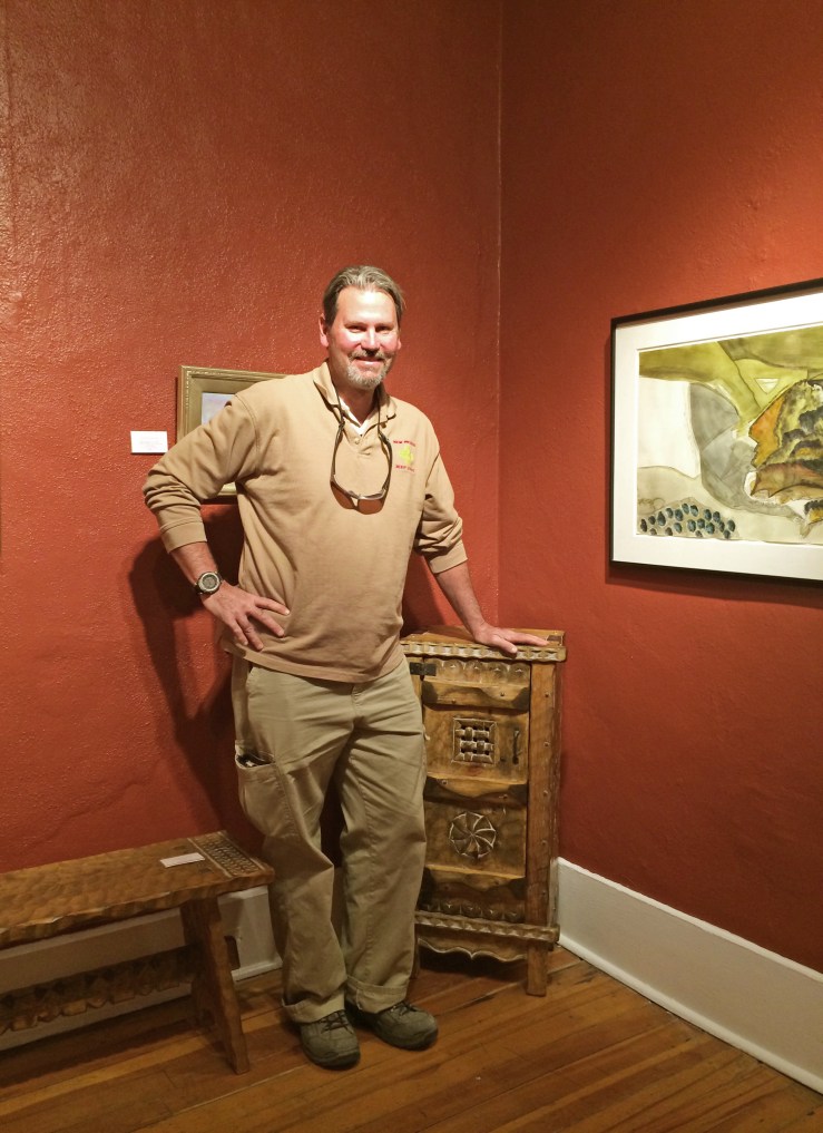
Roch in our Southwestern Art Room with his hand crafted pie safe and bench

Roch Hart‘s first steps into fine furniture making were the result of a big dilemma.

“I fell in love with Spanish colonial furniture. I had to have it, but I couldn’t afford it,” he says. He had never learned a craft before, but he was determined to do something. He started by buying all the books he could find on building furniture.

More than two decades later, Roch pulls up to Matthews Gallery in a big red jeep. He takes two impeccably hand crafted pieces of furniture from the trunk. One is a tall corner table emblazoned with a Cochiti Pueblo-inspired design, and the other is a pie safe with intricate latticework and a special type of dovetail joint in the door. Roch is the very first fine furniture maker to join our stable, and his mastery of the craft is truly spectacular. In a way, these beautiful objects are generations in the making.

Roch’s great grandmother came to Santa Fe in 1881. She was a single 16-year-old woman who braved the Old Santa Fe Trail, probably to escape an arranged marriage. Soon after her arrival she married a German man and they opened a mercantile near Canyon Road.

“She came from an aristocratic family. She had lots of money, but she chose the poor man’s way in,” Roch says. Her daughter, Roch’s grandma, grew up among the local tribespeople and learned their language and lifestyle. “My grandmother would go out and show me edible plants, and she could even butcher things,” Roch explains. “She could take a rabbit, take and a stick and ‘Bang!’ Then she would show you how to prepare it.”

She was also a great admirer of native art. She taught Roch about kachina dolls and paintings she collected. Roch’s mother took it one step further, trying her hand at retablo painting.

Roch took a different path, enrolling at New Mexico State University and then studying to be a police officer. He spent 20 years at the Albuquerque Police Department, but his love for New Mexico’s multicultural history always stuck with him.

Roch-Hart-Furniture-Corner-Table

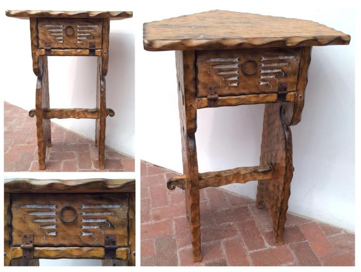
Corner table with Cochiti design detail

When he got interested in furniture making in the early 1990’s, Roch started by studying the intricacies of the Spanish colonial style. He learned that a particularly sturdy joint, the mortise and tennen joint, was the only one Spanish colonists were legally allowed to use. He also discovered that the pervasiveness of trasteros (a Southwestern style cabinet) was due to a high colonial tax on closets.

“At the same time that I was learning all this, I realized I wanted to do something different,” Roch says. “I didn’t want to keep replicating colonial.” The budding craftsman’s big breakthrough came on a visit to the Nicolai Fechin House museum in Taos.

Fechin (1881-1955) was a Russian painter and craftsman who settled in New Mexico in 1927. He purchased a two-story adobe home and greatly expanded it over the next few years, carving intricate doors, windows and furniture pieces that were inspired by European and Native American aesthetics.

On that first visit to the museum, Hart was busy crawling on the floor and inspecting every angle of Fechin’s furniture when the artist’s daughter Eya appeared. They started talking, and she recognized his passion for the craft. “She had so much in-depth knowledge, and I didn’t even know who she was,” Hart says. She walked him through the house and pointed out different styles and techniques her father used.

“Fechin blew me away,” Hart says. “He took art and applied it to furniture. I had felt caged in by the things I was learning, but all of a sudden I realized I could do anything I want.” Just as Fechin had drawn from multiple influences in his work, Hart began to use styles and motifs from the different cultures around him.

Roch-Hart-Furniture-Pie-Safe

Pie safe with rosette detail 

Hart carries his latest works through the gallery to our freshly painted Southwestern art room, carefully placing two pieces in opposite corners. He’s eager to point out his stylistic choices. The rosettes on the sides of the pie safe are inspired by Native American metalworking techniques, his choice of joints was influenced by Fechin and the gridded design in the front is all his own. On the front of the corner table, a stepped carving bordered by elegant curves represents a Cochiti blessing.

“I incorporate my love for the Native arts, for the Spanish and for my European ancestry,” Hart says. “I try to tie a little bit of everything into every piece.” The works before us bear clear markings of the artist’s rich ancestry and influences, but they also hold a heaping dose of something else: Hart’s soul.

“I think furniture should be art,” Hart says. “It’s unique and really fits my love for Santa Fe and New Mexico.”

For more news about Roch Hart’s latest work, check out his artist page on our website and connect with Matthews Gallery on Facebook, Twitter and Pinterest.

LOR’S LORE: Introducing Artist Lor Roybal

Lor Roybal- Dodge's Disbelief- Matthews Gallery

Lor Roybal, Dodge’s Disbelief, acrylic on paper
When Lor Roybal‘s big blue van pulls up in front of the gallery, we’re never quite sure what’s in store. She’s a blur of swirling textiles as she bursts through the door with something bright and colorful in tow. Her specialty is portraits, usually of characters from dreams or her vivid imagination. Sometimes she carries a box packed with miniature paintings and other times she holds a large frame in her hands. Once she brought by a loose stack of old sketches and wild free verse poems.

Lor is a familiar face in Santa Fe’s art community, but no one seems to know much about her. She lives somewhere along the Pecos River north of Santa Fe. Her two-room house is off the grid so she heats it using firewood in the winter. Her dog is her closest companion and painting is her favorite pastime. She is a scholar of art history.

“When I first started showing people my little paintings, I would say, ‘Here’s my treasure chest of gems,'” Lor once told us. There’s definitely something precious about Lor’s colorful faces. Each subject has a name and thorough biography. There are daring circus performers and pensive poets, gossipy grandmothers and mischievous little boys, cherubic elves and long-departed spirits. Some of the figures are intelligent riffs on other artists’ styles, from Picasso to Chagall to Renoir, but all possess a wild twist of Lor’s style.

Lor is now officially part of our stable, and we couldn’t be prouder to represent her. As you’ll see in her latest batch of acrylic paintings on paper, the artist is truly one-of-a-kind. Check out some of the work below, and connect with us on Facebook, Twitter and Pinterest for continued updates.

Lor Roybal- Posi- Matthews Gallery

Lor Roybal, Posi, acrylic on paper

Lor Roybal- Emiles Incredulity- Matthews Gallery blog

Lor Roybal, Emile’s Incredulity, acrylic on paper

Lor Roybal- Stendhals Boat- Matthews Gallery blog

Lor Roybal, Stendhal’s Boat, acrylic on paper

Lor Roybal- Young Clown Lujo- Matthews Gallery blog

Lor Roybal, Young Clown Lujo, acrylic on paper

From MoMA to Matthews: Gauguin’s Metamorphoses

Paul Gauguin - Mahana No Atua - Matthews Gallery Blog

Paul Gauguin, The Day of God (Mahana No Atua), woodcut

There’s no record of what Paul Gauguin’s last lover Marie-Rose Vaeoho thought of him, but their courtship must have been rough. By the time Gauguin reached the Marquesan island of Hiva Oa in 1901, he had eczema, syphilis, malaria, tooth rot, a heart condition and a very bad liver. Local teen Marie-Rose gave birth to his daughter in September of 1902, and he died on May 8, 1903. Gauguin’s body was already rotting in the tropical heat during the burial.

This distasteful finale is an ill-fitting epilogue to Noa Noa, Gauguin’s fanciful (and mostly false) account of his early travels in Polynesia. The artist’s twilight years may have been ruled by destruction and decay, but he clung to themes of rebirth, transformation, divinity and utopia in his art and writing. The New York MoMA’s new exhibition Gauguin: Metamorphoses centers on woodblock prints and other works on paper that he produced between 1889 and the time of his death. At Matthews Gallery we have two Gauguin woodblock prints from the same period that he made to accompany his Noa Noa memoir.

From MoMA:

 These remarkable works on paper reflect Gauguin’s experiments with a range of mediums, [including] radically “primitive” woodcuts that extend from the sculptural gouging of his carved wood reliefs […]. Gauguin’s creative process often involved repeating and recombining key motifs from one image to another, allowing them to evolve and metamorphose over time and across mediums.

For Gauguin, the printmaking process was a natural extension of this mercurial philosophy. It allowed him to mirror and tweak imagery between prints and even in different runs of the same print.

 In New York, you can see several versions of Gauguin’s Noa Noa woodblock prints. In Santa Fe, come track the evolution of the series through two of our works. Here’s a peek—

Paul Gauguin- Mahana No Atua- Woodblock print and painting- Matthews Gallery Blog

The Day of God (Mahana No Atua), our woodblock print and the painting

Our woodblock print and its oil counterpart were created around the same time and are close mirror images of each other. Both show three women on a shore with a Polynesian sculpture (based on carved Buddhist reliefs from Java) rising above them. In the painting, our eyes are drawn to the bright colors and wild abstract forms of the water. In the print, the women and the statue stand out as bold graphic elements, highlighting the symmetry of the composition.

Gauguin’s decision to reverse the composition from one work to the other brings up some interesting interpretive questions. The three women in the foreground may represent birth, life and death. If their positions can be so easily flipped, perhaps life’s course isn’t so linear either. Viewed together, the works form a loop that reflect Buddhist beliefs concerning rebirth.

Paul Gauguin- LUnivers Est Cree- 5 Versions- Matthews Gallery Blog

Five versions of Paul Gauguin’s L’Univers Est Cree, including ours (center)

We’ve written about our version of L’Univers Est Cree on the blog before, but Gauguin, his son Pola and artist Louis Roy made several print runs from the block. Some are crisply defined and others are murky with only a few details clearly in view. Some incorporate bright reds and yellows, while others are starkly monochrome.

When Gauguin presented his Noa Noa prints in a private studio show in Paris in 1894, he hung several versions of each print. The decision seems like the artist’s acknowledgment of his futile struggle to embrace a paradaisical version of his island experiences. As scholar Alaistar Wright puts it, the repeated, ever-changing images “allowed him to reflect on the impossibility of having any authentic experience in his dreamed-of Polynesian idyll.”

Visit us at Matthews Gallery to see Paul Gauguin’s incredible woodblock prints. To learn more, read our blog post about “L’Univers Est Cree” and listen to Lawrence’s accompanying podcast.  For daily gallery news, connect with us on Facebook, Twitter and Tumblr.

MEMORY IN BLUE: Jan van Leeuwen

Jan van Leeuwen- Barbed Wire Number 1- Matthews Gallery Blog

Jan van Leeuwen, Barbed Wire No. 1 (Cyanotype), Matthews Gallery

What color is memory? Is the human soul tinted by life’s great joys and sorrows?

Jan van Leeuwen‘s darkest recollections are a deep blue tide. His self-portraits take shape much like memories do. It’s a long process with details fading in and out of focus, projecting visions of the self that never feel quite complete. It took a lifetime for the photographer to discover his medium, but when he did the images came spilling out.

Jan van Leeuwen- Cyanotype Portraits- Matthews Gallery Blog

Leeuwen was born in Amsterdam in 1932. In 1940, when the artist was 8 years old, the Dutch surrendered to the Nazis and Leeuwen watched as his community fell apart. Jewish neighbors and schoolmates fled or were taken. Over the course of the four-year occupation, the young boy’s confusion turned to anger, frustration and guilt.

Leeuwen’s first career was as a kitchen wares distributor, and he learned how to work a camera by photographing the products. He took his first serious stab at the medium in 1986 when he was in his 50’s, mostly so he’d have something to do when he retired.

Jan Van Leeuwen- Cyanotype Portraits- Matthews Gallery Blog

Drawing inspiration from the innovative spirit of the Dutch Renaissance masters, Leeuwen developed his own method of producing photographs. He uses a 100-year-old wood camera to capture an image on resin-coated paper, creates a negative and then makes a contact print using a UV-B lightbox.

The process of capturing and transferring the images echoes the artist’s struggles with the trauma he experienced in his youth and the impact it has had on his identity. For the cyanotype in our collection, the artist used a long exposure to fracture himself into eight meshed figures. The only thing starker than their furrowed brows is the strand of barbed wire that stands in their way.

Jan Van Leeuwen- Cyanotype Portraits- Matthews Gallery Blog

Leeuwen created Barbed Wire No. 1 in 1993. A year later he quit his job to pursue photography full-time. Since then he’s had a stellar contemporary art career, with shows across the world and artwork in The Photo Review, Art in America and many other publications.

The artist’s success hasn’t dampened the intimacy of his self-portraits, or lightened the burden of his memories. However, Leeuwen reminds us that sadness is accompanied by beauty, and creation always surmounts the pain of destruction.

Learn more about Jan van Leeuwen’s art and life on the Matthews Gallery homepage, and connect with us on Facebook, Twitter and Pinterest for more gallery news.

CURATE THIS, CURATE THAT: Place your votes!

Collectors-Choice-Social1

The selection process for our social media-curated show COLLECTOR’S CHOICE is underway, and fans on Facebook, Instagram, TwitterTumblr and other networks have placed their votes. It’s time for some tie breakers on WordPress! Check out the match-ups below and vote for your favorites in the comments section. From January 31 to February 5, we’ll unveil your selections in the gallery and online.

JAMIE CHASE

Jamie Chase- Collector's Choice- Matthews Gallery blog

ROUND 1! Jamie Chase is known for his figurative work like image #1, and also his abstracted landscapes like #2. Which one should appear in the show? Take the curatorial reins!

WILLIAM LUMPKINS

William Lumpkins- Collector's Choice Show- Matthews Gallery Blog

Do you prefer William Lumpkins‘ careful watercolor brushstrokes (#1) or experimental wild felt-tip pen marks (#2)? Read more about the influential Santa Fe modernist here before you decide…

KATE RIVERS

Kate Rivers- Collector's Choice Show- Matthews Gallery

Curate this! Should we feature a Kate Rivers book collage in the show, or one of her nests? Read about her mixed media work in this blog post, and vote for #1 or #2 in the comments.

HANNAH HOLLIDAY STEWART

Hannah Holliday Stewart- Collector's Choice- Matthews Gallery Blog

These tall, spindly bronzes might be very different, but they’re both by powerhouse feminist sculptor Hannah Holliday Stewart. Figurative or abstract? Curate that!

PAUL GAUGUIN

Paul-Gauguin-Collectors-Choice

Two Tahitian myths inspired these woodblock prints by Paul Gauguin. Which do you prefer? Read about them in this blog post, and vote now!

Thanks for participating in COLLECTOR’S CHOICE! To place your vote on other social networks, connect with us through the links on our About Page.

BE OUR CURATOR: A Social (Media) Experiment

When we cooked up a full-fledged social media strategy for the gallery early last year, we had no idea what we were in for. Twelve months and countless posts, photos, tweets, likes and pins later, we’ve learned a lot. No offense to professors past, but engaging with our vibrant online community of aesthetes has been the best art course we’ve ever taken. It’s high time we thanked you for your passion, so pull out your CV and add “curator” to the list. Starting tomorrow, we’re giving you the opportunity to help us put together a very special show.

COLLECTOR’S CHOICE: 10 Artworks We Love will feature art chosen by online fans across all of our social media platforms. Keep an eye on Matthews Gallery’s Facebook, Twitter, Pinterest or other networks from Friday, January 17 through January 30 to vote on your favorite work in our collection. From January 31 through February 5, we’ll unveil your selections in the gallery and online.

Join us as we shatter the definition of an art curator and gallery show. There’s no one we’d rather collaborate with! Learn more about the show on the Matthews Gallery website.

ONE WORK OF ART: Jean-Pierre Jouffroy

Jean-Pierre Jouffroy- Untitled Modernist Landscape- Matthews Gallery Blog
Two photographs.

Jean-Pierre Jouffroy - Matthews Gallery BlogOne shows a young artist with a determined look in his eyes, and the other an older gentleman at the opening of an 80-year retrospective of his artwork. What happened in the span between the shots?

Sometimes art by Picasso or Gauguin finds its way to our gallery, but other times we get our hands on an exquisite work that bears a name we’ve never heard before. Such was the case with this lovely 1940’s painting by a man named Jean-Pierre Jouffroy, which reminded us of the artwork of James Brooks and other lyrical abstractionists.

Thank goodness for Google. An image search of the artist’s name brought up these two photos, and some French-to-English translating revealed the fascinating story behind them.

Jean-Pierre Jouffroy was born in Paris in 1933. When he was 11 years old, he saw the work of Wassily Kandinsky and Nicolas de Staël in a gallery and fell in love with modernism. “As a young boy, I dreamed of covering the surface of the earth in paint,” Jouffroy recalls.

Early in his career, the artist created purely abstract work that was heavily influenced by Staël. Then, in the late 1950’s, Jouffroy had an artistic epiphany.

“An abstract painting always shows something, like it or not,” he explains. “The painting is the image of an internal battle. This fight is itself a metaphor for our relationships in the social sphere.” Based on this realization, Jouffroy decided to incorporate the visual vocabulary of abstraction into representational work.

The shift sent the artist on a journey that traced the innovations of modernists like Picasso and Cezanne in reverse. Just like those artists, Jouffroy was experimenting with abstracted figures and landscapes, but he was coming from a wholly nonrepresentational world that his predecessors never explored. In tributes to Cezanne, Gauguin, Manet and Braque, he brought great artists of the past into harmony with a movement they all, in one way or another, helped to inspire.

Jouffroy’s new explorations caught the eye of the art world, and he exhibited at Paris’ Museum of Modern Art, the Art Institute of Chicago and other renowned institutions. Though he was focused on figurative work, he was often associated with lyrical abstraction (as we suspected) because of his background, his loose brushwork and his inventive use of color.

Our Jouffroy painting represents an interesting phase in the artist’s evolution. Though it predates his representational work, it has undeniable elements of landscape. Perhaps it’s the first sign of the transformation that would send Jouffroy’s career in a spectacular new direction. You can see echoes of the work’s palette and brushwork throughout the artist’s retrospective at the Place du Colonel Fabien that opened in November.

Check out Jean-Pierre Jouffroy’s “Untitled (Modernist Landscape)” on our website, and connect with us on Facebook and Twitter for more gallery news.