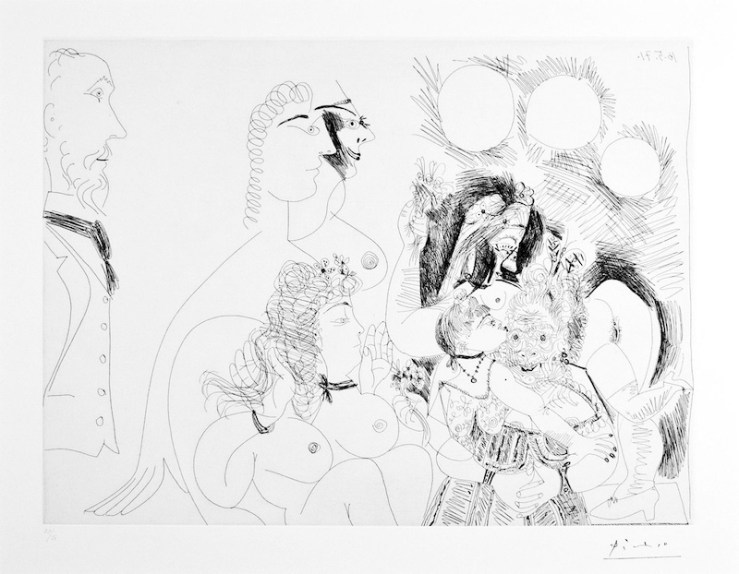
MORANG AND FRIENDS: Alfred in Paris

Alfred Morang Portrait- Morang and Friends Exhibition- Matthews Gallery BlogAlfred Morang, 1952

“After Morang’s death, all of a sudden people started to realize that he was a great artist. People regretted that they didn’t pay enough attention to him,” Santa Fe art collector Paul Parker said at the end of our interview last week.

As Parker will tell you, Alfred Morang’s death in a Canyon Road fire in 1958 was the end of an era in Santa Fe. From his arrival in 1937, Morang had helped cultivate a vibrant art scene in the City Different. His house parties of the 1930’s and 40’s earned him a reputation as “one of Santa Fe’s… most colorful Bohemians,” as the Santa Fe New Mexican dubbed him in his obituary. Morang was a masterful painter who drew inspiration from the French Impressionists, and a talented teacher who passed his knowledge to the next generation of Santa Fe artists. He was a great writer, musician and radio broadcaster.

However, towards the end of Morang’s life, he and his wife Dorothy divorced and he became increasingly isolated. He spent most of his time fervently painting in his Canyon Road studio. Santa Fe artist Bill Tate had this recollection of a frigid winter in the 1950’s:

Oh my, it was cold! The snow was pouring down unmercifully and as I walked into Alfred’s tiny studio, I pushed paintings aside to make a path, then found them sliding in behind me as I penetrated the cache of completed canvases. It appeared that paintings were everywhere. There in the middle was Alfred, happily painting away, bundled up like a Siberian monk—galoshes, muffler, sweater, heavy top coat which came to his ankles, and a woman’s hat pulled snuggly down over his ears and neck.

The studio had a sky light, but where the glass was supposed to be, there was none. Alfred had hung an old muslin sheet over the opening to shut out the falling snow. Evidently Alfred had let the fire go out in the small space heater. Or maybe had forgotten to pay his gas bill. I don’t know. But it was awful. I had been there just a few minutes when the muslin partially ripped loose from the ceiling and began flopping in the wind. Snow dumped all over Alfred as well as the canvas.

Alfred never looked up, never stopped painting. His blue-cold hands kept mixing painting and dabbing it on the canvas. Occasionally, he would lean back to assess the effect, but throughout, he was totally oblivious to my presence… or the muslin that danced in the bitter breeze.

I attempted to speak, but only a chatter came out. I retreated to the warmth of my own studio. To the day he died, Alfred never knew I was there.

This somber image of an artist in the winter of his life is not how Parker likes to think of Morang. Soon after he first visited Santa Fe in the 1990’s Parker developed a fascination for the Santa Fe icon that has taken him on many adventures, including a national treasure hunt that inspired our latest exhibition. The artifacts Parker discovered will appear alongside artwork by Morang and his contemporaries in our December 12-26 exhibition MORANG AND FRIENDS, evoking an era full of crackling creativity. Morang stood at its warm heart.

In the story below, Parker captures the Santa Fe zeitgeist before and after Morang’s death, and travels to Paris to complete a mission in Morang’s memory:

 Alfred Morang- Santa Fe Hillside 1949- Matthews Gallery Blog 
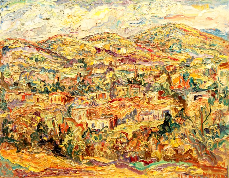
Alfred Morang, Untitled (Santa Fe Hillside) 1949, Oil on Canvas

HUNTING FOR ALFRED MORANG

by Paul Parker

I had been thinking about this mission for a long time and I finally find myself in the library seated in front of this antique microfilm viewer the size of a small refrigerator and I have loaded the reel containing the early 1958 issues of the Santa Fe New Mexican.

I was not sure why I had this unremitting need to know more about Alfred Morang. I had first seen his work painted on the adobe walls across from the bar in El Farol on Canyon Road and in Maria’s on Cordova, but I know the real inspiration came from my good friend Jim Parsons in Taos. Jim was an art dealer and appraiser forever and a friend and mentor for 20 years. When he mentioned that Alfred Morang was one of his favorites I knew I needed to pay attention. It was like Willy Wonka telling me about one of his favorite chocolate bars.

It helps that Alfred was such a compelling man, so well versed in music and literature as well as painting. He was the youngest person ever to perform a solo violin concert in the prestigious Jordan Hall in Boston. He was also an accomplished writer. The London Times once called him one of America’s leading non-political short story writers. Erskine Caldwell was a friend of his and he often visited Alfred and his wife Dorothy in Santa Fe.  Alfred’s short stories and poems were published alongside Frost, Poe and Mark Twain. I do know the main reason I am so drawn to him is that his art touches me. Behind that art is Alfred’s story, his life experience and that is what drove him to create the art that Jim and I and many others enjoy so much.

Alfred Morang- Untitled Portrait of a Woman 1950- Matthews Gallery Blog
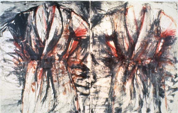
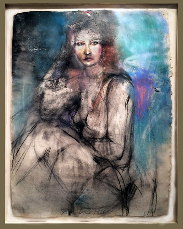
Alfred Morang, Untitled (Portrait of a Woman) 1950, Oil on Board

There is a very sad part to his story and it is that part that drew me to the library. Alfred Morang died in a fire in his Canyon Road apartment studio on a cold January night at the age of 56. I had wanted to come here to the library and read the January 29, 1958 issue of the Santa Fe New Mexican for some time. I wanted to know the details, I wanted to read what people said, I wanted to know what page it was on and how big the article was. I was scrolling through the microfilm and as I started approaching the day he died I realized I was reading the papers that he probably read unaware he only had days to live.

The closer I got to the issue of the paper I had come to see the more time I took reading the articles and I even started reading the ads. I lingered the longest on Tuesday’s edition dated January 28, 1958. That was the last paper Alfred could have read.

There was an article on that day that I am sure must have caught Alfred’s eye and the headline read, “French Ballet loses Backing”. Alfred never made it to Paris, but his heart was there. His heroes were the French Impressionists and he considered himself to be one of them. Monet and Bonnard were his favorites. The article explained that the French Education Ministry had withdrawn the government subsidy for the production of Francoise Sagan’s ballet “The Broken Date”. The ministry’s action followed a storm of protest. Apparently one dance was performed in a bathroom setting designed by painter Bernard Buffet and was described by some critics as scandalously erotic. I would like to have gone to Paris with Alfred and attended that performance. A French ballet with a bathroom setting designed by Bernard Buffet coupled with scandalously erotic, I am sure we both would have enjoyed that.

That Tuesday the Lensic was showing “Pal Joey” starring Rita Hayworth, Frank Sinatra and Kim Novak. Kaune’s was having a sale featuring Pork Chops at 59 cents a pound and Swanson’s Pot Pies at four for a dollar with your choice of chicken, turkey or beef. Cherry Motor’s at 607 Cerrillos Road had an ad for the new Rambler American for $1789. The ad proclaimed that one had been driven from New York to Los Angeles using only 80 gallons of gas averaging over 30 mpg. I remembered that time. One week before this ad ran I had celebrated my 12th birthday and becoming a teenager was in sight. Unlike today I was looking forward to getting older and that was the time I began thinking about cars. Chevrolet had just introduced the 283 V-8 a year earlier in the now iconic 1957 Chevy. The fuel economy push left over from the war was fading fast and the Plymouth Hemi and the “Little GTO” were on the horizon. The economical 6 cylinder Rambler American never had a chance.

IMG_0474
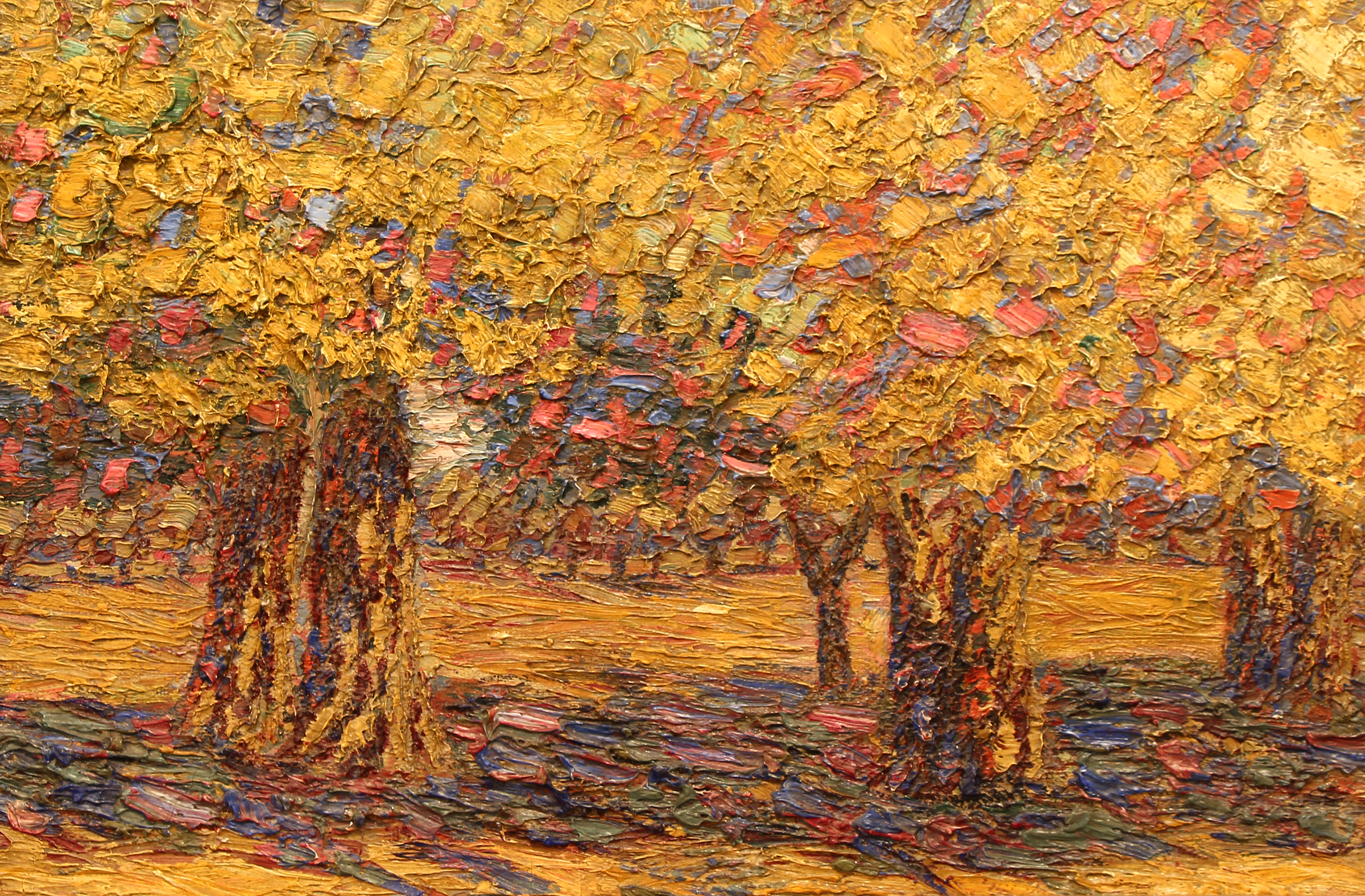
Alfred Morang, Pecan Grove, Oil on Panel

I read every bit of that Tuesday’s paper. It was as if I felt that Alfred would be okay as long as I did not turn the page, but I knew it was time to see what I had come to see. I took a last look at the classifieds and marveled at an ad for a 2-bedroom adobe with wall-to-wall carpet “close in” for $16,500 and then I hit the button and watched the microfilm reel turn slowly.

The first thing I saw positioned on the top left side of the front page of that Wednesday edition of the Santa Fe New Mexican was a large photograph of a cat crouching on the corner of a charred mattress. The rest of the bed was strewn with papers and tubes of paint. Underneath the right half of the photo was a caption “Mourning for Her Master…This lonely cat was found wandering through the charred ruins of the home of her master Alfred Morang who died in the fire early this morning. The cat is on the bed where he died.” Morang’s friends had commented on his love of cats and noted that he often went hungry himself so he could afford to feed them. Two other cats perished in the fire with him. Unfortunately I discovered that the cat on the mattress in the picture had to be put down because it had extensive lung damage. There was also a picture of Alfred. A cigarette in a holder was hanging from the corner of his mouth dangling over his scraggly beard and he was wearing a black hat with a brim that was tilted slightly to the left making him look decidedly like an artist and decidedly French. The story next to the photo read “Well Known Artist Dies In Home Fire… Alfred Morang, 56, one of Santa Fe’s best known and most colorful Bohemians died at about 1:30 am last night in a tragic fire at his home in the 600 block of Canyon Road.”  Friends reported they had last seen Alfred in Claude’s bar around midnight. His apartment was just up the alley out back.

Five days after the fire the New Mexican noted…“Funeral services were held Saturday at the Fairview Memorial Park Crematorium in Albuquerque for Alfred Morang, widely known Santa Fe artist, writer and critic who was burned to death early Wednesday morning in a fire at his home here. The body was escorted to Albuquerque by a group of close friends, including Randall Davey, Will Shuster, Harlan Lizer, Walter Dawley and William Currie. Alfred was transported in a Spanish Colonial coffin made by Abolonio Rodriguez, custodian of the art museum.”

IMG_0505
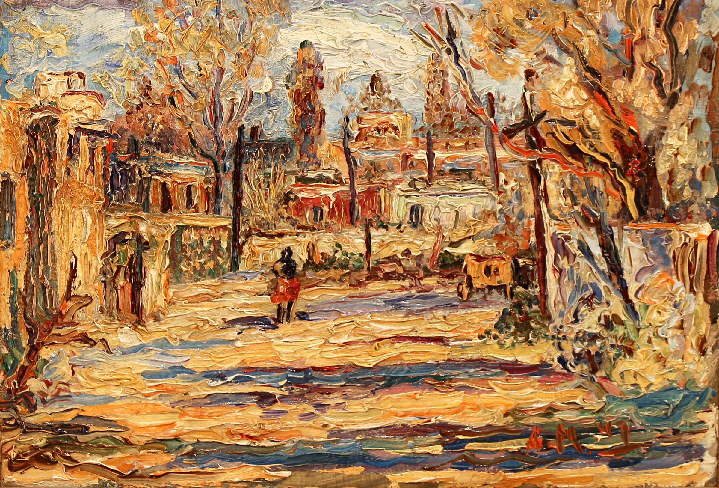
Alfred Morang, Guadalupe Plaza 1947, Oil on Board

Alfred was born in Ellsworth, Maine in 1901 and came to Santa Fe in 1937. Like many who came here he suffered from TB. He immediately became a fixture in the Santa Fe art scene. He wrote a weekly column for the newspaper and he produced a weekly radio program for 17 years on KVSF called “The World of Art with Alfred Morang.” Most of all he was famous for his enthusiasm for art and his ability to teach and many benefited from “The Morang School of Fine Art”.

Walt Wiggins authored a book published in 1979 appropriately titled “Alfred Morang…A Neglected Master”. Walt uncovered several quotes during his research for his book and my favorites include the following.  “When Alfred Morang’s life came to a tragic end in January of 1958 nothing before or since has so shaken the New Mexico art colony. Some say it was a sense of guilt that struck the community for not having shown a greater sense of appreciation for one who, by destiny, was different.” One Santa Fe artist reasoned, “Why shouldn’t Santa Fe be stunned with the loss of Alfred?  After all, he taught half of us how to paint and the other half how to see.”

The February 10th 1958 issue of the Santa Fe New Mexican carried the report of the local memorial service for Alfred in Lorraine Carr’s column “It Happened in Old Santa Fe”. Dr. Reginald Fisher, director of the Art Museum spoke first. “Friends this is not a funeral, we are simply gathered here for a creative expression of merit and appreciation of a spirit that has been active in an activity that we in Santa Fe like to call art. Alfred was an inventive, searching and daring spirit as French as Lautrec, yet he never saw Paris. Last week his restless spirit found peace.”

Painter and close friend Randall Davey was next. “I have known Alfred since he arrived back in 1937. He was a kind, a gentle and a humble soul and in all those years I never heard him speak unkindly of his fellow man. He was a great painter; many of you did not think so, because often he sold his work for a mere pittance through necessity. Nevertheless it was great art and the happiest work I have seen in New Mexico. He had a love and a delight for painting and I doubt that anyone will surpass him in this field.”

IMG_0495
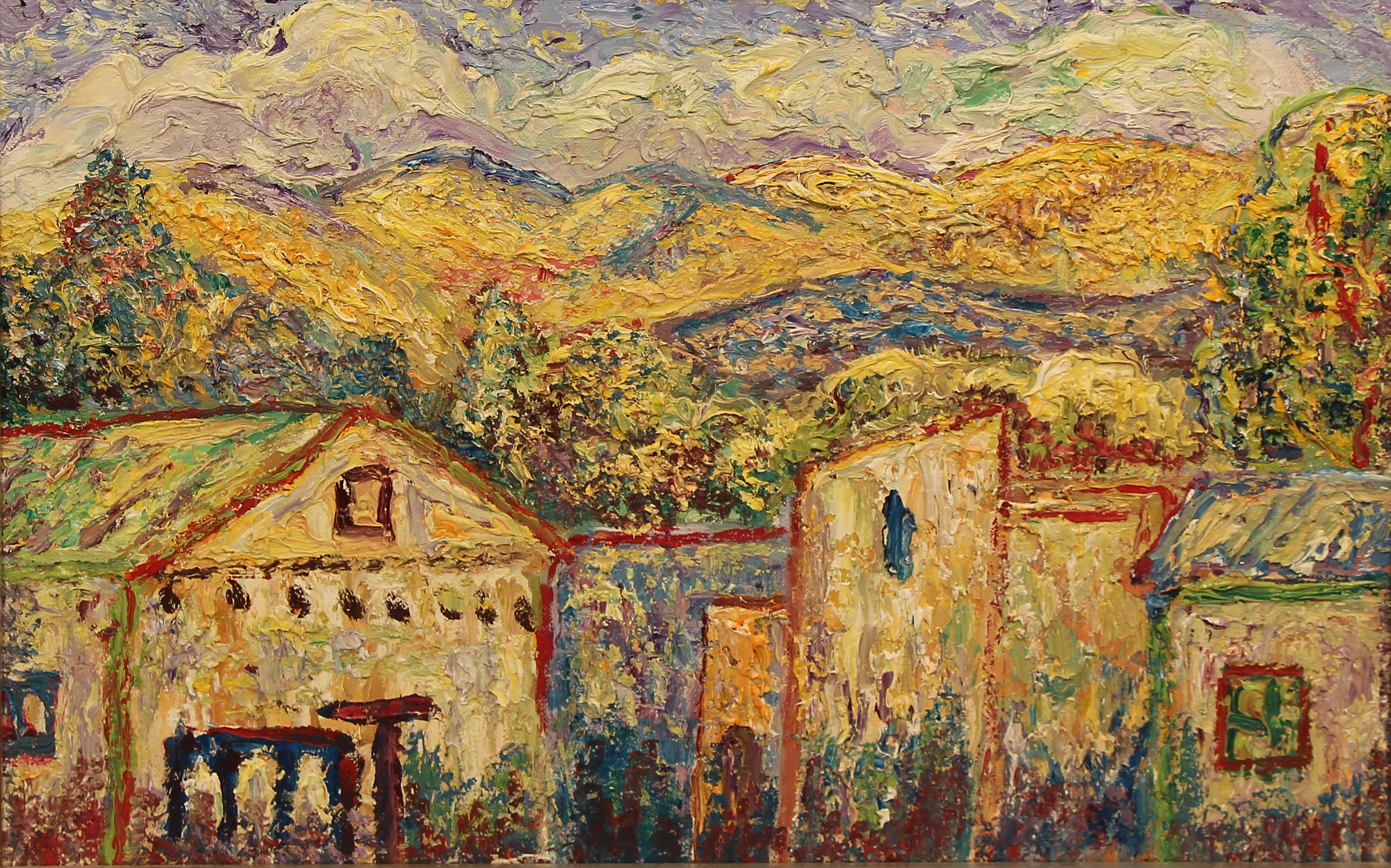
Alfred Morang, Untitled (Mountain Landscape), Oil on Board

I hope Alfred enjoyed himself on that Tuesday. I hope he spent some time with friends and some extra time petting his cats. I hope he wrote another poem and put the final touches on his most recent favorite painting before he headed down the alley to Claude’s that evening.

Claude James ran the well-known Canyon Road bar where he often spent time and, as legend has it, her rowdy spirit was just what was needed to run that place. I would love to have met Alfred there that fateful night for a few drinks. I’m sure we would have talked through the evening about art and life as we cast occasional glances at the ever present ladies that were often the subject of his paintings and when Claude said “It’s midnight, would you fellows like another one?”  I would nod and say, how about a couple of shots of your best cognac. I would love to take a sip, lean back and turn to him and say “Alfred I know you often say that you don’t believe in art for art’s sake, but you believe in art for people’s sake. Can you explain to me what you mean by that, and please…take your time?”

A few weeks after I finished writing this story I found myself engrossed in the details of planning a trip to Paris. I was not sure why, but suddenly it came flooding over me with incredible clarity. Human life really is very fragile and it really is all going to come to an end someday and we do not know when. I knew then I needed to go to Paris and I needed to go now. Unfortunately most people have that epiphany too late in life. They start thinking about the things they never got to do after it’s too late to do them. I knew then that this sudden obsession with Paris was a message from Alfred. Paris was his promised land, but he never made it there and I was going to go for both of us.

I told a friend in Santa Fe this story and he said, “You should do something for Alfred in Paris.” It was a great idea, but what would I do? I had been in Paris 5 days when I suddenly knew. I found an image of a Morang painting on my laptop. I printed it and wrote a bit on the back about Alfred and headed off to the Musee d’Orsay. This time as I enjoyed the paintings I was also searching for a repository for Alfred’s work and I finally found it. I can tell you that a fine example of the genius of Alfred Morang now has a home in Musee d’Orsay on the banks of the Seine and it will take a jackhammer to find it. He is close to Monet and Bonnard, the masters he so admired. Alfred, you finally made it.

Source: Bill Tate’s tale first appeared in the 1979 book Alfred Morang: A Neglected Master by Walt Wiggins.

Picasso: Past, Present and Future!

Pablo Picasso and sister Lola- Matthews Gallery blogPicasso and his sister Lola. He was about 8 years old
in this picture, and already had some swagger.

In the art world, it’s a holiday. Pablo Picasso was born in Málaga, Spain on October 25, 1881. In the 133 years since, the artist has irrevocably changed the way we look at art— and the world around it.

We’re frequently struck by the way Picasso would capture an artist’s attention and radically alter his or her course. Just look at this 1955 lithograph by Italian futurist Gino Severini, which is often mistaken for a Picasso by gallery visitors. French artist Jean-Pierre Jouffroy shifted from figurative artwork to pure abstraction after studying Picasso and his contemporaries, and Robert Motherwell‘s decision to become an artist hinged on a European tour of modern masterworks.

On this momentous day, we’re looking back at every Picasso that has passed through our gallery. Each one has a fascinating story… Pablo Picasso- Les Saltimbanque- Matthews Gallery blog Les Saltimbanques is the earliest work by Picasso we’ve ever exhibited. It’s a drypoint from 1905, when the artist was about 24. It was commissioned by legendary art dealer Ambroise Vollard, who gave Picasso his first gallery show in 1901. The frolicking figures are characters from an opera-comique about a circus troupe. An early appearance by the harlequin (far right) is notable, as the archetype would become one of Picasso’s most-used personal symbols.

Pablo Picasso- Personnages Masques et Femme Oiseau- Matthews Gallery blog

Fast forward to 1930. With the help of Vollard, Picasso had built his name into the first true global artistic brand. In yet another stroke of marketing genius, Vollard commissioned Picasso to create a series of 100 etchings—including several portraits of the dealer himself. The star of the Vollard Suite is the minotaur (second from left), another one of Picasso’s personal symbols. At the beginning of the series the minotaur is a virile beast, but by the end he is blind and weak, relying on a beautiful young muse to guide him. Completed in 1937, it’s the middle-aged Picasso’s meditation on his waning virility.

Pablo Picasso- Alex Maguy Gallery- Matthews Gallery blog

A youthful face peers from this offset lithograph Picasso designed for the Alex Maguy gallery in 1962. The exhibition was a retrospective of his artwork, but those captivating, wonder-filled eyes hardly hint at the darker themes the octogenarian turned to in his later years.

Pablo Picasso- 156 Suite- Matthews Gallery blog Picasso created the 156 Suite in 1971, not long before his death. Some consider the etchings to be his most personal series, a diary of a man struggling with impotence and pushing helplessly against the inevitable.

In contrast to our print from the Vollard Suite, women take the dominant role in these works. Models turn on artists, witch doctors stab at their patients and—in the case of this print—prostitutes tangle at a brothel while a man looks on, paralyzed. The gentleman is Degas, who appears in several prints in the series and with whom Picasso felt solidarity in his struggles.

Pablo Picasso 1971- Matthews Gallery blog Check out our Twitter, Tumblr and Pinterest profiles today for more insight on Picasso, and learn more about all of the artwork in this post on our homepage.

OUTSIDER/INSIDER: Abstract Expressionism at Matthews Gallery

Stanley Boxer and Robert Motherwell at Matthews Gallery Boxer (left) and Motherwell

It was Mark Rothko’s 111th birthday this Friday, and the occasion has us pondering one of the 20th century’s most polarizing art movements: abstract expressionism.

Three artworks by renowned abstract expressionists have recently landed on our walls. The first two are heavily impastoed oil paintings by Stanley Boxer, who resolutely clung to the far fringes of the movement. Determined to defy labels, he was furious when art critic Clement Greenberg called him a color field painter, and yet the arc of his creative explorations closely paralleled that of his abstract expressionist contemporaries:

In the manufacture of my art, I use anything and everything which gets the job done without any sentiment or sanctity as to medium. Then, too, I have deliberately made a practice of being “visionless”… this is, I go where my preceding art takes me, and never try to redirect the future as to what my art should look like. This is a general credo and foundation for everything I have ever done and stands firm in its solidity as this is written.

Boxer, who died in 2000, would have loved Grace Glueck’s New York Times review of a 2004 exhibition of his late works. She notes that he was “never part of a movement or trend,” but rather driven by paint’s “physical possibilities without script or program.”

Abstract Paintings by Stanley Boxer- Matthews Gallery Blog Atriumofashreddednight  (top) and Crisppitchofsigh, Oil on Linen

Glueck ends the piece with a brief analysis of Boxer’s titles, lyrical lists of words that are jammed together in unbroken strings. The works in our collection, for example, have names that read like fragments of beat poems: Atriumofashreddednight and Crisppitchofsigh. Glueck writes, “As Boxer joked in his titles, these canvases, more than most, do not really lend themselves to verbal exposition. They live for the eye, to which they bring deep satisfaction.”

Boxer’s titles provide a link to Robert Motherwell, the other abstract expressionist represented in our collection. Unlike many “abex” artists who labeled their canvases using dates or arbitrary numbers, Boxer and Motherwell were unapologetic in their wordplay.

That’s where the similarity ends. While Boxer considered himself an isolated frontiersman of abstract painting, Motherwell was an eager icon of abstract expressionism. He coined the term ‘New York School’ to describe his revolutionary circle, which included Mark Rothko, Jackson Pollock and Willem de Kooning, and acted as a spokesperson for the movement in the world of academia.

If Boxer’s titles were little more than impressionistic quips, Motherwell, who was a scholar before he became a “serious artist” and wrote numerous essays on aesthetics, chose names that have inspired endless analysis. His most famous series of paintings, Elegies to the Spanish Republic, chronicles the Spanish Civil War in bold strokes of black and white and subtle passages of ochre, blue, green and red.

Mainly, I use each color as simply symbolic: ochre for the earth, green for the grass, blue for the sky and sea,” Motherwell wrote. “I guess that black and white, which I use most often, tend to be protagonists.” In varying contexts, each color holds a universe of meanings. To fully understand the use of ochre in Motherwell’s Spanish Elegies, “You would have to know that a Spanish bull ring is made of sand of an ochre color,” the artist wrote.  Other works that feature ochre, like Western Air or Personage, with Yellow Ochre and White, would naturally spark different associations. 

Robert Motherwell- Africa 4- Silkscreen- Matthews Gallery Blog Robert Motherwell, Africa 4, Silkscreen

What to make of our Motherwell silkscreen, titled Africa 4? Motherwell completed the Africa suite in 1970, the same year he created his Basque and London suites. They were his first projects entirely devoted to silkscreens, and a divergence from the heavily layered nuances of his oil paintings. Here his black abstract forms stand crisply against their off-white backgrounds, although on closer inspection, their tumultuous edges still seem to weave in an out of focus.

“All my works [consist] of a dialectic between the conscious (straight lines, designed shapes, weighed color, abstract language) and the unconscious (soft lines, obscured shapes, automatism) resolved into a synthesis,” the artist wrote in 1944.

Motherwell first explored the concepts of automatism and the subconscious with a group of Parisian Surrealists, including Duchamp, Ernst and Masson, who had fled Europe during World War II.  Their ideas would help shape the spiritual side of abstract expressionism, a spontaneous, intuitive element that Motherwell carefully balanced with his more intellectual inclinations.

Motherwell’s connection to the Surrealists lends us a potential clue to the significance of the ‘Africa’ title. In his 1946 essay ‘Beyond the Aesthetics‘, Motherwell discusses the life of French Symbolist poet Arthur Rimbaud, who helped inspire Surrealism. In the final decades of his life Rimbaud quit writing and set off on an African expedition, a leap of faith that Motherwell compares to the Surrealists’ break from Dada and formation of a new movement:

Like Rimbaud before them, the Surrealists abandoned the aesthetic altogether; it takes a certain courage to leave poetry for Africa (as Rimbaud did, fh). They revealed their insight as essentially moral in never forgetting for a moment that most living is a process of conforming to an established order which is inhuman in its drives and consequences. Their hatred sustained them through all the humiliating situations in which the modern artist find himself, and led them to conceptions beyond the reach of more passive souls. For them true ‘poetry’ was freedom from mechanical social responses. No wonder they loved the work of children and the insane – if not the creatures themselves.

Perhaps Motherwell’s Africa suite represents a similar journey, a leap into the unknown that is a clear break from previous adventures. Just as Rimbaud abandoned an intellectual pursuit for one centered on travel and action, and as the Surrealists broke from the societal battles of the Dadaists to explore dreamscapes, so Motherwell’s stark Africa forms landed him in a new realm of image-making. Perhaps he sought to prove that even the most distinctly divided blacks and whites could possess endless shades of grey.

Learn more about Stanley Boxer and Robert Motherwell on our website, and make sure to connect with us on Facebook, Twitter and Flickr for more gallery news.

ONE WORK OF ART: Beatrice Mandelman’s ‘Cool Wind’

Beatrice Mandelman- Cool Wind circa 1950- Matthews Gallery

Beatrice Mandelman, Cool Wind c. 1950, Casein with Collage on Masonite Panel

When John Sloan invited Beatrice Mandelman and Louis Ribak to visit Santa Fe in 1944, the two artists were on the rise among New York City’s avant-garde. They had ties to Hans Hoffman and Fernand Leger, and were often mentioned in the same breath as Jackson Pollock. Sloan, who had been summering in New Mexico for years, had a reputation for spiriting away his favorite artists to the Desert Southwest. During their trip the recently married duo took a train to Taos and decided to stay.

The move marked a radical change in Mandelman and Ribak’s artwork. “We had to start all over again,” Mandelman said. “We spent the first couple years painting landscapes.” They were known for their figurative paintings in New York, but in this radically different environment their focus shifted to pure abstraction. They were trailblazers for a new wave of artists called the Taos Moderns, a movement that enlivened the Taos art colony but enraged an older vanguard of academic painters with ties to the Taos Society of Artists of the 1910’s and 20’s. To this tight clique of romanticists, the newcomers stuck out like colorful cacti—particularly Mandelman.

Portrait of Beatrice Mandelman in her Taos studio circa 1950- Matthews Gallery Beatrice Mandelman, 1950

“She worked with full abstraction at a time when most artists were not daring enough to do so,” writes David L. Witt in his book Taos Moderns, noting that Mandelman considered herself “the first of the second generation of artists in Taos.” The voice of a young, female abstract painter had never been part of the remote art community.

Far from the big city, Mandelman developed a new appreciation for the natural world and humanity’s relationship with it. By the late 1940’s she was developing an abstract symbol system to express her emotional responses to the landscape. Her elegant compositions didn’t mimic the lines or palette of the high desert, but they perfectly evoked the strong, solitary spirit of its inhabitants.

The mixed media painting in our collection was likely done in the 1950’s. Early in her experiments with abstraction Mandelman chose a muted palette, but here brighter colors poke through. This more expressive style was inspired by Henri Matisse and Mandelman’s former teacher Leger, and allowed her to explore the highs and lows of human experience with great vigor. Cool Wind‘s undercurrent of chilly blues and bright accents of orange and red call forth the sensation of a shiver passing up the spine.

As the evenings get cooler in Santa Fe, we’ve developed an ever-evolving passion for this piece and the innovative artist who created it. Learn more about Beatrice Mandelman on our website, and connect with us on Facebook, Twitter and Instagram for daily gallery news.

THE LUMPKINS LEGACY: Bill’s Last Request

William Lumpkins Jr- Matthews Gallery Art Opening

William Lumpkins Jr. next to his father’s serigraph “Abstract Landscape #3

At last Friday’s opening of NEW MEXICO MODERNS: The Lumpkins Files, William Lumpkins Jr. was a quiet presence. He stood to the side surveying his father’s work or chatted softly with visitors, many of whom were family friends. One woman had known his dad, who died in 2000, through an art discussion group that met at local coffeehouses. “Whenever Bill spoke, we all had to lean in. He was such a lovely, gentle man,” she said.

Will’s father may have passed down his mild temperament, but both men are also legendary for their fierce artistic passion. Will has carefully preserved the artwork in The Lumpkins Files show for years, and meanwhile has developed his own artistic style. The jacket he wore to the show was emblazoned with intricate celtic knots and a dragonfly.

When we asked about his dad, the more colorful side of Will’s personality emerged. Here’s William Lumpkins’ son on his father’s never-before-seen artwork, and why he decided to release it more than 15 years after Lumpkins’ death.

 What’s it like to see your dad’s work hanging in the gallery? 

Well, his work was all around us growing up, so it’s not that strange. The gallery did an excellent job though.

When did you first bring the work to Matthews Gallery?

About a year and a half ago. I had shopped around and didn’t relate to anybody until I met Larry.

Where did you keep it for all these years? 

I had it in a case between sheets of acid-free paper. When I was teaching at Virginia Commonwealth University, I was in charge of museology. It was a whole print and painting conservation training program. So my dad knew that I could take care of them. Watercolors in particular are a sensitive thing for archiving.

Why didn’t he want you to release them until now? 

It didn’t have to do with the work. He said to me, ‘Okay, you wait until after you’re 70 because by then your personal artistic statement will be you. You won’t have to mimic me.’ So at 70, my artwork was me and I brought these out again.

Were you ever tempted to release them before that? 

No, it just didn’t seem right until I started looking around recently. I trusted you guys.

One of the biggest surprises in this body of work was the watercolor from 1937. That’s one of the earliest Lumpkins pieces we’ve ever seen. Did you know it was in there?

I knew that the work spanned a lot of time. When Dad was closing down the studio, he picked these out because these were the ones that he really liked from different points in his career. He felt that they were significant, and that they weren’t typical. His typical work is pretty well-known, but these he wanted to hold out so that they’d be totally new.

What was your vision for this show? 

I gave the work to Larry and said, ‘Do you what you think is best.’ I just want them to be out in the open where they can be seen. If people want them enough, if people like them a lot, that’s good.

Hear more from Will Lumpkins in this week’s Pasatiempo, and visit the show at Matthews Gallery through Friday, April 25. For more images from the opening, check out our photos page and connect with us on Facebook and Instagram.

NEW RELEASE: Fremont Ellis of Los Cinco Pintores

Fremont Ellis- La Plata Mountains- Matthews Gallery Blog


In 1921, Fremont F. Ellis and his friends Jozef Bakos, Walter Mruk, Willard Nash and Will Shuster founded an avant garde art society that would change Santa Fe forever. The five men were in their early 20s, and most of them had recently migrated there from the East Coast. They chose a name inspired by their new life in the Southwest: Los Cinco Pintores (The Five Painters).

In December of that year, Los Cinco Pintores mounted their first group exhibition at Santa Fe’s Museum of Fine Arts. Their work was diverse in subject matter, but their rallying point was modernism and the art of early Taos painters Robert Henri and John Sloan of the Ashcan School.

“These men believe in color and are not afraid to use it,” wrote a critic who attended the inaugural show. “Upon entering the galleries, visitors are greeted with a great shout of color that’s almost stimulating.”

Fremont Ellis - Watercolors - Matthews Gallery Blog

Over the next few years, Los Cinco Pintores worked together to build a row of casitas along Camino del Monte Sol near Canyon Road. This earned them another nickname, “The Five Nuts in the Adobe Huts”. Meanwhile, word of their exploits had reached other artists back home.

By 1923 another group called the New Mexico Painters was exhibiting paintings of sweeping Southwestern landscapes across the Midwest and the East Coast. Artists like Randall Davey, Andrew Dasburg and Theodore Van Soelen settled in the area, and the Santa Fe Art Colony was born. The City Different has fostered a vibrant art community ever since.

Fremont Ellis- Watercolor Diptychs- Matthews Gallery Blog

These newly released works on paper are by Fremont Ellis (1897-1985), who was the last surviving member of Los Cinco Pintores. Ellis grew up in Montana and was inspired to become an artist at 14 when he saw Albert Bierstadt’s paintings on a trip to New York City. He worked as a photographer in California before settling in Santa Fe, and used his photographs of landscapes to inspire his painted compositions. This body of work holds the vigor and immediacy of the artist’s many outdoor adventures.

Learn more about Fremont Ellis on our website, and connect with us on Facebook, Twitter and Tumblr for daily gallery news. Also, don’t forget to mark your calendar for our exhibition NEW MEXICO MODERNS: The Lumpkins Files, opening next week!

NOT A POP ARTIST: Five Sides of Jim Dine

Jim Dine Rainbow- Matthews Gallery Blog


78-year-old artist Jim Dine has earned his place in any good post-war art history textbook. Picking exactly when to spotlight the artist must be a difficult task for scholars. The painter, sculptor, illustrator, printmaker, stage designer and performance artist has a way of diverging from the status quo and ending up at the forefront of new art movements. Just when things get established, he’s off on his own again.

A mixed media drawing  by Dine recently found its way to Matthews Gallery, so we took the opportunity to explore 5 manifestations of the chameleonic artist:

Fluxus Performer

Dine grew up in Cincinatti and got his BFA from Ohio University. When he arrived in New York in 1958, the art world was fixated on a type of work you couldn’t sell in a gallery. Some critics called them “wacky nightmares“, others described them as “a three-ringed circus with undertones of group therapy“, but Dine and his friends Claes Oldenberg, Allan Kaprow and John Cage dubbed their performance art pieces “Happenings”.

Happenings were designed to be as ephemeral and unpredictable as day-to-day life—but a little weirder. Battles between ballerinas and roller-skaters, reenactments of the Lincoln assassination, bikini stripteases and blue ice cream feasts were all passionately performed, often in rapid sequence. Whether you call it though-provoking or senseless, the Fluxus movement was one-of-a-kind. For Dine, all the world was a stage until…

Pop Progenitor

Jim Dine- Robe Diptych- Matthews Gallery Blog


Jim Dine, Red and Black Diptych Robe, 1980

In 1962, Dine’s paintings appeared alongside work by Andy Warhol, Roy Lichtenstein, Ed Ruscha and others in the Pasadena Art Museum’s show New Painting of Common Objects. Curated by Walter Hopps of Ferus Gallery (site of Warhol’s first solo show), the exhibition was a seminal moment for a new movement: Pop Art.

Dine’s inclusion in the exhibition made perfect sense at the time. He was experimenting with serial imagery of familiar objects and symbols like bathrobes, hearts and tools. However, the artist’s expressive style and often tender subject matter clashed with the postmodern angst of other Pop progenitors. Soon enough, he was plotting his escape…

Modernist

Jim Dine- Paris- Matthews Gallery Blog

Jim Dine, Paris Smiles in Darkness, 1976

Dine moved to London in 1967, a strange decision considering his controversial history with the United Kingdom. A year before his solo exhibition at London’s Fraser Gallery was raided by police and the owner was fined for showing “indecent” images.

The artist defiantly continued to his relationship with Fraser and used his time in Europe to study the work of Van Gogh, Picasso, Matisse and other modernists. In 1971 he returned to the United States, ready to chart a new course…

Neo-Expressionist

Jim Dine- A Lady Sitting Drawing- Matthews Gallery Blog

 Jim Dine, A Lady Sitting, Mixed Media, 1975

Minimalism was en vogue when Dine arrived in New York, but the artist wasn’t interested. Instead he focused on figure drawing, refining his skills in various mediums and earning a reputation as a master draftsman. The mixed media drawing in our collection is from this period. A stunningly realistic face painted in oil is framed by confident charcoal marks and a glowing crayon color field.

In the years to come Dine’s figurative work would mark him as a founder of Neo-Expressionism, but critics could never assign the artist a particular label for long…

Modern Individualist

2008_JimDine_23220011

Installation shot, Jim Dine: Poet Singing (The Flowering Sheets)

 Perhaps Dine’s artistic identity is best summed up by MoMA:

This commitment to a personally invested, image-dictated content and a continuing interest in the technical and expressive potential of every medium has characterized Dine’s work as a whole. Thus, Dine has often been out-of-step with the major movements of the post-World War II period and must be considered a modern individualist.

It’s a bit of a non-title, but Dine defies labels at every turn. The almost-octogenarian is still working his way into new chapters of art history.

Check out our website for more on Jim Dine, and connect with us on Facebook, Twitter and Flickr for to-the-minute gallery news.

BURST OF BRILLIANCE: Adolph Gottlieb’s Southwestern Epiphany

“It was like being at sea,” said Adolph Gottlieb. The artist had just spent a year in the Desert Southwest- from 1937 to 1938- and returned to his hometown of New York City with a radically altered style. “There’s… a tremendous clarity of light and at night the clouds seem very close,” he continued. This was a very different type of “sea” than the one that carried Gottlieb on his inaugural artistic journey. When he was 17 he dropped out of high school and caught a merchant ship to Europe. He spent two years there, including six months in Paris where he audited art classes and visited the Louvre every day. Back in New York, he studied at The Art Students League and befriended Barnett Newman, Mark Rothko and Milton Avery. Together they founded the abstract expressionism movement, working to develop color field painting and other innovations. They remained close until Gottlieb decided to strike out on his own to Tucson, Arizona. It was an endeavor that would markedly separate him from his contemporaries, even after his return to the East. Gottlieb’s New York friends called the style he had developed in Arizona simplistic, but the artist refused to look back. He distanced himself from his colleagues and focused on developing a Surrealist style. Experiments with automatism and surrealist biomorphism helped him create an abstract symbol system for his gridded Pictographs series. Finally, in the 1950’s, he started work on two series that would become his most well-known work. Both series are represented in our collection, and their very existence seems linked to the bare, elegant vistas of the Desert Southwest.

IMAGINARY LANDSCAPES

Around 1950-51… I was finally getting away from the pictographs and looking for something… So it was necessary to find other forms, a different changed concept. So finally after a certain period of transition I hit on dividing the canvas into two parts, which then became like an imaginary landscape… What I was really trying to do when I got away from the pictographs was to make this notion of the kind of polarity clearer and more extreme. So the most extreme thing that I could think of doing at the time was dividing the canvas in half, make two big divisions and put something in the upper division and something in the lower section.

The color and texture of the land mass in “Green Foreground” recalls Gottlieb’s sea simile. In this period the artist was consolidating surrealist and abstract expressionist theories by approaching the two movements as different sides of the same coin (hence a “polarity”). Our lithograph implies a fantastical landscape, but works just as well as a flat, wholly abstract composition. If we imagine ourselves exploring this terrain, it would look much like Gottlieb’s surroundings in the Southwest, albeit with a greener tint.

BURSTS

After doing the imaginary landscapes until say 1956, in ’57 I came out with the first Burst painting… There was a different type of space than I had ever used and it was a further clarification of what I was trying to do. The thing that was interesting that it was a return to a focal point, but it was a focal point with the kind of space that existed in traditional painting. Because this was like a solitary image or two images that were just floating in the canvas space. They had to hold the space and they also had to create all the movement – that took place within the rectangle.

Gottlieb’s Bursts are Imaginary Landscapes that have further dissolved into abstraction, though their compositions still root them somewhat in reality. In “Crimson Ground” two discs rise (or set) like a sun and moon from a monochrome tangle with the most ephemeral of horizon lines.

When I started doing the Bursts I began to do part of the painting horizontally. It was necessary to do that because I was working with a type of paint which had a particular viscosity, which flowed, and if it were on a vertical surface it would just run. If it were on a horizontal surface, I could control it… I was using a combination of brushes and knives, palette knives… and spatulas… I’ve tried everything, rollers, rags, I’ve put paint on with everything.

“Crimson Ground” isn’t a painting, but it still has a painterly quality to it. The edges of the discs are uneven and textured, and the forms below are as splattered as a Pollock drip painting. This further highlights the polarity between the surreal landscape and an abstract expressionist painting. One is focused on depth, the other focuses solely on the surface. Learn more about Adolph Gottlieb on our website, and connect with us on Facebook, Twitter and Pinterest for to-the-minute gallery updates!

CURATE THIS, CURATE THAT: Place your votes!

Collectors-Choice-Social1

The selection process for our social media-curated show COLLECTOR’S CHOICE is underway, and fans on Facebook, Instagram, TwitterTumblr and other networks have placed their votes. It’s time for some tie breakers on WordPress! Check out the match-ups below and vote for your favorites in the comments section. From January 31 to February 5, we’ll unveil your selections in the gallery and online.

JAMIE CHASE

Jamie Chase- Collector's Choice- Matthews Gallery blog

ROUND 1! Jamie Chase is known for his figurative work like image #1, and also his abstracted landscapes like #2. Which one should appear in the show? Take the curatorial reins!

WILLIAM LUMPKINS

William Lumpkins- Collector's Choice Show- Matthews Gallery Blog

Do you prefer William Lumpkins‘ careful watercolor brushstrokes (#1) or experimental wild felt-tip pen marks (#2)? Read more about the influential Santa Fe modernist here before you decide…

KATE RIVERS

Kate Rivers- Collector's Choice Show- Matthews Gallery

Curate this! Should we feature a Kate Rivers book collage in the show, or one of her nests? Read about her mixed media work in this blog post, and vote for #1 or #2 in the comments.

HANNAH HOLLIDAY STEWART

Hannah Holliday Stewart- Collector's Choice- Matthews Gallery Blog

These tall, spindly bronzes might be very different, but they’re both by powerhouse feminist sculptor Hannah Holliday Stewart. Figurative or abstract? Curate that!

PAUL GAUGUIN

Paul-Gauguin-Collectors-Choice

Two Tahitian myths inspired these woodblock prints by Paul Gauguin. Which do you prefer? Read about them in this blog post, and vote now!

Thanks for participating in COLLECTOR’S CHOICE! To place your vote on other social networks, connect with us through the links on our About Page.

LET THE HUNT BEGIN…

This slideshow requires JavaScript.

“Where did you get that?”

That’s a common question among Canyon Road visitors when they see historic work by Henri de Toulouse-Lautrec, Paul Gauguin, Salvador Dali and other famous artists on our walls.

There’s no supermarket for art like this. Finding and authenticating it is an elaborate process, and the treasure hunt often begins where you’d least expect it. If you’ve ever wondered about the value of that painting or print on your wall (or in your attic), we might be able to help.

We’ve been in the fine art business for over 15 years, and have assisted hundreds of clients in selling their historic and vintage art. Whether you own a Renoir lithograph or an exquisite painting by a little-known American modernist, a sculpture by Arnaldo Pomodoro or a watercolor by an anonymous 19th century artist, we’d be delighted to take a look at it.

We’re primarily interested in art from four categories: European, American, Southwest and Contemporary. It could be a single work or a collection within any price range. If you’re looking to sell or consign, we offer fair prices.

Contact us at info@thematthewsgallery.com to get the process started, and check out our website and Facebook page to learn more about us.

Matthews Art Group- Sell your historic and vintage art